Here’s an idea. Grab a stack of cash and throw it off your balcony. Bad idea? From an SEO and design perspective, I found out that many websites ignore one of the most important conversion goldmines that leads to a boost in sales.
I’m not talking about product pages or even check-out pages. The unappreciated key lies on the thank you page. Most of the time, “thank you” is said at the end of the physical transaction process, but in the web world, it is at the beginning. So, should a landing page connect to a thank you page?
I will walk you through the psychology behind the thank you page’s high conversion potential (Spoiler: it’s not what you think), show you some examples of thank you pages and teach you how to make them more effective.
What is a Thank You page?
A thank you page is the page visitors can see after completing the desired conversion action: purchase, download, application or registration.
The site visitor is no longer an observer who stumbled on the site, but a prospective client, a person who has studied and considered your offer and is almost ready to give you their money. That is why you should allow the visitor to feel important and valuable. Show respect for their time. It is not difficult, and it significantly increases customer advocacy.

No thank you page? Do you respect me?
Are Thank You pages needed or is this an old-school practice?
The thank you page should be one of the points of contact between the client and the website owner. Gleanster Research showed that half of the leads are qualified, but they are not ready to make a purchase just yet.
However, you can increase your sales rate by four to ten times while properly leading prospective buyers through your sales funnel. Consider the thank you page as a way to turn your website visitors into leads and one-time shoppers into repeat customers.
Showing a boring message such as, “Thank you! Check your blah blah blah…” may cause the user to leave—and that’s an expensive gamble these days. Even the simplest thank you page is better than none at all.
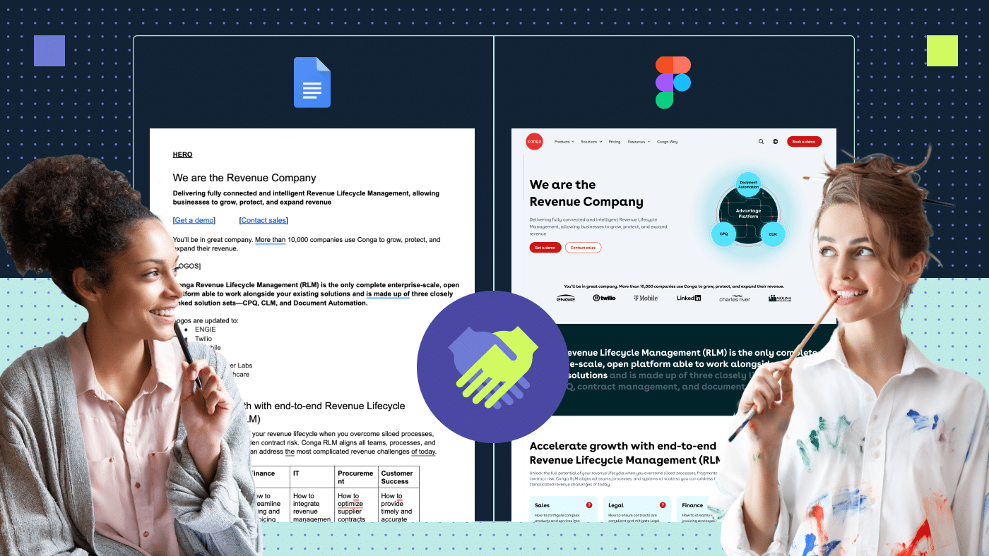
There are still websites that do not provide a thank you page even after a user has filled out the application form. Or, these websites leave an inconspicuous message, as seen in the example below (underlined in red).

Thank you message bad practice.
As a result, the user doesn’t understand whether the action is confirmed or not. If the visitor does not understand something, that’s a red flag for usability (and your hungry sales team).
This situation is similar to when you ask for a sales assistant at a store, and he ignores you. But if you have a full-fledged thank you page, everything becomes clearer. The user sees that their message has been sent with a thank you page.
Increase profits
Increasing profits is the primary goal of any website owner. Upsell and cross-sell look organic on the page where the seller thanks for the purchase. Offer an improved version of the ordered product at an extra charge or show related services. You can also offer free trial signup, webinar or demo.
Increase user loyalty
To win over the user, give them something useful, unique and valuable—for example, a checklist, ebook, promo code or discount.
Attract new subscribers
Offer to subscribe to project news, helpful newsletters or social networks. Make it feel exclusive.
Strengthen the credibility of the company
Companies sometimes share customer reviews and discuss customer success on the thank you page. These sections demonstrate the expertise to the prospective customers.
Reach more prospects
Ask users to forward your offer to friends or repost it on social networks to reach a wider audience. Word-of-mouth works well during promotions and sweepstakes.
Conduct a survey and collect the necessary information
If you need to get feedback from the user, you can create a questionnaire so that after completing the target action, they answer the necessary questions. You can always get them interested by offering a gift or discount on their next purchase after they submit a review.
Critical elements of the thank you page
The more resonating and visually pleasing the thank you page, the better the results will be. It is important to remember that it should not contain unnecessary information distracting from the final goal.
To do this, you must clearly articulate what you want to achieve with this page. Do you want to increase the number of readers on your blog? Sell more products? Or just start talking about your services? Depending on the purpose, the content of the page will also change.
Let’s look at the thank you page examples and analyze the main elements of the thank you page.
Gratitude
Giving thanks is a mandatory factor in thank you pages. Say “thank you” to the user and proceed with further communication. Don’t be boring! The page needs to make a user feel happy and wanted. At the same time, don’t flood the page. Do not add more than four to five lines of text.

Perkbox’s thank you page is fun and optimistic.
Action confirmation
Confirm that the user did everything right and tell them what will happen next. For example, let them know if they will be expecting a phone call during the business day, a verification email, SMS, etc.

Remote year page gives us a clear picture of what to expect after filling out the form.
Call to action
Your website should not have pages that lead the user to a dead end. Think carefully about your sales funnel. Where would I suggest going next? For now, this is the logical next step and complements the asset you just delivered to users. Examples of calls to action include:
- Ask the user to subscribe to the newsletter. It would be beneficial for your company to set up the automatic addition of a user to the contact database when purchasing your product/service.
- Offer to create an account. If the user ends up on the thank you page after making a purchase. It’s time to invite them to register an account on your platform.
- Ask users if they want a sales call or a product demo. We must make every effort to move the user through the sales funnel, so don’t be shy to remind them about your offers in the most suitable places.

On Hubspot’s thank you page, the company reminds users that they can create a free account.
Contact information
If the user has emergency questions, give them ways to communicate with the customer support team.

Drip allows you to call right from the page.
Invite users to follow you on social media
Asking users to follow you on social media is another simple request, and I’m surprised many companies neglect it. Users who have already interacted with your content and company will be more likely to follow you on social media. Adding a few links to your social media profiles allows them to stay up to date with the latest happenings in your company.

Acquisio reminds people to share their posts on social media.
Recommend additional articles and other helpful resources
If the user finds your product attractive, they may also be interested in other offerings. You can add some of the most popular posts or content related to the user’s interested product. Also, if the user has subscribed to your product or service, you can add helpful content such as an FAQ section and other related pages.
Regalix surveyed 285 B2B marketing companies and discovered which content is most useful depending on the purpose of the thank you page:
| Awareness | Consideration | Purchase |
|---|---|---|
|
|
|

Another cool example: Commerceiq.ai are proud of its blog.
Offer similar products when upselling
When upselling, showcase services similar to those purchased by the user or services that would be complimentary to their original purchase. This practice is especially true for SaaS companies. For example, if a customer is currently on the cheapest plan, offer to upgrade to a more expensive one by listing the additional benefits.
You can also make a special offer for a longer subscription timeframe. For example, if a customer pays monthly, offer a discounted rate if they switch to a yearly subscription model.

After a visitor enters their email address for free tools access, Digital Marketer attempts to upsell by taking you to a page asking you to purchase a subscription.
Don’t forget social proof
By posting positive reviews from real people or showcasing testimonials on the thank you page, you reassure the user that they’ve made the right purchase. You can also add reviews about your business or the product. Showcasing positive reviews will motivate users to move further up the funnel and explore your other products.

Axissocial has a page dedicated to clients to remind visitors that they have satisfied clients.
The content of the thank you page depends entirely on the goal. Avoid overly long thank you pages. The ideal option is to fit your content above the fold. At first glance, the user must understand what is being offered.
After introducing the thank you page on the site, you need to set a specific period during which you will monitor and analyze the results. For example, check how many people have subscribed to the newsletter once a week. If users do not take the necessary actions after going to the thank you page, you need to look for the cause of the problem and fix it. Perhaps you need to change the appearance or semantic content.
Thank you page B2B business lifehacks
In addition to the main elements on each thank you page, from the B2B SEO perspective, it’s important to monitor analytics and improve the product.
Extend time spent on your website
How much time a user spends on a site is a metric that affects a site’s rank and search engine results. To increase it, you can offer additional pages for viewing on the thank you page related to the previous actions of the client. For example, include articles that discuss in further detail the purchased product.
Measure success in Google Analytics
The thank you page is shown after your visitor converts. So, generally, it shows whether your marketing efforts are successful or not. You need to decide on a goal to add proper Google Analytics tracking. Measuring analytics will help to measure conversions on many parameters, such as type of page, traffic source, visitor type, device type, region, etc.
Don’t forget to close the page from indexing
From an SEO perspective, indexed thank you pages can ruin your analytics. Let’s say you found out that 70% of your conversions came through organic search, and you want to know which landing page is performing the best. You might be shocked that more than 20% of the conversions were a direct thank you page hit.
Catch up with your clients
Install a retargeting code on your thank you page to push customers if they don’t buy. Research indicates that on average proper retargeting from industry to industry increases online sales from 6.5% to 20%. Research from Spiralytics based on seven industries analysis states that retargeting ads beat all other ads by more than a 10x efficiency rate.
Take a survey
The thank you page can serve as a feedback tool. With the help of the questionnaire, you can find out what problems your customers are worried about and whether you can solve them. At this stage, users are already actively involved in the process, so there is a good chance they will share information with you.

Eric Silu’s head will help to increase sales by adjusting products for buyers’ needs.
Extra tips to get high conversion
Above, we analyzed some of the best thank you pages practices. But, is that enough? I think we should always aim for more and go above and beyond. Let’s look at life hacks that will allow you to be extraordinary and attract an audience’s attention.
Offer a friend referral bonus
The Ogilvy survey discovered that almost 74% of people consider word-of-mouth one of the most important levers of influence on their decision-making. This method helped Dropbox grow by 3900% in 15 months. The point is to thank the user for recommending your product to a friend who will purchase your product.
In the case of Dropbox, the company offered free additional storage to users that referred the service to a friend and purchased a Dropbox subscription. This spawned a viral campaign that led to the explosive popularity of Dropbox.

Get the most out of every step of customer interaction.
Add the human touch
Include a picture or video of the C.E.O. or any team member. Videos are characterized by higher conversion. A video on a landing page increases conversions by up to 80%! Additionally, 64% of users are more likely to buy online after watching a video.

Wistia uses a stylish and sometimes very funny video to add a bit of human touch.
Add promotions or special gifts
Once a user is ready to check out, add a discount, free whitepaper or even raffle prizes. It is the best way to convert users into customers.

Optimizely offers to get the Personalization toolkit and a free webinar.
Games
When the customer has to wait for the next steps, for example, a call or email, incorporate a game. Small games like Google Dinosaur allow you to spend some time having fun, increasing customer loyalty and your brand’s awareness.

Google Dinosaur is a fun game that often appears when the Internet is offline.
Incredible examples and why they are cool
Here are a few examples of some excellent thank you pages.
1. Hubspot
The HubSpot thank you page contains all the needed elements for the page to be successful: a clear name, huge C.T.A., share abilities, links to related content and a sentence about the company. Hubspot uses an additional Schedule A Demo section that pushes leads further down the funnel. Good job!

Watch and learn. Hubspot makes full use of the thank you page.
2. Social Triggers
The thank you page on Social Triggers looks strange in some moments, but it contains many extra cool elements we can use.
- Social proof. Near the Facebook icon, we see the number of people who liked the brand page, as well as photos of these users. In addition, there is a section for comments at the bottom where users can discuss the book.
- Adding a human element. Social Triggers did a great job of building trust and humanizing the brand by using photos of the founder and presenting the text in the form of a fun thank you letter. It is also a plus that they call users by name—this is an example of high personalization.
- Call to action. Finally, the company provides clients with clear instructions on how to proceed next. Social Triggers explains how users can get the marketed offer by offering a link to download it instantly.

A fun example looks odd sometimes but grabs all our attention.
3. Segment
Although the page is quite long, Segment put a lot of effort into approving its credibility.
- “You’re in great company.” – from the first glance, we feel a friendly atmosphere.
- Call to action The company immediately offers a C.T.A. with the Try Segment form at the top of the page. Nice start.
- Social proof. Customer success stories are great social proof. In addition to regular text, they added the ability to watch a video review.
- Additional social proof. The following section includes live Twitter reviews. I love it.
- An additional call to action. The two bottom buttons with Demo and Free Account allow users to choose what is better for customers now. Buttons appear twice on the page, at the top and at the bottom, which helps in increasing their conversion rate.

One of the top converting examples. But I would probably make it smaller.
4. Productive Shop
Let’s look at an example of the thank you page from Productive Shop team.
- “Thanks! We’ll get content cooking” – A creative and cheerful example of gratitude.
- We see a subscription confirmation and a description of what to expect.
- Call to action – We offer our resource center for users to read more cool content.
- In case the user has any troubles or needs to reach our support, we leave the Contact us page link.
- Social media – Adding “follow us” links increases social media subscribers.
- On the right, we suggest reading two popular blog posts to maximize the page’s value.
- Social proof – Client review and links to case studies tell more about the benefits we can give.
- Q&A section answers the most common questions our clients ask us.
- Book a call section – This allows users to pick a date and time for a meeting with our team. We include a real image of our CEO Imran to humanize the company.
So, based on the list above and the many pages I saw, I can say that Productive Shop has created the best thank you page for conversions—and I’m not just saying that because I made it.

Productive Shop thank you page best template.
A summary on Thank You pages
A well-designed thank you page is an example of how a small detail can change a person’s mind. Of course, if the whole site looks bad and doesn’t meet the requirements, then the thank you page will not save it. But for well-thought-out sites, this element can take user interaction to the next level. It is better to offer something useful so that the client becomes a repeat client and recommends your site to friends.
And, of course, you should not stop there and limit yourself to the steps in our article. Develop your website, try different versions, conduct A/B testing and look for the best option for your business.
P.S. – Hope you are still here and that you really got something useful from this page. Don’t forget to share this post online. We wish you high conversions! 🙂
P.P.S – The team asked me to remind you that we can create cool designs for you—including creating and optimizing thank you pages. Want more information? Get in touch.