 SEO Consulting
  SEO audit
  Uncover market and competitor insights
  Increase Sales Qualified Leads (SQL)
  For CMOs
  For demand generation leaders
  For technology startups
 Enterprise SEO
  Web Search Optimization
  Local SEO
  GEO
GEO  PPC Advertising
  CRM Consulting
  Website Design & Branding
  Website Development
  Web Support
  Web pricing
  Content Writing
  Editorial Calendar
 All resources
  Case studies
  Marketing fundamentals
  Worksheets
  Webinars
  Blogs from the field
  Essential SEO checklists
  Case studies
  The team
  Careers

Navigation is a crucial element in any system, be it physical or digital. Navigation acts as your trusty guide, helping you locate those specific points of interest that you’re searching for, whether it’s finding the check-in desk at an airport or that one elusive webpage on a website. Just like how doors, hallways, elevators and numbers in a building all play a vital role in helping you get around, links, menus, calls to action and search options on websites are your virtual helpers. But if the design of a website is too intricate, users may lose their way and abandon ship.
That’s why an intuitive and user-friendly website navigation design is an absolute must for B2B brands. After all, even if your website has top-notch content and features, it’s all for nothing if visitors can’t find them. In other words, navigation is the key to unlocking the door to a successful web design.
In this article, we’re going to take you on an exciting adventure, highlighting the importance and sharing the best practices for website navigation. Plus, we’ll give you some examples of B2B companies that have hit the jackpot with their navigation.

What is website navigation and how do people navigate
A website’s internal link architecture, or navigation, is like a GPS that connects all the pages and helps users find their way around in a snap.
But before we dive into the details, let’s get into the mind of the user. The experts at Nielsen Norman Group’s Theory of Information Foraging have been hard at work studying how users think. Will they scroll or click? When will they decide to leave a page? These are just a few of the questions they’re exploring.
So, what do users really want? Two primary questions drive their decision-making process:
Does the page have the information they need, and can they access it quickly?
Marketers and content creators often make the mistake of cramming too much information on one page in an attempt to describe a product fully. But guess what? Users don’t have time for that. They want relevant information fast, without having to sift through extraneous details.
When users land on a page, they want to get to the point — and fast. Scrolling through every word is just plain inefficient. That’s where navigation comes in. It needs to be logical, simple and convenient so users can find what they need without wasting time and energy.
So, if you want to create an exceptional website experience that keeps users coming back for more, pay attention to your navigation.
The importance of website navigation
Website navigation serves not one, but two essential purposes that can make or break your website’s success.
- First off, it allows users to effortlessly switch between top-level categories, no matter where they are on the website.
- And secondly, it helps those who don’t enter via the homepage understand what your website is all about in a flash.
But if your navigation is subpar, it can lead to a world of trouble. I’m talking about increased bounce rates, less time spent on your site, decreased conversions and, ultimately, revenue losses. So, it’s critical to get your navigation game on point to keep your B2B prospects happy and engaged.
Role of site navigation for user experience
An effective navigation bar in a website is critical in creating a positive user experience that not only helps visitors quickly find the information they need but also drives brand loyalty, conversions, retention and revenue. A report by the Baymard Institute found that the average cart abandonment rate for online retailers is 58.6%, with 30% of those abandonments being the result of a poor user experience.
To avoid abandonment, it’s crucial to create site navigation that’s both straightforward and predictable, while still complementing the website’s unique and exciting content. This means that website creators must consider:
- The list of pages accessible to users
- The users’ current position on the site
- The users’ flow to receive the necessary information
An effective web nav design can minimize the learning curve and increase conversions and revenue, while poor website navigation can lead to a range of issues, from an increased bounce rate to decreased conversions. And that would sink your search engine optimization (SEO) efforts.
Did you know that from 10 to 60% of website visitors will leave a website if they can’t find what they’re looking for within 15 seconds? So, it’s essential to create intuitive, easy-to-navigate websites that deliver an excellent user experience. Don’t let your website be the reason why users quickly abandon their search. Instead, make sure your website navigation is smooth, easy to use and gets users to the content they need in record time.
⭐️Thinking of other ways to enhance your UX? Learn more about 10 design principles all web teams should follow.
Role of site navigation bar for SEO
Effective navigation is a critical component for a website’s success, not only for users but also for search robots. Robots index documents by following the links like stairs. Links help robots understand the content, weight and context of pages, as well as the relationships between them.
Pages included in navigation get more inbound links and traffic and, as a result, rank higher in organic search results. If a page exists in isolation and is not referenced, it will not be indexed. The best website menu structure is logical and easy to understand, with intuitive links between pages in the form of a horizontal or vertical menu and internal linking.
To boost your enterprise SEO results, it’s crucial to prioritize the top navigation bar and left sidebar as these are the first elements of the HTML source code that search engines index. Therefore, they should be appropriately highlighted to lead search engines quickly to the most important pages. The speed of page discovery also affects its organic search rankings.
On the other hand, a website with complex sections, subsections and pages but no clear navigation links between them may not be indexed by search engines. It’s vital to develop an effective website navigation structure that allows search engines to crawl through your site and help improve your search engine rankings.
Role of website nav bar for conversions
Imagine a website that draws visitors in, enthralls them with visually appealing and clickable elements and guides them effortlessly to the information they need. This intuitive process is critical for increasing conversion rates. That’s the power of effective website navigation. When a website is structured with easy-to-navigate menus and logical links, users are more likely to engage and spend more time on the site. This increased engagement leads to lower bounce rates as visitors are more likely to take action and explore the site further.
Research has shown that improving the web nav bar in a website can have a significant impact on page views and time spent on the site. In fact, a study by HubSpot revealed that companies that improve website navigation can see a 50% increase in page views and a 48% increase in time spent on the site. This demonstrates the power of well-designed navigation in increasing conversions and ultimately driving business success. So don’t underestimate the impact of an effective website nav bar — it could be the key to unlocking your website’s full potential.
Best website menu structures for B2B business
The central primary navigation component of the commercial site is the main menu. Positioned prominently right below the header, the main menu is always visible without the need for scrolling.
With its visually appealing design and easy-to-use functionality, a well-designed B2B website navigation menu can help set your business apart from the competition. So why settle for a boring and ineffective navigation system when you can wow your users with an exciting and innovative design? We’ll dive deeper and follow the best B2B website navigation examples to understand how to achieve optimal user experience.
Dropdown menus
Dropdown menus extend from a horizontal menu bar whenever a website visitor hovers over or clicks on one of the main options. While dropdown menus can save space and simplify the layout, overusing or misusing them can cause confusion and usability problems. Multi-level dropdowns, in particular, can make it difficult for users to find what they need and require careful mouse navigation. The good news is, you can improve your website navigation by avoiding multi-level dropdown menus and opting for simpler, more intuitive designs.
Remember the Steering law: the longer and narrower the tunnel, the more time it takes to steer the mouse pointer. There is nothing more frustrating than having to look for a needed link twice because you clicked the wrong thing or accidentally closed a menu. So, keep your dropdown menus short and sweet to improve navigation efficiency and user experience.
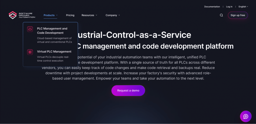
Are you curious about how to effectively use dropdown menus on your website without frustrating your users?
Software Defined Automation’s website is an example of ideal dropdown usage.
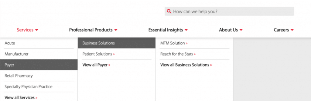
Mega menus
Mega menus provide a two-dimensional dropdown layout, making it easier for users to compare and choose from multiple paths at once. They are the ultimate game-changer, displaying all options at once and eliminating the need to rely on short-term memory. These menus are the perfect solution for when you have a large number of choices or need to reveal lower-level site pages quickly. With multiple levels of information hierarchy, users can navigate more effectively and even correct their mistakes without any hassle.
Research from the Nielsen Norman Group proves that mega menus offer a better user experience than regular dropdown lists. They allow for better grouping, utilize imagery and showcase everything at a glance, making them more engaging and user-friendly.
⭐️Pro tip: Mega menus can be a powerful tool for promoting the most critical pages of your website. Utilize the available space wisely, and showcase various items such as case studies, new resources, open career positions and more.
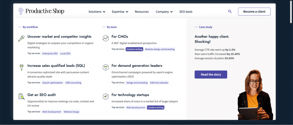
Take a look at Productive Shop’s mega menu as an example of good website navigation. Note how the pages are sorted into clear categories, accompanied by eye-catching icons. Also, see how we strategically place page promotions and case studies in the mega menu.
By providing users with relevant and interesting content right from the start, they’re creating an engaging user experience that’s sure to keep visitors on the site longer and ultimately lead to more conversions. If you’re looking for inspiration on how to design a mega menu that truly stands out, this example is a great place to start.
Vertical menus
Vertical navigation, also known as sidebar navigation, lists website pages in a column that’s either on the left or right side of the page. This type of primary navigation is commonly used to categorize and organize blog posts and articles.
Although less common than horizontal navigation, vertical navigation has several advantages, including:
- Easy scanning. Vertical navigation makes it easy for visitors to scan and locate the information they need since it displays all the available options in a single column.
- Longer page labels. Vertical navigation allows for longer page labels, which means you can convey more information without making the menu look cluttered.
- More primary links. For larger websites with tons of content, vertical navigation provides more space for top-level links, making it easier for users to navigate and find what they’re looking for.
By using vertical navigation, websites can enhance the user experience and make it easier for visitors to find what they’re looking for quickly. It’s a smart design choice that can improve the overall usability of the site.
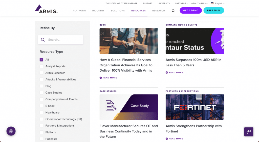
The Armis’s resource center is a great example of a website that uses vertical navigation to provide users with an organized and easy-to-use browsing experience. The website’s Filtration section has numerous items, and thanks to the vertical list, users can scan the options without extra clicks and quickly find what they’re searching for. The grouping of related content into categories is a masterstroke, simplifying the user experience and making navigation more enjoyable.
Hamburger menu
Hamburger navigation buttons are a popular design element used primarily for responsiveness on mobile and small screens, as they save space while providing easy access to expand content offerings. The button typically consists of a three-line icon. When clicked, a drop-down or pop-out menu appears, displaying linked content labels that are usually listed horizontally.
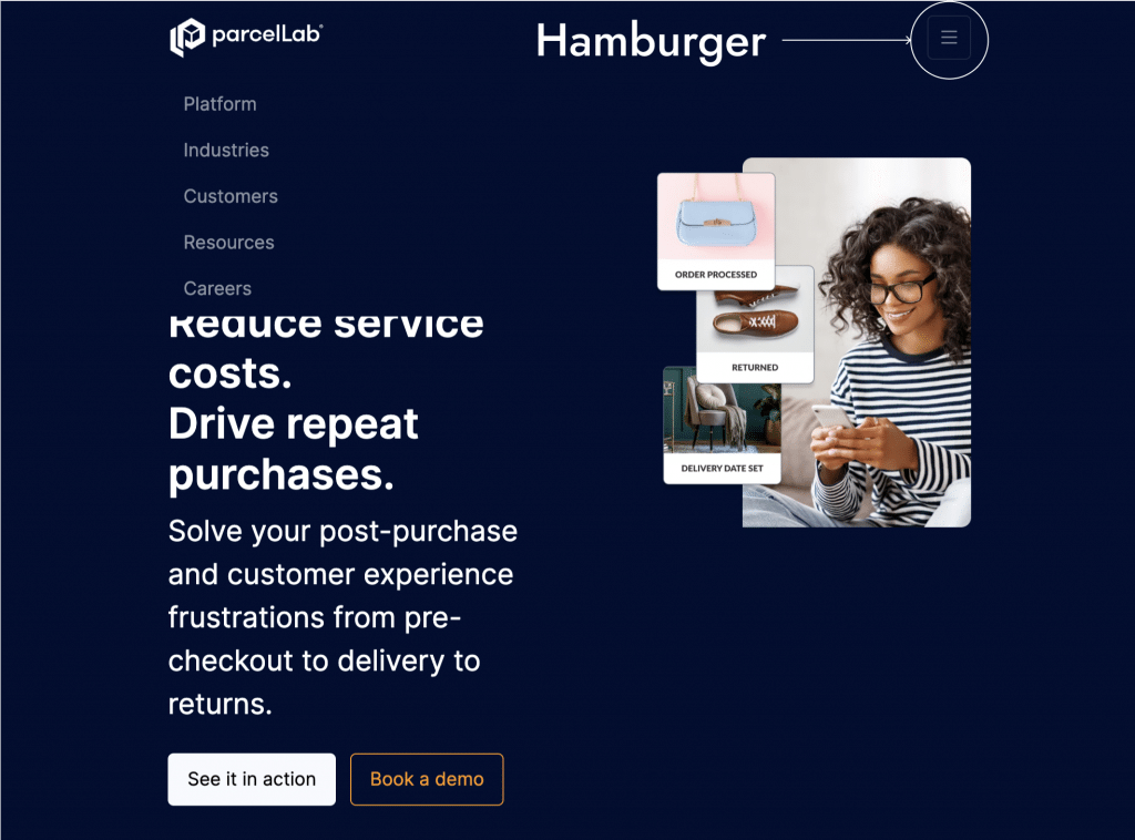
As an example, parcelLab, seamlessly integrates the hamburger menu on mobile and tablet screens, replacing the mega navigation typically used on desktop. This simple design element provides a sleek and modern look while maintaining website functionality on any screen size.
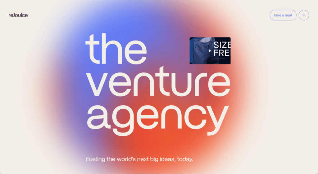
Now the hamburger is often found on the desktop as well. With more space for creative design on the main screen, it’s a bold move for any website. However, using a hamburger menu on desktops can have its drawbacks. Not everyone may understand its usage or even be able to find it easily. Moreover, it can cut the discoverability of the navigation in half.
The Rejouice Venture Agency dared to take on the challenge of using a burger menu instead of the traditional header menu on their website. While this site design choice may look modern and clean, it’s important to consider whether it’s appropriate for the target audience. If the website’s primary audience is not creative youth, using a burger menu could actually harm conversions and user engagement.
Footer menu
Most websites use a combination of a horizontal navigation bar at the top and a footer menu at the bottom of the page. By strategically placing your website’s most important information in two distinct locations, you increase the chances of visitors discovering what they’re looking for.
Visitors who take the time to scroll down to the bottom of the page are often the most interested in your site. That’s why it’s crucial to ensure that the content in the footer — the secondary navigation — is valuable and offers them a reason to stay and explore further.
The key to effective footer navigation is to organize your pages into logical groups, just like Dotmatics has done. Additionally, it’s essential to include links to social media profiles and any calls to action or on-page forms that allow users to request a demo, if applicable. And let’s not forget about compliance with legal requirements. Make sure that your footer includes links to important pages like your privacy policy, terms and conditions and sitemap.

⭐️Want to learn more about designing a website navigation? Read this introduction to designing a website on Figma.
Secondary navigation elements that can improve your UX design menu bar
Search bar
Many websites have a lot of content, which can make it difficult for users to find specific information or pages. Implementing a search function can be a game-changer for your website. By making it easy for users to search for specific information, you’ll keep them engaged and increase conversions.
From an SEO perspective, website search data can provide valuable insights into user behavior, preferences and needs. By analyzing search queries, you can optimize your copy for SEO and cater to your audience like never before.
However, formulating a good search query requires more mental effort and a higher interaction cost than recognizing and clicking on a navigation link. If users don’t have a clear idea of what they’re looking for and are not familiar with the website’s content, the search is not effective.
Additionally, users often have high expectations for site search, which can be challenging for the search functionality to meet. In many cases, site search performs worse than users expect. I recommend not having a search bar at all than offering one that does not work properly. An ineffective search tool can frustrate users and lead to a negative user experience, potentially driving them away from the website or platform.
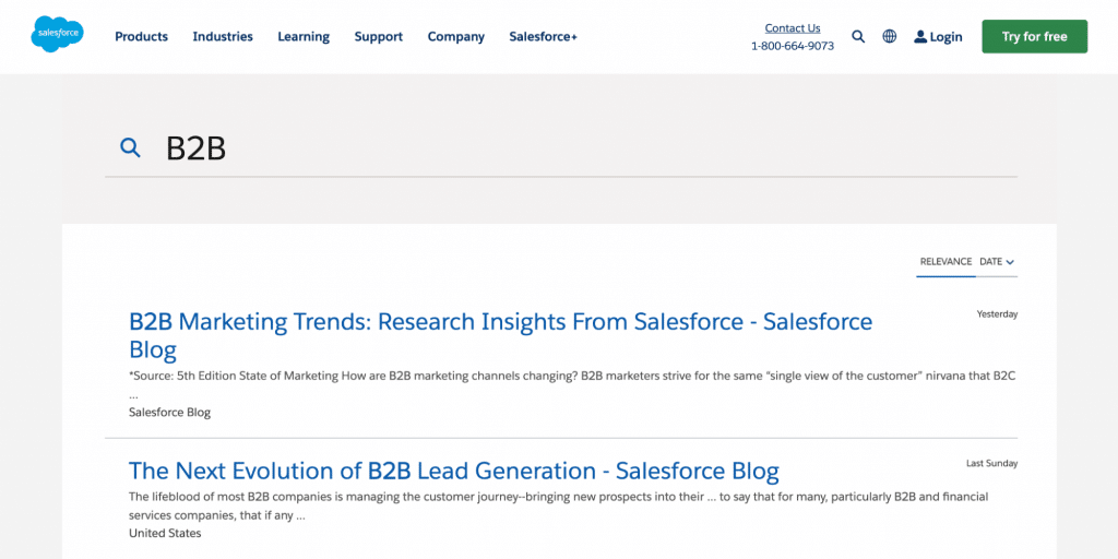
The search section on the Salesforce’s website is located in a separate panel near the main navigation. Once a keyword is entered, the search feature offers a sophisticated and easy-to-use list of relevant pages that match search criteria. It’s like having a personal assistant to help you find exactly what you need on the website. So, if you want to keep your users engaged and provide them with the best possible experience, reach out to our team to implement a search function on your website.
Icons panel
The icons/tools panel is a critical component of UX design menu bar. These elements can enhance the user experience by making it easier for users to navigate the website and access its most commonly used features. From search to Log In/Sign Up options, language switcher and help, the tools panel can contain a range of useful features to simplify your users’ experience.
The tools panel should be easy to use, visually appealing and in a consistent location. It’s essential to prioritize the most commonly used features to avoid clutter and provide a seamless user experience.
On many websites, you may have noticed that a lot of the tools have migrated to the top-right corner or even to the top upper bar. By placing these commonly used tools in a consistent location, web designers can make it easier for users to find and use them, which ultimately improves the user experience on the website.
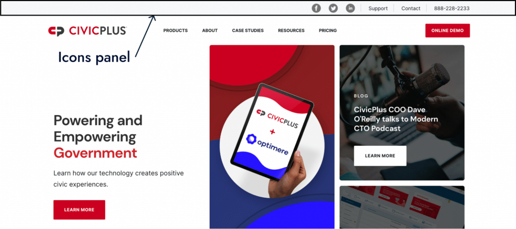
CivicPlus is an example of good navigation design in websites. Take a look at the icons/tools panel in action. With a dedicated top bar for social media, support and contact options, users can focus on accessing information quickly without distraction or confusion. It’s the perfect approach for avoiding overwhelming website navigation and keeping users engaged and satisfied.
Logo
The logo placement in website design is not just a branding decision but a crucial aspect of the user experience. By making the logo clickable and redirecting users to the Home page, designers can provide users with a familiar and intuitive way to return to the main page.
Including the logo in the main navigation can also save space on the page, as it eliminates the need for a separate “Home” button. This design decision is particularly helpful on mobile devices, where screen space is limited. In fact, users can experience inconvenience when the logo in the header is not clickable.
Placing the logo in the main navigation also can help reinforce brand identity. The logo must be visible, large enough to stand out, but not so big to overwhelm the other elements on the page. A left-aligned logo is the most common placement and deviating from this can confuse users.
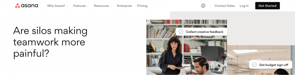
Asana, for example, has good website navigation design. The logo is designed to stand out from the menu tabs by size, color and spacing. This intentional design choice helps the logo to catch the user’s attention, making it easier to find and recognize. Additionally clicking on the Asana logo typically directs the user back to the main page.
🌟Your logo makes your brand recognizable. See how you can reinforce your identity with a company brand book.
Breadcrumbs
Derived from the famous fairy tale, breadcrumbs guide users on their journey through your website, just like Hansel and Gretel found their way home. This element provides essential information about the user’s current location within the site hierarchy and allows them to navigate back to the main page and move up the site’s levels.
As one of the best practices for web navigation, breadcrumbs should be visible on every page except for the main page, usually at the top left of the screen. The font for the clickable links should not be too large or expressive, so they don’t overpower the primary content.
Breadcrumbs are a useful secondary form of navigation, especially for users who enter a site through an external link and do not start from the main page. However, they are not necessary for sites with a flat hierarchy that is only one or two levels deep, or for sites with a linear structure. In these cases, it is sufficient to clearly indicate the top-level section or category in the top navigation where the page belongs to.
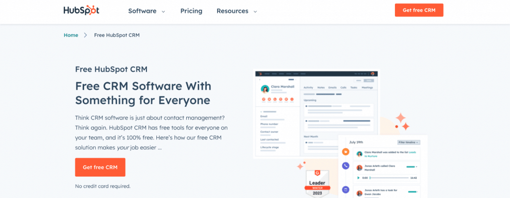
As you can see, the breadcrumbs on HubSpot website show the user’s current location within the website hierarchy, starting from the Home page and leading down to the specific page they’re on. This makes it easy for users to understand where they are on the website and how to navigate to other pages if they need to.
Internal links
Unlike external links, which direct users to a different site, internal links lead to pages on the same site. These links are incredibly valuable as they pass weight and signal to Google which pages on your site are most important, boosting their search ranking. The more internal links you have to a particular article, the more significant and valuable Google deems it. You can use internal linking to promote new pages on your site by adding links to them on other pages.
In addition to their SEO benefits, internal links serve as a vital navigation tool that simplifies your site structure and enhances user experience. A clean and straightforward structure not only makes it easier for users to navigate but also allows search engines to process and index more pages in a single visit.
Sitemap
A sitemap is like a roadmap, guiding users and robots to all the significant pages of a website in no time. Think of it as a table of contents for a thrilling adventure. As a website navigation design best practice, a sitemap is an essential website navigation system component, as without it, visitors may become disoriented and leave the site in frustration.Did you know that a sitemap helps search robots crawl your websites’ content? By excluding unnecessary sections and highlighting new pages, a sitemap can speed up content indexing and ensure that all your pages get the attention they deserve.
If you’re wondering whether your website needs a sitemap, here are some telltale signs to look out for:
- A lot of website pages. A sitemap can make navigation a breeze for both humans and robots.
- A few internal and external links. It can be challenging for search crawlers to discover the website if there are almost no other resources linking to the site and its pages are poorly interconnected.
- A lot of multimedia content. A sitemap can help search engines extract relevant data and display your media content, such as images and videos, in search results.
- Frequently adding and updating content. A sitemap can help prioritize the indexing of new or updated pages.
- The website was created recently. Having a sitemap can help speed up the indexing of your pages and get your site ranking in search results in no time.
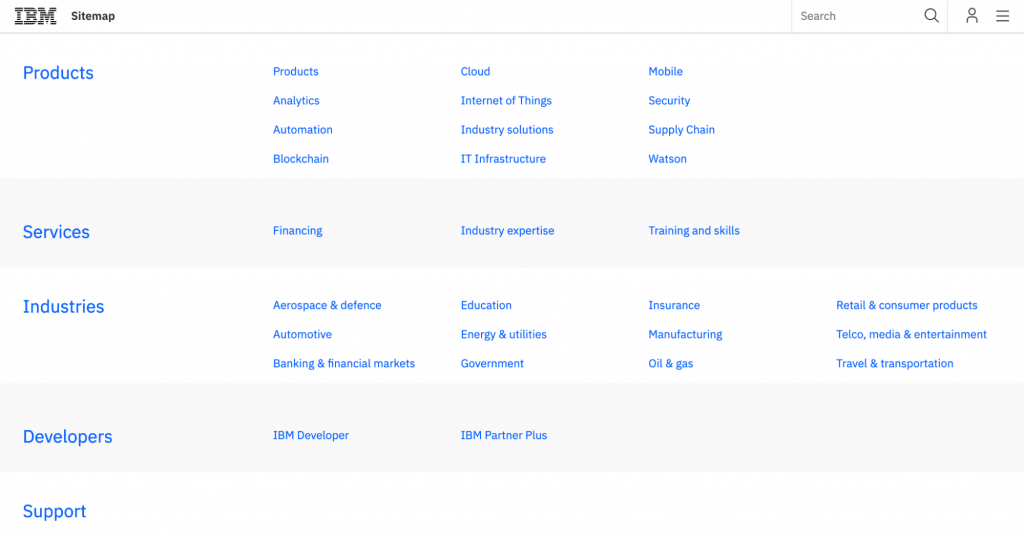
IBM‘s sitemap page provides a comprehensive overview of the company’s range of products, services and solutions. The page is well-organized and easy to navigate, allowing visitors and crawlers to quickly find the information they need.
Top 9 UX tips for creating best web navigation
Congratulations to all the dedicated readers who made it to the end of my long reads! I’ve included a bonus section packed with even more valuable insights and tips. Whether you’re looking to revamp an existing site or build a new one from scratch, these are my top nine best practices for website navigation that are sure to take you to the next level.
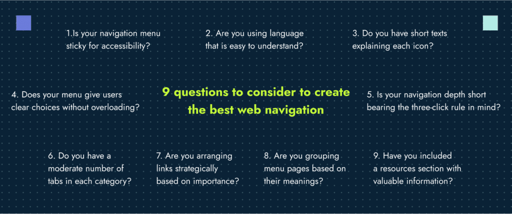
1. Stick your navigation menu
A good way to give the user access to navigation from any place of the page is to stick it to the top of the page. The persistent navigation technique keeps important navigation elements visible and accessible to users as they move through a website, making it easier and more efficient for them to find what they’re looking for.
By keeping important navigation elements fixed in place as users navigate through your site, you can not only improve the user experience but also boost your SEO ranking potential. By placing a “Book a demo” call to action in a sticky header, you also can increase conversions and drive more sales. And for those content-heavy pages, sticky menus are an absolute game-changer.
Just take a look at the heatmap comparison of a site in the hospitality industry before and after implementing sticky navigation — users are scrolling further down the page, engaged and interacting with content.
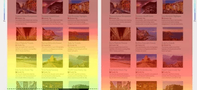
Website scrolling map before and after implementing sticky navigation
But, if your content is rich and interactive, with charts to examine and articles to read, you’ll want to make the most of visible space of the window. That’s where the option to hide navigation on scroll down and show it again on scroll up comes in handy. This approach ensures that users can access the navigation bar quickly and easily, without interrupting their flow. And, for those times when users want to jump back to the top hero screen, why not add a button-icon “to the top.”
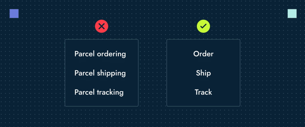
2. Use plain language
Let’s talk about item names. The goal is to make them easy to understand. Forget about trying to be trendy or stand out with slogans — users need to know where they’re going and what happens when they click on any menu item.
Avoid made-up words or quirky phrases, stick to plain language that’s easy to search for. As users navigate your site, make sure each page clearly shows them they’re on the right track. Plain language also works best for search engine visibility if the search provides a literal match between the words in the user’s mind and the words on your site. Also, avoid sloppy copy in your menu items so that you don’t confuse users and search engines.
Use short, clear titles —one word is ideal, but using 2-3 words is okay if you need it. Keep it visual and easy to read. It’s a design faux pas when the menu item name breaks into two or three lines. And remember, when it comes to mega menus, less is more, the base form of verbs (“shop”) is usually better than gerunds (“shopping”). Also, avoid using the same words to the start names of items, it will make scanning difficult.
3. Add text to icons
Let’s talk about adding some graphic elements to your menu. Icons are cool, I highly recommend using them as they help to scan the navigation menu faster. But not everyone can understand what they mean. Plus, different websites use icons in different ways, which can be confusing. So make sure all the icons are clear and have text labels to help users understand what they represent. Don’t rely on hover-text explanations either, because they won’t work on mobile or touch screens. Be accessible and use words, or combine words and icons to make sure everyone can understand.
Did you know that researchers have found that labeling the hamburger menu with “Menu” and adding a border around it to make it look more like a button makes it more likely to be clicked? People are more likely to click on things they understand. So don’t use only a person icon for login and only a flag for changing language. That would probably decrease the click rate of the button.
Also, before making live changes to your navigation menu, conduct wireframing to ensure there is space allocation and functionalities work as intended.
4. Don’t overload users
When it comes to menu options, less is definitely more. Fewer options mean less to scan, less to understand, and less to get wrong. The key is to focus on giving users clear choices and directing them to their desired destination as quickly as possible.
Avoid cramming all your pages and sections into the menu, you have footer and sitemap for that. Doing so will only overload the menu and weigh it down, making it useless for navigation. Users may suffer from cognitive overload when faced with too many options and miss important links due to secondary content noise. To avoid this, think of how useful is every menu item you plan to add to the mega menu.
5. Leverage the navigation depth or three-click rule
You may have heard of the infamous three-click rule, which suggests that if users can’t find what they’re looking for in three clicks, they’ll quickly exit your site. But is this rule actually helpful or could it hurt your website’s conversions?
While easy access to key information is crucial, blindly following the 3-click rule can lead to overly complicated navigation. In fact, in some cases, like a resource center, a detailed and well-organized navigation system may actually be more helpful in quickly finding the content you need, regardless of the number of clicks. However, the 3-click rule can work well in certain situations, like during the checkout process or when booking a demo.
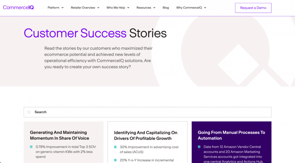
If you do decide to follow the 3-click rule, make sure that each click leads to a page with minimal loading time. Three clicks with long loading times can be more frustrating for users than five clicks that load quickly. Additionally, consider creating clean landing archive pages at key points along the way. These pages offer groups of links, often with images or other elements, to guide users to their desired destination. Good example of archive page is the case studies page on CommerceIQ website. This page provides thumbnails and links to separated case studies landing pages.
6. Keep the number of tabs moderate
The fundamental principle is that the number of categories on your site should be based on what makes it easy for people to find and access information. So forget about limiting yourself to only four categories. However, there is a catch: Hick’s Law (also known as the Hick-Hyman Law) suggests that the more choices you present to your users, the longer it takes them to make a decision.
There’s a solution. Cognitive psychologist George Miller found that the average person can hold only seven — plus or minus two — items in their short-term memory. So, when designing your menu, stick to that number. You can provide a limited number of top-level navigation elements and offer a submenu for each element if you’re dealing with a complex website.
So, let your creativity flow when it comes to designing your website categories. Just keep in mind that too many options can be overwhelming for users.
7. Order your links strategically
But there’s more to it than just the number of elements in your menu. Did you know that the priority of the most commonly used menu items can make a huge difference in how people use your website? The serial-position effect tells us that people tend to remember the first and last items in a series the best. This means that the elements at the beginning and end of your navigation menu will be the most effective, as the brain remembers them more easily than the middle elements.
So, when designing your navigation menu, make sure to prioritize the most commonly used menu items and place them at the beginning or end of the list. This way, they will be much more visible and memorable to your users.
8. Group web pages
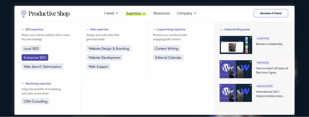
I’ve got some awesome advice for you based on the short-term memory theory we just discussed. Take a look at your credit card. The card number is sixteen digits long and would be hard to read if they didn’t divide it into four blocks of four digits. By grouping numbers, it is easier for our brain to process them. We should use the same approach with our mega menus.
I highly recommend dividing all the pages on your website into groups based on their meaning, with each group containing no more than seven elements. This will help to reduce cognitive overload and allow your users to find the pages they need much more quickly. Let me show you an example from Productive Shops’ website — if all the pages were simply listed, users might get lost and spend ages trying to find the right category.
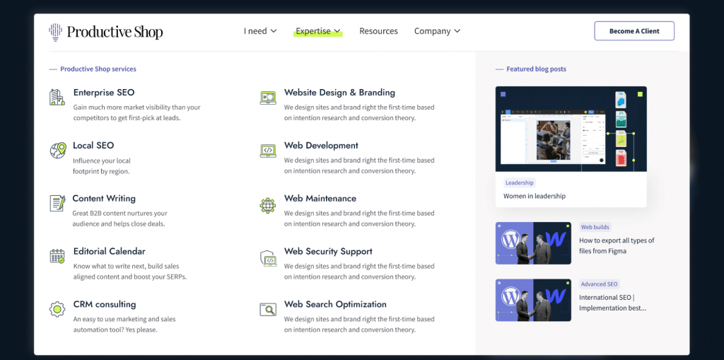
But by implementing clear and understandable grouping, the layout becomes much more intuitive and finding the right page is a breeze!
I’ve got some seriously cool tips to help you create killer groups on your website:
- Aim for a medium level of granularity. Don’t overwhelm your users with massive groups that take forever to sift through, but don’t make them so small that your mega menu ends up with a ton of groups that people struggle to understand.
- Make sure you’re using concise and descriptive labels for each group. Remember, you want to make it as easy as possible for your users to scan through and find what they’re looking for, so start with the most important words and avoid any confusing jargon or made-up terms.
- Don’t forget to order your groups. You can do this based on an inherent order among your features, like a workflow, or you can prioritize by putting the most important or frequently used group in the top-left corner (assuming you’re using a left-to-right language like English).
9. Add a resources section
Want to know more about improving your website’s engagement? It’s all about adding a “Useful Resources” section to your main navigation. This section is where you can showcase pages within your website that visitors will find incredibly valuable. From blog posts and FAQs to tutorials and industry-specific content, the sky’s the limit.
But why is it so important?
- Easy access. Visitors can quickly and easily find relevant content or resources without having to navigate through multiple pages or perform a search.
- Better SEO. When search engines crawl a website and find high-quality links in the navigation, it signals to them that the link is a valuable resource and can improve its ranking in search results.
- Increased conversions. A Useful Resources section can also help to increase conversions, such as sales or sign-ups. By providing visitors with helpful content and resources, they are more likely to engage with the website and take action, such as making a purchase or filling out a form.
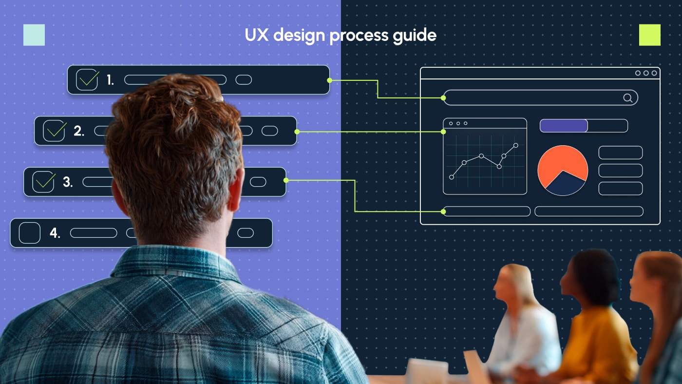
☝️ Learn about UX design process.
Upgrade your site’s navigation design with Productive Shop
Optimizing your website navigation is absolutely crucial. By creating an intuitive and user-friendly experience for your visitors, you can attract more people to your site and keep them engaged for longer. And that’s not all — this can also lead to higher conversion rates, happier customers and a stronger brand reputation.
So if you want to take your business to the next level, you’ve got to focus on making your website a joy to navigate. The benefits are absolutely worth it. Our team will help you optimize your navigation and design to create a user-friendly and efficient online experience.
Reach out to us to enhance your website navigation experience.