Imagine building a house. There is a process that you need to follow. You begin by setting up the base, then the beams and structure and finally the finishing touches like paint, furniture etc.
When it comes to website design, it’s the same thing: you need to lay out the foundation and go from there. At each stage, you add more elements —structure, sections, layout, icons, typography, colors etc — until you have the final product.
The level of detail in each of those stages – or wireframes – is what we refer to as design fidelity.
So what are wireframes in web design?
Think of wireframes as the skeletal outline of your website, giving you visual cues of what it will look like. Each stage varies from the other, adding functionality, user interface (UI) design and user experience (UX) in the process.
The 3 types of wireframes
Different levels of fidelity in design determine the 3 types of wireframes for websites. Here they are:
1. Low-fidelity design
This wireframe type is the early prototype of your website or app, once you have decided upon the goal of your project.
Low-fidelity wireframes are usually sketches on a piece of paper or sticky note. It’s a quick scribble that helps you and the team to brainstorm concepts, ideas and features to include in the project.

2. Medium-fidelity design
This stage is where your website/app will look like a blueprint.
Mid-fidelity wireframes are usually shades of grey showing the placement of elements like logos, fonts and buttons. It can also include placeholders for images, future content and copy. This stage shows the client potentially what the website might look like without including colors or images that may affect the decision-making.
Once the structure of the project has been decided, it’s time to take it off the drawing board and onto the computer screen.

A mid-fidelity wireframe looks like a blueprint with placeholders for elements that will be added to the design later on.
3. High-fidelity design
These wireframes are a representation of what the final product looks like. This stage involves the usage of colors and design elements such as graphics or vectors, images, logos, fonts and branding. The lorem ipsum text is replaced by the approved copy.

Benefits of wireframes in design
Here are the top 5 wireframe benefits:
1. Cost-efficient
Wireframing provides a skeletal version of the design of a new website. By using wireframes, you can avoid the costly and time-consuming process of redesigning later in the project.
2. Defined features before the development stage
Creating wireframes helps all concerned stakeholders determine what features can be included or excluded before the website goes into development. It can also set client expectations for features they may want to include at this stage.
3. Responsive design on different devices
Creating a wireframe can help envision how the sections will look on different devices. This approach can save time when designing the desktop and mobile versions.
4. Improved user experience
An engaging web design helps improve the user experience. Based on feedback from tests conducted on potential users, you can quickly adjust the design. This is less time-consuming because wireframes are the bare bones of the website (for example, they lack design elements or color).
5. Better understanding of content placement
As the wireframe progresses, the designer can also adjust the layout based on the content that will be present on the website. Although content can be adjusted to fit the design, the layout gives the copywriter a good idea of how to fit it within a particular section.
Cons of web design wireframes
Even though the pros of wireframes outweigh the cons, you should take into account these challenges:
- Lack of realism: Wireframes are skeleton versions of the final product. As a result, they tend not to look like the real product, often confusing those not involved in the UX design process. Wireframes also lack the wow factor that tends to swing a client in the right direction.
- UX issues: Due to the lack of visual representation, wireframes can look confusing to potential users when a UX designer is conducting tests. As a result, the user might be slow to navigate through the website and the desired outcome may be less favorable, ultimately affecting the user experience.
- Internal use only: Low-fidelity or mid-fidelity wireframes might not work with clients, who might feel confused by the lack of colors or elements. Therefore, these type of wireframes are not a very suitable option to present to potential clients or investors.
- Lacks interactivity: A wireframe is essentially an early prototype that lacks interactivity. Without interactivity, the user/client usually cannot understand how to navigate through the website.
When assessing the importance of building a wireframe for your web project, keep in mind that this step can help to save the entire team time and money. Wireframes help to stop an unfinished, feature-lacking or bad UX project from seeing the light of day.
Using Figma to create medium and high-fidelity wireframes
Although Figma is not the only tool out there for wireframing and prototyping, it’s ideal for creating mid and high-fidelity wireframes. Its collaborative features make it easy to collaborate with other designers and stakeholders involved in the project.
Read the blog post on how to design a website on Figma.
Using tools provided in Figma, you can create a frame and set the columns that will be used in the design for the desktop version and easily translate that for other devices. Additionally, auto layout in Figma will help you create and edit components easily. Project members can comment on features they liked or disliked.
With a high-fidelity design, you can use the prototype feature to show the client how the project will look live. This visual cue plays a major role in pushing the design forward to the development stage.
Low, medium and high-fidelity wireframing on Productive Shop website: How we did it
See the images below for a peek into how we combined low, medium and high-fidelity wireframing when designing our website.
We used low-fidelity wireframing for the mega menu

The first image shows the low-fidelity wireframe we used for our mega menu, while the second image shows the finalized mega menu.
We used mid-fidelity wireframing for our Resource Library

The first image shows our resource center wireframe and the final output
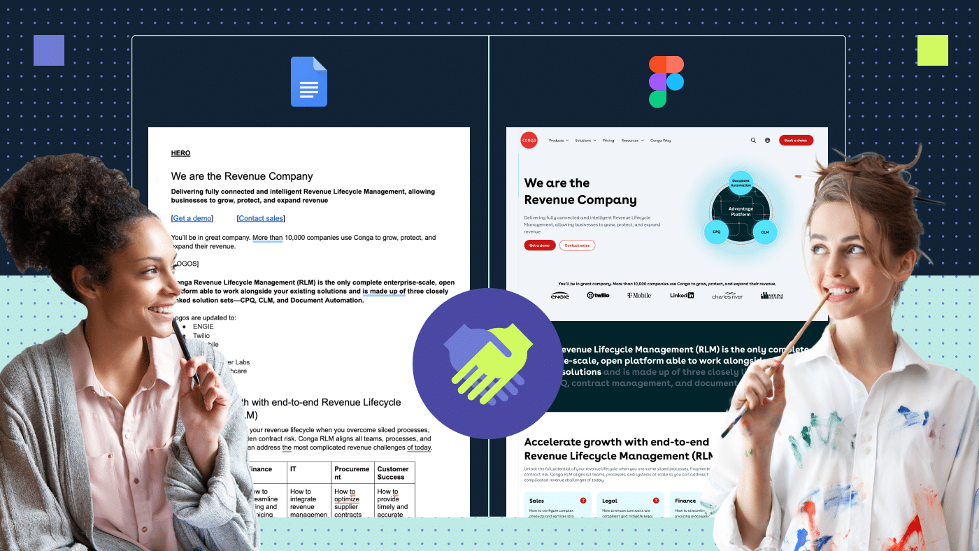
We used mid-fidelity wireframing for our Demand generation page

The first image shows our mid-fidelity wireframe and high-fidelity mockup for our Demand Generation Page. The second image shows the final design.
This project was the first major redesign for Productive Shop’s branding since its inception. Here are some of our processes and key takeaways:
1. Brainstorming: We drew multiple sketches and tried out different ideas. We considered our client base, what kind of a company we wanted to come across as and how to include it in the design.
2. Wireframing: Once we had our concept nailed down, we moved on to laying out the structure. Multiple iterations later, we had what you see above. What helped the most was creating rough low-fidelity designs until we perfected it.
3. The bigger picture: The redesign had to be applied across the entire website, so we had to consider the flow and how each element from the homepage would tie into other pages. These elements included icons, colors, images and various graphics. When creating a website, consistency is a key design principle.
4. Content: One of the things that helped early on was that we already had content for our website. This helped put the design into perspective. In addition, we could see if the content fit the layout and adjust it accordingly.
5. Color usage: While initial wireframes are devoid of color, once we had the structure laid out, we added color to key areas that needed to be highlighted to our target audience.
6. Functionality over form: The design should always be pretty and aesthetically pleasing. However, if its functionality is broken, there is not much the design can do to change the users’ minds. We focused on ensuring usability first.
7. Emotional detachment: As designers, we always love everything we create and defend it furiously, but the goal of these wireframes was to ensure ideation and push out the final polished product. After all, there are always multiple iterations of a final design.

A final design file is never the final design file.
8. Annotations and comments: Figma’s feature that lets you easily add comments on your artboard helped gain valuable feedback without having to always schedule calls. We would also just add a quick sticky note next to the design to explain the idea. This practice helped save a great deal of time.

Design and Development team collaboration on our Web design and branding page
When to use each type of wireframe
Here’s when you should use each type of wireframe:
Low-fidelity wireframes
You should use low-fidelity wireframes only for internal purposes, so you can brainstorm with other designers, project managers and stakeholders of the project.
Low-fidelity wireframes are a sketch that will not woo any client or potential investor.
Mid-fidelity wireframes
You should use mid-fidelity wireframes when you have established what this project is going to solve and what features it will include. You can also use this type of wireframing for user testing, although the test needs to be focused on fixing features that the user finds problematic. Finally, you can use mid-fidelity wireframes to showcase what the structure will look like to the client.
This stage is still too early of a prototype to show potential clients or investors.
High-fidelity wireframes
This is a final proof of concept, a mockup, which uses all the colors and other elements. At this point, copywriters will also jump into the process and actively work with you to package the design well.
A high-fidelity wireframe/mockup/prototype can be a showcase for higher-ups and clients. At this stage, you will also be able to test out how the user feels about the colors and imagery used.
You can also create a fully functional prototype with visual effects to showcase what the actual website or page might look like.
From a UX perspective, it is a great way to gain feedback from users and record their journey navigating the website and fix any potential issues before the page goes into the development stage.
Final thoughts on the importance of fidelity in web design
Understanding the value of fidelity in design is crucial to the end goal of your web project. Make sure to pick the right level of wireframe depending on factors such as resources, time and expectations.
As your project evolves, there will be a mix and match of all three levels of wireframe fidelity, depending on how open-ended or closed the project is. Wireframing, at the end of the day, is the base of your design.
If you’re stuck on your website design and need our help, give us a shout.
Frequently Asked Questions
What does fidelity mean in design?
Design fidelity means the level of detail and functionality involved in a wireframe or a prototype. There are three levels: low-fidelity, mid-fidelity and high-fidelity. Each serves a different purpose and is used multiple times in the design project.
What are the 3 types of high-fidelity prototypes?
The 3 types of high-fidelity prototypes are:
- Paper prototypes, which allow you to create a digital representation of the product without using digital software. They are a great way to explore and ideate on different concepts.
- Clickable mockups, which have some interactivity, such as buttons and links that lead users to the next page of the product. They make use of presentation software like Invision.
- Hi-fidelity prototypes, which are full-fledged prototypes that have UI animation, visual button clicks and interactive content present.
What is a wireframe used for?
Wireframing is used to lay out the content and functionality of a website on an artboard in a design software or a paper. It is used in an early stage of a project to determine the basic structure before it goes to the development stage.
What are the three key purposes of wireframes?
Wireframes have the following purpose:
- Define sections and features on the website
- Provide an easy way to iterate ideas
- Improve collaboration and efficiency
Is wireframing UX or UI?
Wireframing is one of the crucial steps for both user interface (UI) and user experience(UX).
- In UI, the designer creates the base structure, including layouts and placeholders for design elements such as images, buttons and copy.
- In UX, a designer uses a low or mid-fidelity wireframe to answer crucial questions such as what will be shown in the user interface, how users will understand and interact with the elements (buttons, links, imagery) and how the webpage will work for the user who lands on the webpage.