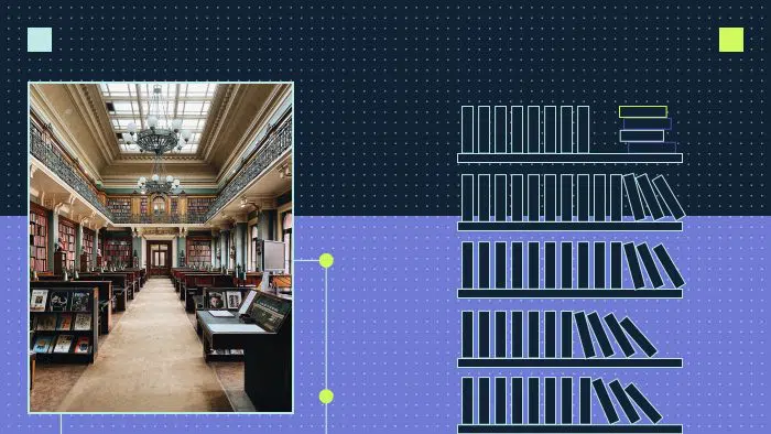
Building a resource center for your B2B website is a great way to educate your target audience, inform the buyer journey and instill trust and thought leadership. When you give prospects and clients helpful content, they will keep coming back for more.
In order to implement this strategy effectively, you need to create a robust content hub with search engine optimization (SEO) in mind. Keep reading to learn how to do it.
What is a resource center on a website?
A resource center is a section of your website where your prospects and clients can learn more about your industry and what you have to offer — your products or services.
A website resource center is basically a marketing gateway to all the content you’re presenting to your audience, from blog posts and case studies to events and webinars.
Resource types
A resource center can consist of numerous categories. Here are the most common resource types in B2B websites:
White papers and ebooks
White papers and ebooks are educational pieces of content breaking down a complex topic for the reader.
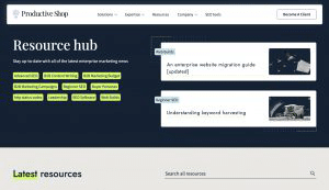
Case studies
A case study is an in-depth analysis of how a specific product or service has been used. For example, companies use case studies to show how their clients achieved results with their solutions.
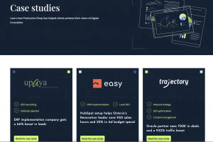
Productive Shop’s case study page.
Solution brief and guides
Solution briefs and guides are marketing collateral developed to communicate how a specific solution or product addresses the specific challenges within an industry segment.
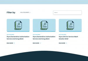
Styra’s solution brief page.
Webinars and events
Events are announcements about conferences, discussions etc that are about to occur. Details are provided on how one can attend this event, usually by signing up. Webinars are online events, usually presentations or discussions. Webinars can be live or on-demand.
Blog
A blog is a website or a section of a website that is regularly updated with new entries on a topic, usually from the author’s point of view.
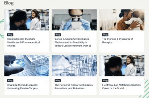
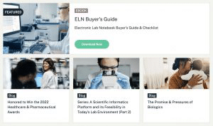
Blog section on Dotmatics website.
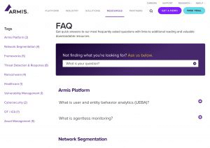
FAQs
Frequently asked questions (FAQs) are generally a list of commonly asked questions that provide answers to the users.
Gated vs ungated content: What is the best approach?
An efficient resource center also provides a good balance of ungated content and gated content.
- Ungated content enables the user to easily download the content or view it without having to fill in forms.
- Gated content requires an extra step as the user has to fill out a form to view the content you are offering.
A gated page will reduce the number of people who will read or share the content. However, it brings key benefits:
- Gated pages are also a great way to gather information about your users so that you can create better content — tailored to their needs — in the future.
- Gated pages also help to generate more leads, because you obtain contact information from prospects.
Keep in mind that the content you provide here needs to be premium — information that the user might not be able to find elsewhere on the web. When the content is interesting, users might take the extra step to fill in the form to download the content.
Why your website should have a content resource center
A resource center keeps all your content organized. If your content is scattered, your prospects will have to hunt for it. Top benefits include:
- Enhanced user experience (UX). Resource centers make it easy to find your content. For example, you can add your webinars or blogs all in one place, so that the users can filter through and easily find the information they are looking for.
- Indication of thought leadership. Offering informed opinion on a topic — through expertise, insights and experience — is an effective strategy to establish authority and influence the industry.
- Content discovery. Your users might be reading a blog and then come across your related topics section and may click on something that interests them. This is great from an SEO standpoint, too, because it means that users will spend more time on your website.
- Improved SEO results. Resource centers enable better SEO by improving conversion rate, helping with community building and increasing lead generation.
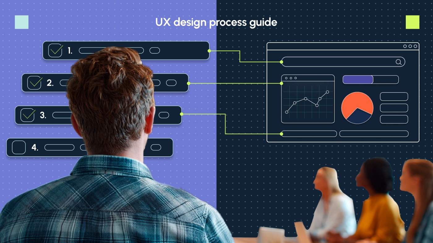
The UI/UX of resource pages: How do you design a content hub?
We’ve outlined why you need a resource center. Next, we will discuss how you create the user interface for an enhanced user experience. All the critical sections and elements you need to have on these pages for an effective website design are listed below:
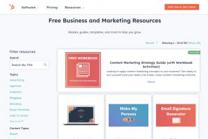
Hero section
You need to start off with an intuitive hero section for the resource center. Adding a title along with your featured posts is a good way to attract a mix of users seeking articles. These cards should feature different resource categories; for example, they could have a mix of blogs and webinars. Each card should have a button linking to the page and a tag that will come in handy when filtering these categories.
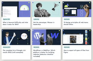
What our resource center looks like.
Filter section
Next, you need to create a filter section, which will filter in categories in your resource center. Here you should add all your content in their respective category: blogs, ebooks, webinars etc. These options are usually shown in a drop-down menu with check marks for the user to select them. Add additional filters as you may require. Don’t forget to add a search functionality next to the drop-down so that users can also choose to search for something by typing it out.
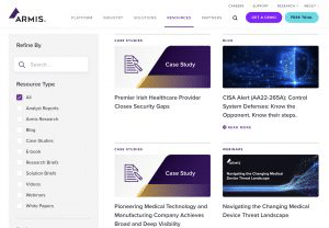
A vertical filter section on Armis Resource Center.
Tags
Here is where the tags you added to the cards come into play. These tags will help the user understand which category the card belongs to and better navigate through the massive grid of content you have on your page.
Thumbnail
Add relevant images to these cards so that the user is able to correlate the text to the image. Adding information to the thumbnail — for example, event name — is a good practice as it visually shows the user what the content is about.
Subscription section
At the end of the page, you can add a prefooter to encourage your users to subscribe to newsletters or upcoming content. This tactic also helps you keep in touch with your subscribers in the future.
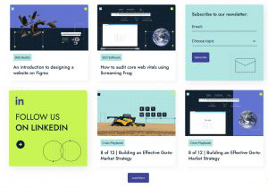
Our subscription and follow us boxes are neatly tucked into the grid.
Inside your article
Once the users click on your article, you need to continue this seamless UX experience. This section will need to be tailored according to the category.
For a blog, you can add:
- A hero image that matches your thumbnail along with the copy.
- Social media sharing options.
- Breadcrumbs so that the user knows where exactly they are on your website.
- A navigation bar for lengthier articles so that the user can quickly jump to sections they want to.
Related topics
Once the user scrolls to the end of your internal page, you can present them with more article options that are relevant to the one they clicked on. This tactic increases the chances that the user stays on your website, rather than leaving it to look for more resources.
URL structures in resource center pages
Always keep the URL structure simple. It should be easily readable to anyone. Best strategy? Use descriptive words.
A URL consists of five parts: the scheme, subdomain, top-level domain, second-level domain and subdirectory. Notice here how the URL structure is easy and simple to understand. There are no words that look gibberish.
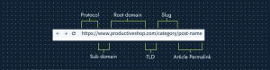
What a good URL structure looks like.
To learn more:
- Read our article on the best practices for optimizing URLs.
- Explore Google’s recommended guidelines for URL structures.
Productive Shop’s resource hub: How we did it
Productive Shop’s resource hub gives users the ability to select their categories right in the hero section. This is how the filter works in our resource center. We’ve done away with the typical categories and, instead, prioritized them on keywords. We’ve also added featured cards for the user to interact with.
Below the fold, you have the search bar along with the latest resources we have to offer.
Each thumbnail is unique to the category and customized to the article. We took this approach to engage as much as possible with the user. Each card also has a tag attached to it to let the user know which category these belong to. Selecting it will lead them to a page with articles from those categories.
Plans we have in motion
As we progress, we’re adding an eye catchy subscription button that floats in the blog as the user scrolls through. On the resource center landing page, there will be a subscription card that quickly lets the user subscribe to our newsletters and future updates. The thumbnails will be customized to the category they are connected to. This will help distinguish them from the other categories.
More resource page examples to inspire you
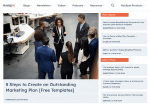
Hubspot
Hubspot hits the nail on the mark with the hero section or its first fold. Its resource page has a large thumbnail for its blog. Alongside it, there is content segregated by popularity and editor picks.
As you scroll down to the second fold, it breaks the typical grid system, adding different grid sizes and a subscription section that grabs the user’s attention.
As you scroll to the near end of the page, it recommends more topics to explore. There is no typical filter here. Hubspot replaces it with a custom navigation bar just for the blog section of their website.
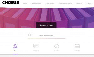
Chorus
Straight up title, a search bar and iconography + text depict the categories they have to offer. The page is clean, simple and intuitive to the user. No distractions.
Marketo
What I love about Marketo’s resource center is how they placed the filter right in the hero section and made a sentence out of it: “Jump to resources by topic or type”. It is also in a larger font size so it is hard to miss it. Then they add the featured section, a list of their collections and latest resources along with a banner before it.
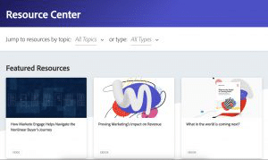
Marketo’s Resource Center with an intuitive filter bar.
How do you measure the success of your digital resource hub
Your resource center’s success helps your business drive traffic and leads. You should measure its success often as it helps you tailor the content to your audience’s needs.
Some of the metrics you should measure are:
- Conversion rate on landing pages
- Internal page visits (to specific resources such as blogs and white papers)
- Click rate on the CTAs
- Exit rate of your resource center
- Bounce rate of your resource center
- Time spent on your resource center and internal pages
You can conduct user research and gather feedback by either quantitative or qualitative methods by asking your users open-ended questions or providing them with pre-selected options. This strategy can help you cater better content to your audience.
Ready to revamp your website resource center?
A resource center can improve your SEO and conversion rates. But it’s not a guarantee of results. You have to strategically mix your content, ensure a balance of ungated and gated content and keep improving the UX based on the feedback you receive from your visitors. When you post articles, ensure that the content you provide is rich and not thin. We’ve explained this in great detail in this blog post.
From a design perspective, always make sure your users can effortlessly navigate through your resource center, make it as intuitive as possible and keep the design fresh as you go.
If you ever need help with designing or creating content for your B2B resource center, feel free to reach out to us!
Frequently Asked Questions
What is a hero section on a website?
A hero section is the first fold section the users first view when they land on your website. It consists of a background image, illustrations or animations with text and a call to action button.
Why is a thumbnail important?
A thumbnail is important because it is a preview image that visually ties in with the content that is written below it. Thumbnails help the users understand context better and relate to it. Since users often skim through websites, a visual cue may entice them to click on the article. Your thumbnails also carry your website’s branding. These thumbnails are part of your design system. Even though each thumbnail has to be relevant to the topic, it also has to also be able to connect to your branding strategy.
What’s the logical difference between tags and categories in WordPress?
Tags and categories help readers locate information on your resource center in different ways. Categories are more general, as they indicate the genre of your posts, while tags tend to be more specific and indicate the topic the post covers. Let’s say it’s a blog post about cybersecurity best practices for startups. The categories could be SMB cybersecurity, while the tags could be phishing, firewall, storage encryption and password management.
Is it better for SEO to use tags or categories in the resource center?
Categories and tags both have different use cases in SEO because categories are broader than tags. If you have created user-friendly categories, there is less need to use tags. Each tag you add creates an extra page on Google that needs to crawl through, making crawling through your website more tedious. Tags also lead to thin content pages, which is not recommended by Google standards. So it is better to use categories rather than tags in a resource center.