 SEO Consulting
  SEO audit
  Uncover market and competitor insights
  Increase Sales Qualified Leads (SQL)
  For CMOs
  For demand generation leaders
  For technology startups
 Enterprise SEO
  Web Search Optimization
  Local SEO
  GEO
GEO  PPC Advertising
  CRM Consulting
  Website Design & Branding
  Website Development
  Web Support
  Web pricing
  Content Writing
  Editorial Calendar
 All resources
  Case studies
  Marketing fundamentals
  Worksheets
  Webinars
  Blogs from the field
  Essential SEO checklists
  Case studies
  The team
  Careers
Users are well aware of design aesthetics and what modern design looks like simply because they are browsing tens of thousands of websites. So when they come across a website that is disorganized, has an outdated design or is cumbersome to navigate, they are quickly put off by it and simply close the tab on you in a matter of seconds. You don’t want that to happen for a host of reasons, so how do you avoid these mistakes?
Simply by following web design principles — a set of web-based design rules and best practices, including basic guidelines, interaction design and layout of the website you are designing.
To help you out, here are the top 10 design principles that I stick by when I am designing a website. These are also website design fundamentals that you should adhere to.
1. Top on the list is to ensure the visual hierarchy
Visual hierarchy determines what users notice when they first land on your website. It also guides the sequence of your design and how you want the users to perceive the information you are showing them. It is one of the key elements of web design.
We, as designers, need to prioritize the important elements on the page all while getting the message across — and, in most cases, that’s the CTA. Here’s what to take into account:
Scale
Naturally bigger elements on the page will grab the users’ attention the most. For example, the size of your headline and then your body copy.
Color scheme
The colors on the page denote the importance of a specific element. You can also play with different colors to emphasize certain words. Users will take notice of specific elements whose color stands out. For instance, your CTA.
Elements placement
You need to decide the position in which the user is going to read the content you have on the page. Most users read from left to right and are used to that.
Place your copy and images strategically. Grouping specific items or elements together gives the impression that they are part of one structure, making it easier for the user to follow.
If your page is missing a visual hierarchy, it will be confusing. Users will have no idea where to start and will leave your page. If they remember this bad experience, they’re not going to want to come back to your site anytime soon! These are the key part of web design guidelines.

Clear hierarchy flow between elements.
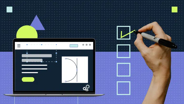
2. Next, have a catchy call to action (CTA)
Your call to action button or CTA is the action you want the user to take after explaining to them what your product is about. When the user clicks on the CTA, you can say you achieved your goal.
The average click rate of a CTA button is 5.23%, which is even more than a click-through rate (CTR) on a Google Ad, so you can see why your call to action button is important.
You need to grab your users’ attention so that they don’t lose sight of it while reading about your product.

CTA Button attracts users’ attention along with the service it correlates to.
3. Website navigation does not have to be a maze
A website that is easy to navigate makes it quicker for users to find the content they are looking for. So your navigation bar should have a proper structure and the ability to find pages they are looking for efficiently.
Design the navigation bar with the user in mind.
- Use easy-to-understand language.
- Link all the pages accordingly.
- Ensure your navigation items are contextually relevant.
- Align the navigation items to answer the typical problems the prospects face.
- Include middle of funnel (MOF) resource within the navigation (i.e. report or on-demand webinar highlight).
- Don’t make the user hunt for the navigation bar.
Often you see websites that go ultra minimalistic and use the hamburger menu to make it look cleaner. The problem is that you are hiding information that the user is looking for, sending them on a wild goose chase for the navigation button — and probably damaging your search engine optimization (SEO) results and conversion rate. The hamburger button has its pro and cons and you should know its place and time.

Clear navigation bar on Productive Shop’s website.
4. Jakob’s Law is all about familiarity
Users spend a lot of time browsing other websites other than yours. This means they expect your website to function similarly to other websites they are familiar with.
This is what Jakob’s Law of internet user experience is about.
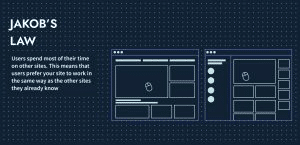
Consider the example of a button that electronically opens a door. By default, the user will push the button to open the door. If the button has to be slid or pulled up, the user would be confused about how it functions, unless provided with visual cues on how to perform the action.
The takeaway? Don’t complicate web design. If your website feels familiar to other websites, they will spend more time on other things you want them to focus on rather than figuring out how your website works.
5. Consistency is critical to effective web design
Being consistent with other websites helps users execute a task by practice. They’ve clicked on a CTA on another website that had a similar design and had no trouble understanding it in yours. You’re essentially reaping the benefits of the practice the user has gained from all the other websites they visited.
Users are used to the placement of specific elements on a website such as a logo on the top left, the navigation bar in the middle of it and a secondary CTA to the right. When you change this organization, for example, to put a hamburger menu in place of a traditional navigation bar, you are asking the user to learn a new action.
Innovation at the cost of consistency is not the way to go. You may want to make your website stand out from the rest but, by changing the pattern, you are risking losing the user. In order to be successful in creating a good website layout, be consistent with what is seen across the web.

6. Whitespace: Too little or too much?
Negative space or whitespace help design elements such as images and content stand out while making the website layout not look cluttered. It is not merely a blank space because it, in fact, adds value to your design layout.
Without white space, the message you are trying to put out is going to look messy. But following this design principle doesn’t mean you should spam your website with negative spacing.
Things to consider when creating negative whitespace:
- Coordination with the dev team: You may create a beautiful website layout with the perfect spacing to make all the elements you want to stand out. But if you don’t convey to the developer the message you trying to push, you will find out the hard way that the design does not match. In the developer world, there are things such as padding, margins and line height. That’s why the developer needs to know what you are trying to do to avoid misunderstandings.
- Above the fold: Often someone will ask you to try and squeeze as much information as possible into the first fold because that’s what the user sees. In the bargain, all the whitespace is sucked out to accommodate the content. Whitespace is crucial to creating an aesthetically pleasing website, and it is unknown at what point the user will start scrolling through your website.
- Clearing the stigma of whitespace: If you have ever designed a website, you for sure have come across the saying “too much whitespace”. However, what you should do is explain your design to the client. As a designer, it is your responsibility to help the client understand the reasons behind your whitespace usage.

Example of whitespace on Productive Shop’s website.
7. Choose your typography carefully
Let’s start off with fonts. The fonts you use on your website determine whether the user is able to read what you’ve written on it. A font may look fancy and curvy, which might look visually very appealing, but if your user is struggling to understand the words on it, you will lose them.
With multiple browsers out there, stick to using web-safe fonts or Google fonts, which are pulled from an API and are extremely safe and reliable no matter what browser you use.
Next, you want to make sure every word on your design is accessible and meets WCAG 3.0 guidelines. This includes the font color, type and size (don’t use cursive font for body copy, please!).
Stick to font sizes that are commonly used in web design because it ensures readability. Minimum readable font size is 14px-16px. Anything under that you will have users squinting to read your copy.

Appropriate font size helps to improve website readability.
8. Design a mobile-friendly website
Quality web designs are responsive, fast and mobile-friendly.
When designing your website, always visualize how your website will translate into mobile devices. Statistically, users are more likely to view your website on their mobile rather than desktop: a cool 59% of them, but this number is more likely going to increase.
To ensure your website is mobile-friendly, you want to follow responsive web design principles. Each element of your desktop version should look and feel similar on mobile. Elements that make your website easier to see on mobile should be translated accordingly from desktop to mobile. And yes, you also have to collaborate with your developer to ensure everything looks as intended.

Responsive mobile site design.
9. “I am SPEED”
“I’m faster than fast. Quicker than quick. I am Lightning!” This is a line from a popular animated movie (Cars :P), but it’s also a mantra you should stick by when you’re designing a website.
Your users’ happiness quotient depends on how fast your website loads. In today’s fiber optic internet world, load times matter. Google says that 53% of people will leave your website if it takes more than three seconds. While that time may seem short in theory, I’m sure you’ve come across a site that takes forever to load.
While you may assume it is solely dependent on the developer to ensure the website is snappy, it also falls on you to optimize the website accordingly. These include the animations, the images and other elements that are present on your website. Remember to optimize the sizes of the JPEGs, PNGs SVGs and animations accordingly and use the file type as per the intention.

Lightning McQueen’s mantra to success.
10. Balance is key
In web design, balance is how your website sits in relation to other design elements. For example:
- Adding contrast to your color palette.
- Using symmetry and repetitive patterns on specific areas of the website to draw familiarity
- Incorporating design elements where required between images and text.
All these approaches add harmony to your website and ensure balance. On Productive Shop’s website, we’ve balanced out the copy, icons and CTA. We’ve made the design familiar to the user, who is able to visualize hierarchy, associate the icons with the copy and understand the action they are supposed to take. We followed the core principles of web design.

Balance between icons, copy and CTA on Productive Shop’s website.
Common web design mistakes
So now that we have all the good web design principles nailed down, let’s have a look at what not to do.
Underperforming CTAs
One of the first things I notice is the CTA since this is essentially your bread and butter when it comes to the website. CTAs need to get the user’s focus. Mistakes include the button colors being dull, wording and positioning issues.
Make sure your CTA is telling the user the action they need to take. Stick by the principles of web design and you should be good to go.

This website design is too busy. CTA is cluttered with H1, taking away focus.
Too much going on
Websites that try to cramp in too much content often tend to look extremely busy and confuse the user. Keep it simple. Add information only that you require and deem essential. Tuck everything else into the second or third fold and other areas. It is not a single-fold page after all! Aim to create a clean design.

This website has text, navigation and CTA cramped into the first fold.
Confusing design
Adding the whole color palette and three-four fonts, multiple CTAs and paragraphs of copy on your website will lead you to this stage. You must avoid it at all costs. Design your website in such a way that everything is balanced across the board. Little or too much of any of thing might have a negative effect on your user experience. You want to make your website user-friendly.

Lack of relevance
Only add elements and copy that are relevant to your target audience. Same goes for colors. You need to know the kind of user you are targeting. Images also play a crucial role in making your website look relevant to the category you are designing for.
Collaborations are key to successful web design
As a designer, you may be responsible for what the website looks like; however, web design is a joint effort between numerous teams. It is what makes a good web page.
- The copy team provides you with relevant information that you need for your website, and coordinating with them at every stage is crucial to ensure the design and copy are in sync.
- Same goes for the dev team. You have to coordinate with developers to ensure your vision is executed in the way you want it to. There could be design elements that may hinder performance and the ability to build the exact design you want, so collaborating with them will help solve a lot of these issues along the way.
- Working with the SEO team will ensure that your website shows up on search engines and that the crucial elements that tie in with search functions are present in your design and code. This is how you create SEO-friendly web design.
Ready to follow the best web design principles
A well-designed website will enhance your user experience and have them coming back for more! But a poorly designed project will put off your potential customers and leave a bad impression on them.
Building an appealing website that hits all the marks is not only crucial but also shows that you are a professional business. It helps build trust among your users and add value to your service and products. If you’d like, we can help you reach these goals! Hit us up to learn how.
FAQs
Why is it important to follow basic web design principles?
It is important to follow the most basic web design principles because design impacts how your user perceives your website, which in turn translates into how they perceive the services you offer.
Why is it important to be involved in the development process?
The design you create should match the output that will be launched onto the web. Often there can be design elements that are impossible to build, or there are spacing, line height and drop shadows that need to be the same as it is on the design file.
Design and development output has to be 1:1. Not including the developer could lead to disastrous consequences such as technical complications, endless back and forth and an increased time for iterations.
How to improve my web design?
You can start by simplifying and eliminating elements and content that is not required to be present on the page. Then you can follow the principles of web design mentioned above to fine-tune your design. Alternatively, you can:
- Refresh your website’s design to modern standards and trends.
- Update its content and CTAs.
- Improve your website’s speed and responsiveness.
Which item is the most important for a successful website design?
There is no single straight answer to how to create a successful website design because it’s a combination of effective visual elements, useful content, great navigation, effective user interaction, branding strategy, search engine optimization, speed, and accessibility.
Why is responsive design good for SEO?
Responsive design makes websites faster, accessible and easier to navigate. Your website will load faster and users can easily find what they are looking for. If users are happy with the experience, they’ll stay longer on your pages, which means search algorithms will deem your page more relevant than your competitors — pushing up your SEO rankings.