
A brand book is a guide to the heart and soul of your brand. It communicates your mission, vision and values to the world which translates into the design. Your brand book includes your logo, typography, color schemes and other elements that are portrayed in your website or product.
You want the world to instantly recognize your brand when they see it and hence need to provide the brand guide to anyone who is creating or handling your product. It is the key to your brand’s image. Brand books are also known as brand guidelines, visual identity guidelines, brand manuals, style guides or brand toolkits. The name does not matter, and this book will be the Bible for your brand.
Several people you would be collaborating with will use your brand book. They could be UI designers, developers, marketing, advertisers, project managers, writers and anyone else who could create content for your brand. With so many people involved, would you want to risk your brand being misrepresented out there? Absolute nightmare!

Sage advice from the only and only Yoda
Why do you need a brand book?
Now that we have the definition out of the way, it’s time for me to tell you why you need one.
1. Consistency
Every time someone views a product from your brand, it could be your website, whether it’s an advertisement on social media, a business card, or any marketing material that essentially has your logo on it, it needs to be consistent.
Every element – a line or an illustration, the font, you name it. Consistency. Imagine someone purchasing a product from your online store, only to notice that the colors are different from what your brand, portrayed on your website. They’re going to immediately feel a sense of disconnect. You wouldn’t want that now, would you?
You want them to recognize the similarities between your website and product. That is why you need consistency across your brand. If you don’t believe me, studies show that using the same brand guidelines across all your collateral could yield you an increase in revenue by as much as 23%. Maybe even more. Consistent brand presentation is what leads to the number you see.
2. Rules
Now to maintain this consistency, you need to create some rules around your brand’s visual direction. These rules include things like maintaining your logo across collateral, the spacing, the fonts, the colors and the elements. (More on this later). This will give you control over output, avoid misrepresentation, and give collaborators much-needed guidance.
3. Tangible
Every company out there has a brand— some may be more defined than others. When your brand is consistent, your users end up recognizing your brand by its service or product. This won’t translate into the best impression in the long run.
Using a brand guide will help you pull together all the elements that make up your brand’s identity. Sounds cool, right? To give you an example, take a look at some of the most popular brands out there. Maybe Apple? The logo (besides the obvious) is instantly recognizable. That half-eaten apple. The consistency flows across all their hardware and software products. Or maybe Amazon, you see the same logo with an arrow across A to Z. The colors on the website are the same ones that you see on your Amazon package wrappers. In today’s Internet-driven world, visual identity is more important than ever.

Apple’s consistent branding across their range of products.
4. Value
When your brand’s identity is coherent, it increases the brand’s perceived value. It will appear professional and add reliability. Creating a brand book will help maintain the quality that your brand outputs and maintain your brand’s image. Your brand’s identity will elicit strong feelings from the users that engage with it. Ultimately, your logo and identity have great potential to convert. It’s not coincidental that some of the most valued brands in the world are also at the top of their game.
Who is involved in creating your brand book?
Ideally, your brand book is created by a brand designer who pulls together your logo, the colors and the way your website, product and any other collateral, should look and feel. This designer will need to open various communication channels with various stakeholders in your enterprise. Other people involved in the making of a brand book can include other designers, project managers and members of the marketing and advertising teams. The goal is to get a sense of idea about your brand, image, mission, core values, target audience and essentially what your brand represents. This process will involve a substantial amount of time and effort. But in the end, it will pay off.
| Role | Involvement |
| CEO/Founder | To ensure that the direction of the brand is supporting of their vision and values for the company |
| Production Designer | Provide guidance into existing design practices |
| Product Management | Provides insight into the target audience, competitors, type of clients |
| UI/UX Designer | Insight into the user experience and user data from apps/website |
| CMO | Marketing strategy of the company and how the product moves, insight into customer interaction with ads. |
How to create a brand book?
Assuming you have reached here, you realize how important it is to create a brand book and brand guide for your enterprise. No going back now, right?
Before we get into how you can create a brand book, you need to set the tone for your brand. The key components are:
- Your mission statement – Write why your company exists. What is your goal? What is your vision for your brand? Where do you want it to go?
- Target audience – Who are your customers and why should they use your product? How do you solve their problem? Include any research or insights you might have gained.
- Brand Persona – What best describes your brand? Is it techy? Sophisticated? Aesthetically pleasing? Or, quirky?
- Values – State your guiding principles. What are the actions your enterprise takes when it puts out a product?
Okay, now that we have the requirements out of the way, or assuming you have those already, let me walk you through how you should create your brand book. Here are the key elements.
Logo
Your logo is what makes the brand recognizable. The swish sign? Nike. Three stripes? Adidas. A half-eaten apple? Err. Apple. Your logo can be a wordmark, monogram, symbol, abstract mark or a mix of a symbol and wordmark. You need to define this and stick by it. Going forward once your brand is out there, people will recognize it.
A word of caution. If you manage to get out there amongst the Apples and Amazons, rebranding your logo is extremely tricky. You don’t want to lose your audience. Remember the GAP logo? Not the old one, the new one. You don’t? Me neither.

Original GAP logo on the left and the redesigned logo on the right.
Logo guidelines
After creating the logo, you need to set guidelines for it. Don’t stretch the logo disproportionately. Don’t change the font or color Don’t add extra shadows or extra elements to it. NO. Add this to your rules. From the product or service you stick it on to the tiny little favicon on your website, the logo has to look the same across all areas on your site. Must. Look. The same. Logos are the most important way a user recognizes your brand. Statistics say it’s 75%! That’s a huge amount.

Logo rules for Productive Shop.
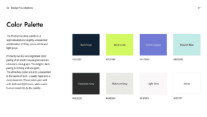
Color palette
Okay, this section is serious stuff. Colors are very crucial and integral to your brand. It sets the tone of all the key components. This section would ideally include the colors that represent your brand and colors that are featured on your services, products and website.
The brand colors should be most consistent among all the collateral you put out there. You should define the usage of these colors. Define which colors can be paired with another color from your palette and which colors should not be used for anything other than a specific area. Add the color values (RGB, CMYK, HEX, CSS) so that there is no margin for error. You should also define the color names and the primary, secondary and tertiary colors/alternate colors.
Typography
Similar to colors, there needs to be a defined font style for all your collateral. Define the usage for H1, H2 and body copy. The size, the color, the weight. Most brands in general stick to two typefaces. At the max, you should use three typefaces and a substitute typeface.

The typography used in Productive Shop.
Imagery/ Iconography/elements
Indicate whether you will be using images, illustrations and/or other types of graphics, as well as how they should be used. Set the tone of the image with examples that best represent you and the target audience you are catering to. You should also detail how these images will be edited, which colors they should be placed with and any other design elements that will go along with the images. It’s best to create examples to showcase these concepts. For elements, be sure to provide samples, the size and their usage as well.

Images used in Productive Shop.
Brand’s tone of voice
The brand’s voice usually depends on the kind of enterprise you are. For example, if Apple is a software/hardware company and its tone of voice conveys premium quality yet is powerful and playful. Mcdonald’s tone of voice is happy and focuses on keeping customers happy through quick and cheap meals.
The tone of voice is a crucial element that you should add to your brand book. It shows your brand’s personality. You can communicate the style you want to have with your audience, depending on the persona you chose.
What happens if you don’t use your brand book?
So you went through the hassle of creating your brand book and setting brand guidelines. But for some reason, they were not applied and the material was pushed out into the open world. What happens?
When you are not using the brand guidelines you set, the content and product you create could end up looking very different from the other. It could be something as simple as a different font that was used, or the colors were misrepresented.
First of all, you lose brand recognition. What’s worse is that your target audience might get confused and associate your brand with some other brand. Your brand’s reputation and business is harmed, which can have a negative impact on your enterprise’s growth. You want to avoid this problem at all costs. For every design that is put out there for the world to view, you want to make sure it meets the standards that you set in the brand book.

This is what it looks like when you don’t follow brand guidelines.
That’s all folks!
And that about wraps up how you should get around designing your brand book and setting up guidelines. Make sure you use it thoroughly and let it guide the look of the content your enterprise produces.
It may sound challenging at first to put out a comprehensive guide, but you can always start with the essentials and go on from there, adding details as you go and as you grow. No brand has had a massive, well-detailed brand book from the start. It always started from something small and basic. Good luck with your branding strategy! Also, if you need help with your brand book and design needs, reach out to us! We’ll hook you up with what you need. Hopefully, I did a good job of convincing you in this article. 😛

That’s all folks! OINK.