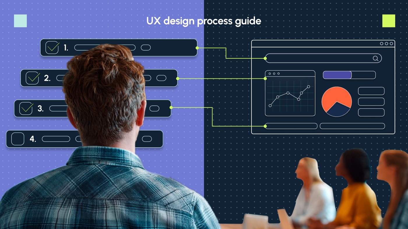
 SEO Consulting
  SEO audit
  Uncover market and competitor insights
  Increase Sales Qualified Leads (SQL)
  For CMOs
  For demand generation leaders
  For technology startups
 Enterprise SEO
  Web Search Optimization
  Local SEO
  PPC Advertising
  CRM Consulting
  Website Design & Branding
  Website Development
  Web Support
  Web pricing
  Content Writing
  Editorial Calendar
 All resources
  Case studies
  Marketing fundamentals
  Worksheets
  Webinars
  Blogs from the field
  Essential SEO checklists
  Case studies
  The team
  Careers
Ever felt like your landing page design is screaming for breathing room?
Imagine walking into a room crammed with furniture, leaving you feeling overwhelmed and unable to relax. Now, picture the same room with strategic spacing and an inviting flow that highlights key pieces. Spacing, in design, is like that. It’s the often-overlooked element that transforms chaos into clarity, guiding viewers’ eyes and enhancing the overall user experience.

Spacing isn’t just about aesthetics; it’s about psychology. Spacing affects readability, comprehension and emotional response. When elements are well-spaced, they can convey a sense of openness, clarity and professionalism, enhancing the user experience and guiding the viewer’s focus. Conversely, crowded or poorly spaced designs feel overwhelming or chaotic, leading to frustration or disengagement.
In this post, let’s delve into two critical spacing elements that greatly influence your website’s appearance and user experience: padding vs margin. I’ll explain how they differ, why they matter and how to use them effectively. And I’ll also share some handy tricks for adjusting them on popular web platforms. So stay tuned. 🚀
📚Read more 👉 Everything about another important spacing element: leading.
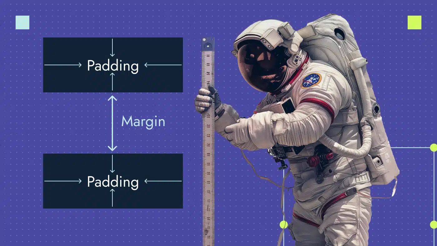
What is padding and why do we need it?
In design, padding is the gap between an element’s content and its border. Think of webpage elements as boxes, with padding being the space inside each box, separating the content from the box’s edge. It’s like a buffer around text, images or other elements, enhancing layout clarity and organization.
Take a look at the picture below. It shows what padding means using a button as an example:

Here are the tangible benefits of incorporating padding into your design:
- Enhanced readability: Strategic padding ensures that content is easily visible and comprehensible, reducing the cognitive load on users’ eyes.
- Improved user experience: Proper padding inside interactive elements like buttons and links prevents misclicks and streamlines user interaction. It directly impacts the number of users who can successfully click a button, which in turn affects conversions.
- Visual balance: Padding creates visually balanced and organized content. It guides users’ attention toward a key area of the content and enhances understanding of your message.
- Responsive design flexibility: Padding can be adjusted to accommodate different screen sizes and devices, ensuring that the design remains functional across various platforms.
- Brand perception: The amount and arrangement of padding subtly influence brand perception. Strategic use of padding can evoke feelings like luxury, minimalism or accessibility, aligning with your desired brand image.
Here’s what it looks like with and without padding:

What is margin and why do we need it?
Margin is the space outside an element’s border. It essentially creates a buffer around the element itself, influencing its relationship with other elements on the page or screen.

Here’s why margins are essential:
- Visual separation: Margins create space between elements, preventing them from feeling cramped. They allow each element to stand out distinctly.
- Enhanced readability: While padding allows us to see and read the content, margin enhances overall readability by providing breathing room and reducing visual clutter on the page, which directly enhances accessibility.
- Visual hierarchy: Margins help establish a visual hierarchy by defining the relative importance of elements and guiding the viewer’s eye through the web page.
- Responsive design: Margins flexibly adjust to ensure the design functions and looks great on any device.
- Aesthetics: A well-planned margin adds to the overall aesthetics of a design, creating a sense of balance, harmony and professionalism.
Here’s what it looks like with and without margins:

When to use padding vs margin
Now let’s summarize the main difference between padding and margin so you know when to use each one of them:
| Padding | Margin | |
|---|---|---|
| Location | Inside the border, between content and border | Outside the border, between different elements |
| Main purpose | To add space between the element and its border | To control spacing between elements and overlap elements |
| Impact on the element size | The size increases | The size doesn't change |
| Value | 0 or bigger (no negative values) | Positive, negative or 0 |
| Responsiveness | Dynamically adjusts based on maintaining a relative relationship with internal spacing and content | Dynamically adjusts based on the screen size by using percentages or viewport units |
| Application | For buttons, cards, form inputs and small page elements | For separating content blocks, images and navigation elements |
Margin and padding in web design
Before we dive deep into the practical usage of margin and padding in web design, let’s lay a solid foundation:
- HTML — or HyperText Markup Language — uses tags to define the structure and content of a web page. HTML includes elements, attributes, content, document structure and comments.
- CSS — or Cascading Style Sheets — applies the visual rules that determine how the website looks and behaves. CSS controls font styles, colors, backgrounds, layout and elements’ positioning, borders and, of course, spacing.
It’s important to clarify that HTML itself doesn’t have a direct property for setting borders, paddings and margins. We need to use CSS for this purpose.
When we break down a website into its visual components, each element like a button, image or paragraph can be visualized as a box in the CSS Box Model. This model defines how these boxes are structured and how much space surrounds them.

How to use padding in HTML and CSS
Padding can be applied to any element using the padding property.
Let’s create a button. The basic HTML code for a button is:
<button>Click Me!</button>
Next, add 1 px border:
button {
border: 1px solid #D1F960;
}
See the result:

Let’s add more breathing room with padding. It’s crucial to note that every element you add to your website has four paddings that can be customized and styled: for the left, top, right and bottom. Instead of setting each side individually, you can use the simplified padding property to apply the same margin amount to all sides:
button {
padding: 24px;
border: 1px solid #D1F960;
}
Looks better right? We added a 24px padding for all sides equally.

Let’s make the button more rectangular. Padding can be set for individual sides the same easily:
button {
padding-top: 24px; /* Applies 24 pixels of padding to the top */
padding-right: 60px; /* Applies 60 pixels of padding to the right */
padding-bottom: 24px; /* Applies 24 pixels of padding to the bottom */
padding-left: 60px; /* Applies 60 pixels of padding to the left */
border: 1px solid #D1F960;
}
Looks great to me now with adjusted padding:

How to use margin in HTML and CSS
To use margin in CSS, you need to specify the amount of space around an element. Let’s use the three service cards from the Productive Shop homepage as an example. HTML code for adding the second card image is:
<img src="enterprise/seo.jpg" alt="Alternative text for the image">
Without setting any margin, the cards will look like they’re glued together:

Next, I’ll give the second card, “Enterprise SEO”, 40 pixels of margin. Here’s how it’s done in CSS:
.image {
width: 292px;
height: 292px;
margin: 40px;
}
Now, let’s see the result. The Enterprise SEO card shifts downward because we added the same margin on all sides.

To align the cards in a row, we should remove the top and bottom margins:
.image {
width: 292px;
height: 292px;
margin-right: 40px; /* Applies 40 pixels of margin to the right */
margin-left: 40px; /* Applies 40 pixels of margin to the left */
}
Let’s look at the result of customizing margins:

Best practices for padding and margins on websites
Now that you know how to set margins and paddings, I’ll share four useful tips to help improve your design:
1. Use negative margin
Conventionally, designers use positive margins that push elements outwards. By using negative margins, you pull them inwards. By allowing elements to overlap each other visually, they create unique design effects. However, it’s important to use negative margins strategically to avoid unintended consequences like missed CTA clicks that lead to a conversion decrease.
Example of negative margin in CSS:
.image {
margin-right: -20px; /* Overlaps the element to the right of it */
margin-left: -20px; /* Overlaps the element to the left of it */
}
In this example, notice that the circles are overlapping:

2. Keep paddings and margins responsive
Ensure that your margins and paddings are responsive by using relative units like percentages or viewport units (vw, vh) instead of fixed values. This approach allows your spacing properties to scale proportionally based on the size of the viewport or parent container. This means your layout can adapt to different screen sizes and devices, providing a better user experience across desktops, tablets and mobile devices.
When you use percentages or viewport units, you don’t have to change elements manually as much when you update your layout. You can count on these units to adjust automatically, which makes it easier to manage your design and saves time in the end.
Imagine you have a card with 40px padding on a desktop screen. If you keep it fixed, the same padding will stay on a mobile screen, requiring manual adjustments. However, if you set it to 1 unit, like “1vw” or “1vh,” the mobile card will automatically adjust to around 16px, saving you the trouble of manual resizing.
3. Deploy auto margins to quickly align elements
Automatic margins in CSS center elements horizontally within their containing area. This works because setting both left and right margins to auto tells the browser to distribute the available space equally on both sides, effectively centering it. Here’s a simple example:
.centered {
margin-left: auto;
margin-right: auto;
In the image below, observe how the button effortlessly shifted to the center. This feature is crucial because it ensures that the element remains centrally aligned across all devices, saving us the hassle of manually calculating distances.

4. Leverage margin collapse
Margin collapsing is a CSS function where adjacent margins of two or more elements collapse into a single margin. This usually happens when they are stacked vertically. The resulting margin is the larger of the two adjacent margins, effectively combining them. This leads to unexpected spacing in layouts but can also be used intentionally to create specific designs.
Take a look at this example: we have a headline with a 40px margin at the bottom and a subheadline with a 30px margin at the top. According to mathematical rules, we should see a 70px distance between them. However, the actual distance is only 40px due to margin collapse.
h1 {
margin: 0 0 30px 0;
}

h2 {
margin: 40px 0 0 0;
}
How to adjust padding and margin on different platforms
In this section, I’ll guide you through the process of adding padding and margin in some of the popular redactors.
WordPress
There are several approaches to adjusting padding and margins in WordPress — each one catering to different levels of user experience and comfort with code. Let’s review the best option for beginners:
- Select the block: Click on the block you want to adjust the padding or margin for.
- Open the settings: To find the Settings panel, click on the Gear icon located on the right side of the editor.
- Go to the “Dimensions” section: This section typically offers controls for adjusting padding and margin values for all sides of the block. You can either use the slider or enter specific pixel values.
- Click “Update”: Save and implement the changes.

WebFlow
To adjust padding and margins in WebFlow, follow these simple steps:
- Select what you want to modify: text, image, card or button.
- In the Style panel, navigate to the Spacing section.
- Click on the needed padding or margin — and then adjust it.

You can also use the visual padding and margin controls directly on the canvas by clicking and dragging the handles around the element.
Additionally, WebFlow offers these functionalities to streamline the process:
- Pre-defined spacings: WebFlow offers pre-defined spacing options in pixels (px) or percentages (%) that you can apply quickly. This can save time compared to entering values manually.
- Linked properties: You can link the padding or margin values between multiple elements by clicking the chain icon next to the value in the Inspector panel. This keeps the spacing consistent across those elements, reducing the need to adjust them individually.
- Global styles: While less commonly used for quick adjustments, the “Styles” panel allows you to define the padding and margin properties for entire sections or pages using CSS syntax. This can be helpful for establishing consistent spacing within a specific area.
Figma
Figma’s auto layout is a feature that helps designers streamline the process of creating and maintaining responsive layouts. Functionalities include:
- Automatic paddings: To set automatic padding in Figma, choose your object, navigate to the “Design” panel and locate the “Auto Layout” section. Here, you can adjust the horizontal and vertical padding by inputting a numerical value or using the drag handle to adjust it visually.

💡Pro tip: In the Frame section, use the Fill container option to automatically adjust the padding to match the full width or height of your container. This can be handy for ensuring buttons fill the entire screen, particularly on mobile devices, without the need for manual padding calculations.

2. Automatic margin: To add an automatic margin in Figma, group the objects into a frame, then navigate to the Auto Layout section and adjust the “Gap between the items” value. The gap is frequently used to determine the spacing or distribution between objects.

💡Pro tip: Adjust the gap setting to auto to maximize the distance between objects. This type of margin is especially useful for arranging cards from left to right based on the grid.

☝️ Need help designing a website on Figma? Check our guide to Figma.
How can you use AI to adjust padding and margins faster across systems?
Artificial intelligence (AI) is rapidly entering our daily design life, enhancing it, speeding up processes and automating routine tasks. While using AI directly to adjust padding and margins is still mostly under development, there are applications and alternative approaches to consider. Let’s take a look at them.
ChatGPT
Although ChatGPT is not a graphic editor and cannot create margins and padding for you, it can help you with:
- Explanations: It can explain the concepts of padding vs margin in simple terms, helping you understand their purpose and usage.
- Examples: ChatGPT can provide examples of how padding and margin are used in HTML and CSS code, showing you practical implementations.
- Tutorials: It can guide you through tutorials or step-by-step instructions on adjusting margins or padding in different web development tools like CSS, Figma or Webflow.
- Best practices: ChatGPT can share best practices for using padding or margin effectively to improve the layout and design of your website or application. For example, here’s ChatGPT’s answer on how to change padding in Figma:

WebFlow AI assistant
While the Webflow AI assistant doesn’t have a dedicated feature for padding and margins, it can still assist by offering suggestions based on design principles and layout best practices. It can recommend adjustments to enhance design consistency and user experience. Here’s an example:

Elementor AI
Elementor AI, much like WebFlow AI, doesn’t include a dedicated feature for automatically adjusting padding and margins. However, it can be helpful in:
- Generating website section variations: Based on your input, the AI will generate three different section layouts. These layouts can serve as a starting point for your website section, offering inspiration and diverse design options. Paddings and margins are automatically calculated in user-friendly proportions.
- Editing existing sections: If you already have a website section but want to explore different design variations, you can use Elementor AI’s “Edit Containers Using AI” feature. It analyzes your existing section and generates new layout variations based on its understanding of the content and structure. Naturally, it includes well-designed paddings and margins.
- Adding custom code: You can directly write or paste HTML and CSS code to customize website elements beyond the standard Elementor options. It automatically accounts for paddings and margins.

Build interactive and responsive pages with Productive Shop
Well-designed pages with optimal spacing are a make-or-break factor that drastically affects the readability and the aesthetic appeal of your website.
If you’re a B2B SaaS business looking to build impactful and user-centric pages that convert visitors, reach out to us. We’ll help you establish a proper spacing system, incorporate margins and padding and ensure your brand achieves the desired look and feel.