
To create a truly stellar website, it’s crucial to master the art of typography. This means paying close attention to details such as line spacing, character spacing and selecting the perfect font.

But there’s one aspect of typography that’s often overlooked: leading. In this article, I’ll show you the right way to use leading in typography and discuss the potential usability issues that may arise with improper lead typography.
So, let’s dive in and take your website design to the next level.
Understanding lead typography
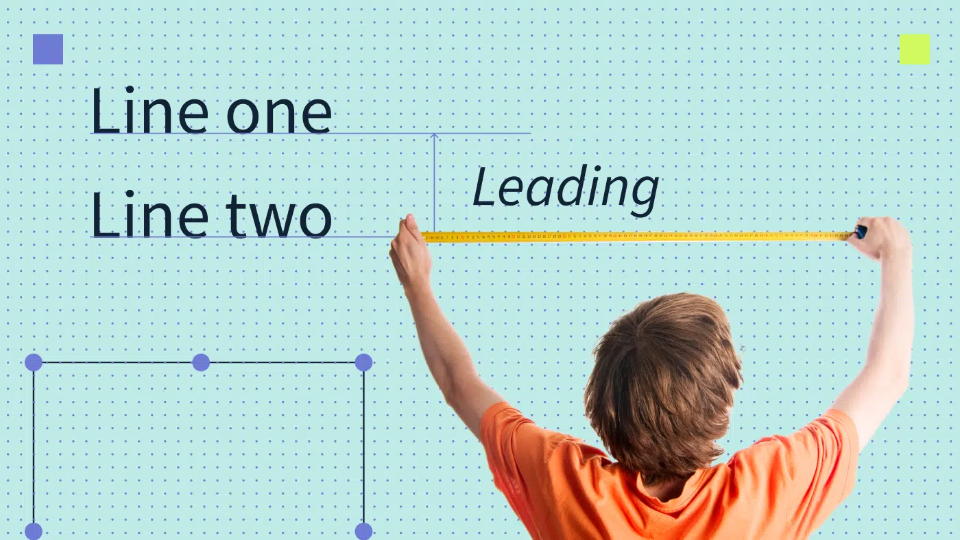
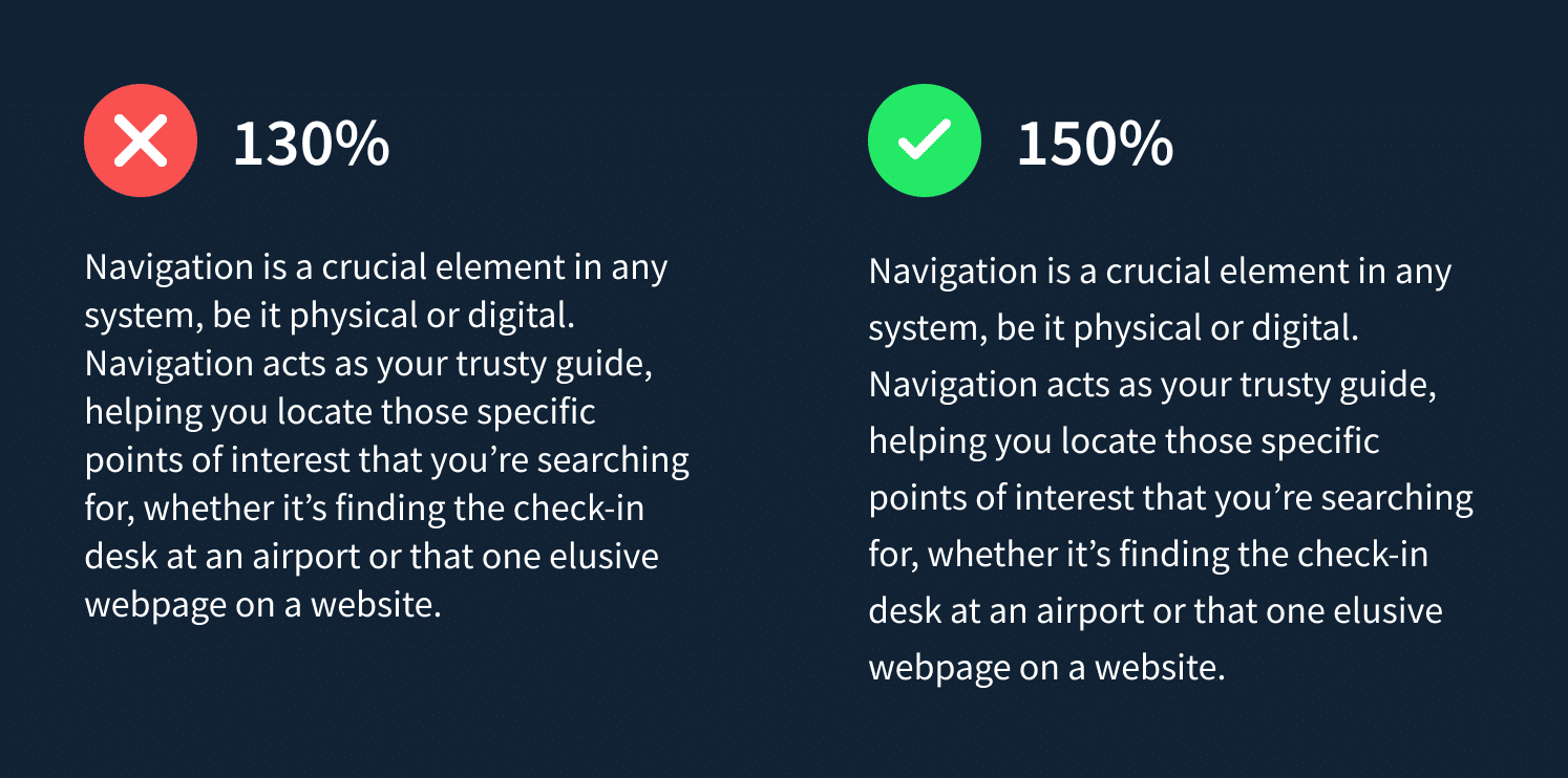
Let’s start with creating a multi-paragraph heading in Photoshop or Figma. For this example, I’ve taken a snippet from my blog post on effective website navigation design. Sure, the original text is readable, but is it really easy to read? Will your eyes start to feel tired after reading a few paragraphs?
Let’s add a touch of magic to this bland text.
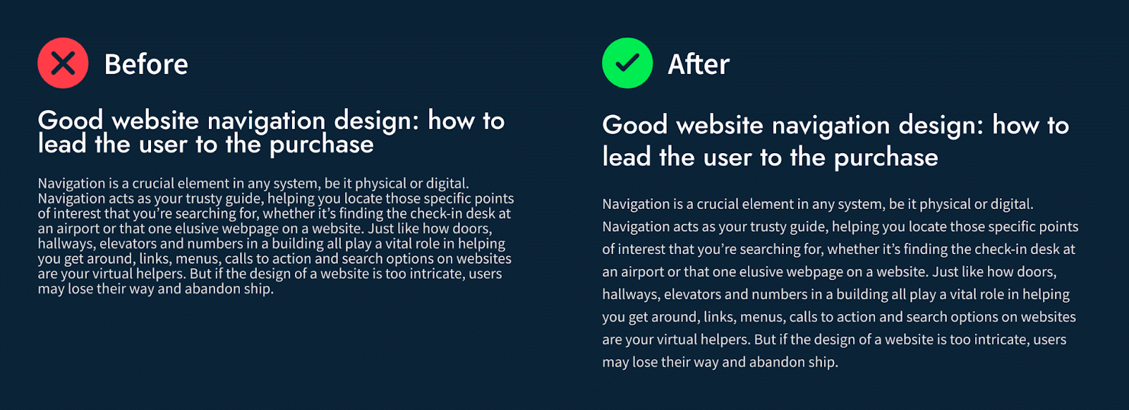
Compare the difference. It’s just the result of tweaking the leading. Now you see what a simple adjustment can do for website readability and overall perception.
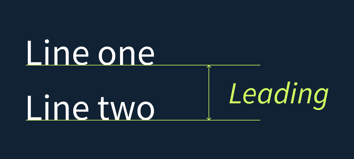
So what is leading in typography? The term describes space between lines of text. In other words, leading is a vertical distance between lines. It’s measured from the baseline of one line to the baseline of the next.
And just in case you’re not up-to-speed on lead typography terminology, the baseline is the imaginary line that runs along the bottom of most letters. With the right leading, your text becomes more visually appealing and easy to read.
The term “leading” originated from the early days of print typography when strips of lead were used to separate lines of type.
Typography line spacing vs leading: what’s the difference?
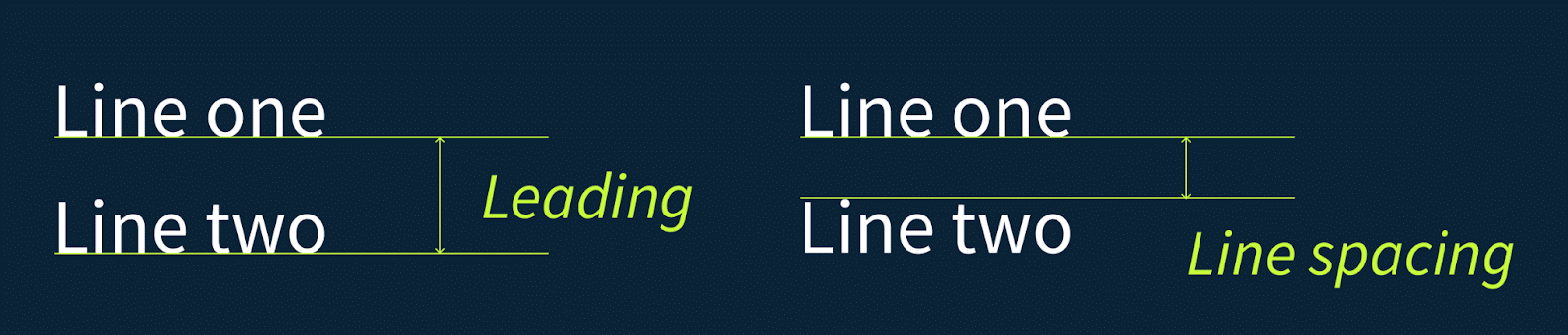
While both leading and line spacing refer to the vertical distance between lines of text, they are not the same thing.
So what is leading in graphic design? Leading is measured by the distance between baselines, which is measured from the baseline of one line of text to the baseline of the next. In other words, it determines the exact amount of leading between lines of text.
Line spacing, on the other hand, is a more general term that refers to the overall line height of a text, including any extra space above or below the letters. This spacing can include leading as well as any additional space added for ascenders or descenders (the parts of certain letters that extend above or below the baseline).
So while leading is a specific aspect of line spacing in typography, line spacing itself encompasses a broader range of factors that contribute to the overall appearance of a block of text.
Both typography leading and line spacing are important considerations in design and their relative importance can depend on the specific context and goals of the project. In terms of web design, we should focus more on leading as it is important for improving the readability and flow of longer passages of text. By adjusting the leading, you can create a comfortable amount of space between lines of text, making it easier for readers to follow the text and preventing fatigue.
💡Wondering about other little adjustments you can make to improve readers’ experience? Discover 10 design principles all web teams should follow.
The importance of leading in graphic design and why there’s so much confusion around it
The distance between lines is a crucial factor that determines the type of type bar and, most importantly, the readability of your text. It’s not something to be taken lightly, as choosing the wrong leading can seriously impact your reader’s experience.
- If the lines are too close together, the text becomes a blur, and your reader’s eyes will struggle to focus on one line at a time. The result? Slow reading, distraction and disengagement.
- If you have too much leading between lines, it’s hard to follow the text’s continuity and readers may become uncertain and exhausted.
- When the leading is just right, it can work wonders for your text’s readability. The eye can flow seamlessly from line to line, creating a sense of stability and confidence. The text becomes more comfortable to read and readers can quickly get into the reading rhythm.
Typography leading challenges
Setting the right leading can be a challenge, especially for typography newbies. The ideal amount of leading can depend on various factors, such as the font size and style, text column width and overall design aesthetic. It takes some experimentation and practice to find that sweet spot.
Another challenge is that leading is often expressed in points, which can be unfamiliar to those not accustomed to working with typography. But fear not. With a bit of effort and experimentation, you can master the art of leading in typography and create text that not only looks amazing but is also easy to read and understand.
So don’t underestimate the power of leading in creating harmonious, functional and timeless typography. With the right leading, your text will be a pleasure to read and your readers will keep coming back for more.
Rules of perfect leading in typography
Every software program for typography layouts comes with default leading for text size. The secret is to find the perfect balance. Let’s run through the recommendations.
General rule
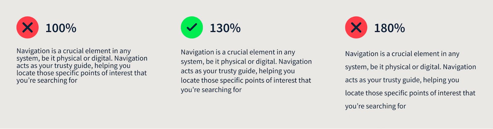
Leading is the unsung hero of typography and it’s crucial to making your text pop. The rule of thumb is to set the normal leading at 120% to 150% of the point size. More than 100% leading is also called positive leading. Let’s remember these numbers. For example, if the point size is 12pt, the leading should be between 14.4pt and 18pt.
Small leading size makes your words cramped, suffocated and hard to read. But if you go too big, your text will look like it’s been shattered into pieces and no one will want to read it.
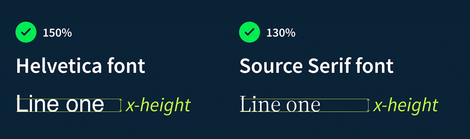
Leading and font type
Fonts are not created equal and you may notice that blocks of text with the same leading will look different with different fonts. The reason is that the height of lowercase letters, also known as the x-height, varies between fonts. That means different fonts will require different leading settings to look their absolute best. Fonts with shorter x-heights will need less leading compared to those with taller lowercase letters.
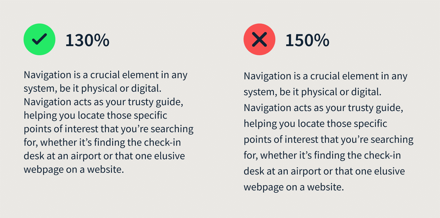
Leading and text line lengths
When considering the leading in typography, it’s important to keep in mind the length of your text. If you have longer lines in a blog article, for example, it’s recommended to increase the leading to 150%. This will make it easier for the reader to jump through the text.
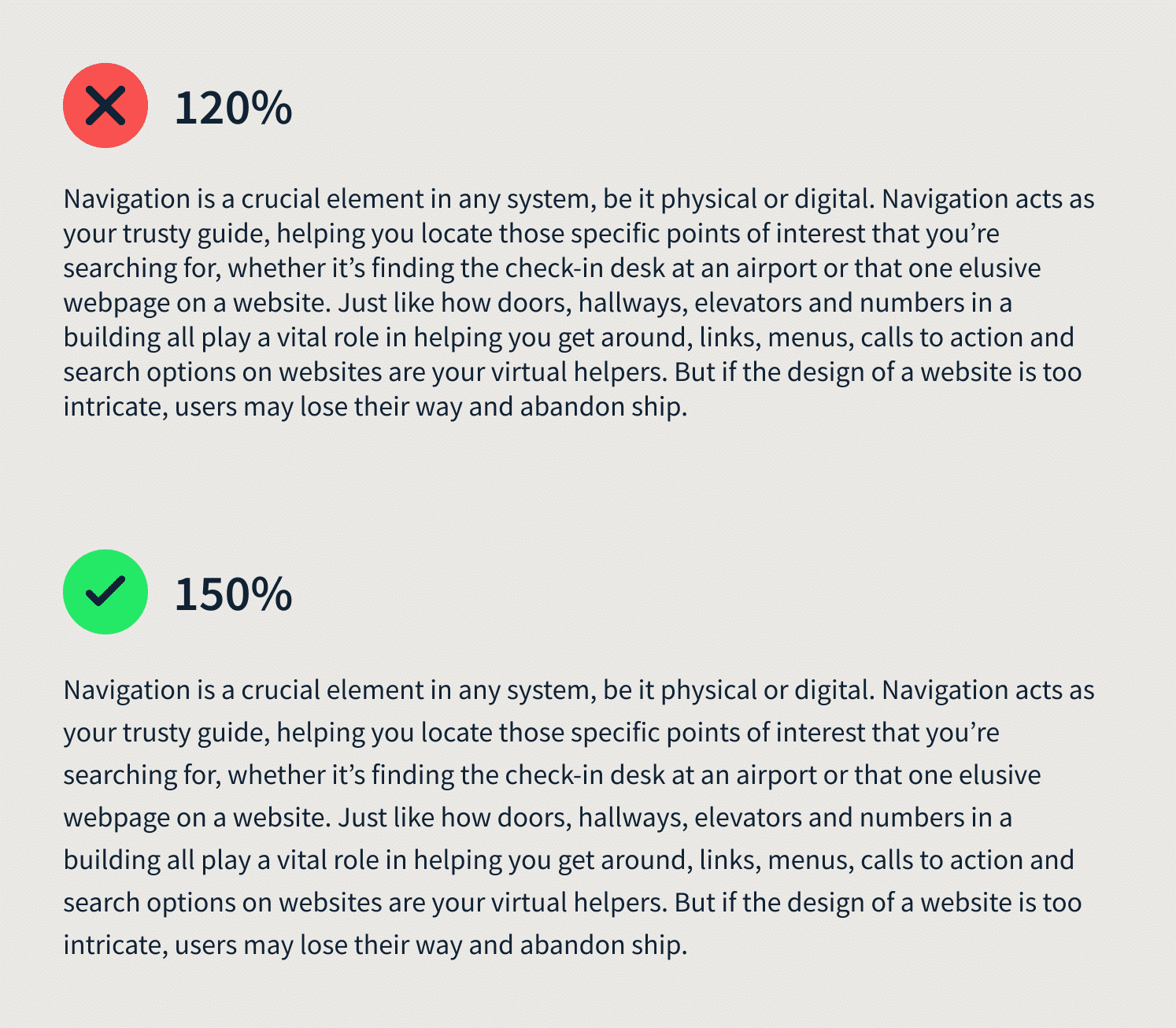
If you’re working with a narrow column of short lines, you might consider slightly reducing the leading to create a more harmonious look and feel. Using smaller leading 120-130%. This will also shorten the column length.
Leading and colors
When designing a dark interface, I recommend using a greater leading and light-weighted typeface, to enhance the page readability. Similarly, different colors add different kinds of weight to the screen, making it difficult to even look at the interface. It can be fixed using correct leading.
Negative leading
The leading can be considered negative if it’s less than the font size on the line. When it comes to design, there’s an important rule to follow: the larger the text size, the smaller the leading should be. As such, leading for headings will vary from that of the body text. So, if you’re working with headlines, you can experiment with leading as low as 80-90% to make them stand out.

✍️Know what else makes your design stand out? Color schemes. Read about the top 10 colors that make people buy.
How to change leading in Figma and Google Docs
Locating the leading field in Figma is a simple process. Navigate to the text section within the design panel and locate the icon featuring a letter positioned between two lines. At this point, you can input any desired leading value in either percentage or pixel format.
In Google Documents, the leading feature can be found on the icon panel located at the top of the document window. To input a custom leading value in points, simply click on “Custom Spacing.” As shown in the attached screenshot, a value of 1.15 corresponds to 115%.
Improve your website typography with Productive Shop
Don’t underestimate the power of website typography leading. It’s a make-or-break factor that can drastically affect website readability and the aesthetic appeal of your text. As a designer or writer, it’s crucial to recognize its significance and master the art of adjusting leading to suit various contexts and design goals.
Say goodbye to adjusting leading by eye and relying on abstract concepts like visual weight. IN typography, leading is not a generic multiplier that supposedly works for every font out there. These simple rules I’ve provided will help you achieve compelling results.
⭐️Contact us with any design questions you may have. Our art team — led by yours truly — is great at customized typography approaches that are tailored to your brand direction.