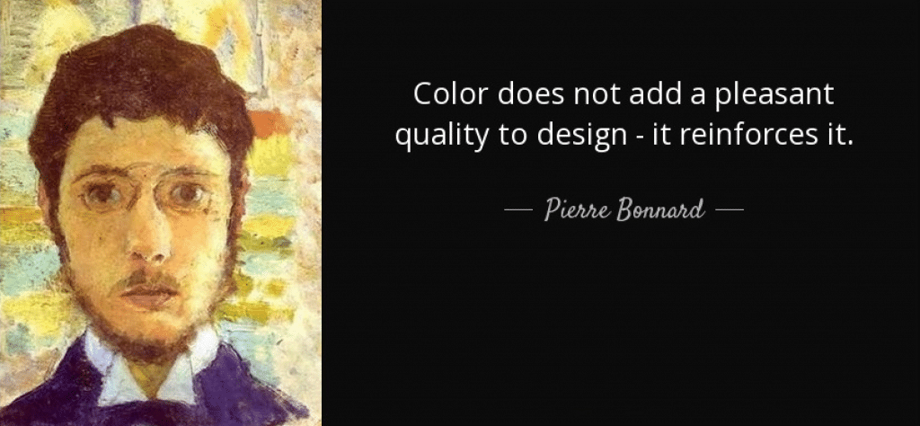
People are visual beings. More visual than we may realize. Colors play a significant role in our perception and can influence human behavior and decision-making. No wonder the color you choose for branding can impact your reputation — either in a positive or a negative way.
Based on research, exposure to certain colors can:
- Change taste perception.
- Affect the perception of time.
- Speed up or slow down the heartbeat.
- Influence your opinion about a brand.
If colors have such a strong effect on people, can they also impact shopping habits? As it turns out, they can.
In this article, I’ll explain how colors affect customer habits. Let’s have a look at how 10 popular colors attract customers to buy.
The importance of the right color for your business
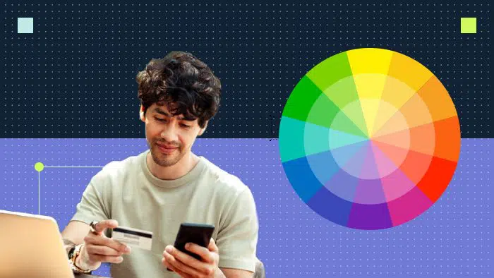
The right color can motivate your website’s visitors to fill out a lead capture form. For example, 75% of consumers say that color is a determining factor when choosing a particular product. And 66% of people won’t make a purchase if the product has a color they don’t like. Although this statistic applies to B2C shoppers more, we can’t ignore that software purchasers are people too, and the use of color plays an important part in forming a perception about the business.
Corporate color plays an important role in the success of a business. You want to be remembered by your clients, and your color can help you achieve just that. After all, color combinations cause clear associations with the brand. For example, what does a circle with the colors red, yellow, green and blue remind you of? Google.

There are 3 main factors people consider when evaluating color:
- Relevance. Marketers often choose colors based on people’s preferences. This is often the wrong approach. You need to understand the appropriateness of color. For example, most people like blue better than brown. But suppose you buy a table. Most people will choose brown as it looks appropriate.
- Aesthetics. You should pick branding colors based on associations and meanings, but you can’t ignore aesthetics. Don’t choose a color only based on its emotional and semantic meaning. After all, your product needs to be attractive.
- Meaning. Colors evoke subliminal associations. There are basic associations; for example, blue resembles the color of the sky and water, and green refers to the color of plants. But some associations can vary based on different cultures. Color psychology will help us understand what emotions a certain color evokes in the audience majority.
Top 10 colors that sell
Now that I’ve made the case for what colors are good for use in marketing, what color makes people want to spend money?
Here are my top 10 picks.
Red
Red is the most powerful color associated with fire, violence, war, love and passion. Historically, red represents both the Devil and the Cupid. Red can affect our physiology as it raises blood pressure and respiration rate. In addition, red speeds up the metabolic process.
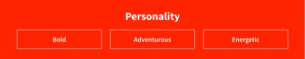
Yes, red might suggest anger, but also pomp and circumstance (think of the red carpet). Red also suggests danger, which is why we have red warning signs and red traffic lights. This color symbolizes passion, strength, energy and striving forward. Red is a great choice for market leaders.
How the color red affects sales
Since red is the most eye-catching color, it allows us to focus the user’s attention on what we need. This color encourages action, so use it tactfully on critical CTAs or as an accent.
By itself, red is an attractive color, but you should use it delicately. It’s easy to overdo and scare off visitors with this color. Red is suitable if the site sells accessories, clothes, household goods and food. In other words, it works for the category of goods, in which the purchase is often impulsive.
When to use red
When you meet something red in the digital space, it arouses interest. Do you want to go and see what’s red there? Maybe there is something important there? That’s why red is considered the best color for advertising. Red is also the color of danger. If you want to sell “safety,” give up on red. In the health sector, it is also not recommended: we associate red with blood and a critical state of health.
Many websites use red for:
- Buttons (buy, register)
- Design of discounts and promotions
- Accents for banner ads
Using too much red (especially pure red) in a design can overwhelm users. But if you need to display strength and passion in your design, red is indispensable.
Successful use of red in SaaS branding
Let’s look at Planview, a leader in portfolio and resource management. Their focus is on speed and driving results to the clients. That’s why they use active red color as well as bolide cars and fast trains in their branding.

Blue
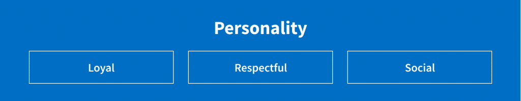
Blue color often represents calmness and responsibility. It is considered one of the best colors for a business.
The shade you choose can greatly influence the user experience.
- Light blues are relaxing and soothing and look fresh and friendly.
- Deep blues are refreshing and energizing.
- Dark blue looks strong and reliable.
All these shades are great for corporate websites to show strength and reliability. Among the negative associations of blue are coldness, callousness, isolation and unattractiveness.
How the color blue affects sales
Blue color helps people cope with feelings of anxiety. This color works for websites and industries where the user should not make impulsive purchasing decisions. While red is good for aggressive bidding, blue is better for websites with a lot of information that the user needs to read before buying.
According to a study, 57% of men recognize blue as their favorite color and 35% of women have the same opinion. Also, the blue-and-yellow color combination is recognized as the most readable and is visible for colorblind people.
When to use blue
Blue is used in different industries, from travel to the high-tech industry. Most social networks use blue in their design. This color is the best for finance, aviation, medicine, IT and insurance industries. If you want your brand to be seen as reliable and calm, blue is the color for you. But it rarely appears in food-related companies’ brandings, as blue tends to reduce audience appetite.
Successful use of blue in branding
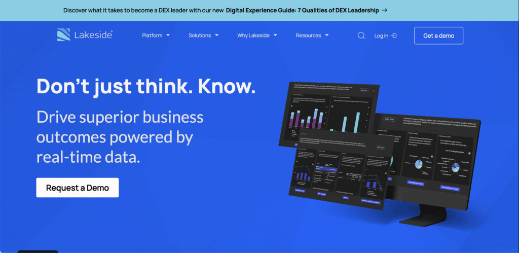
Check out the Lakeside website. This company provides one of the leading B2B digital experience monitoring solutions, and bright blue makes them feel confident and reliable. Good match.
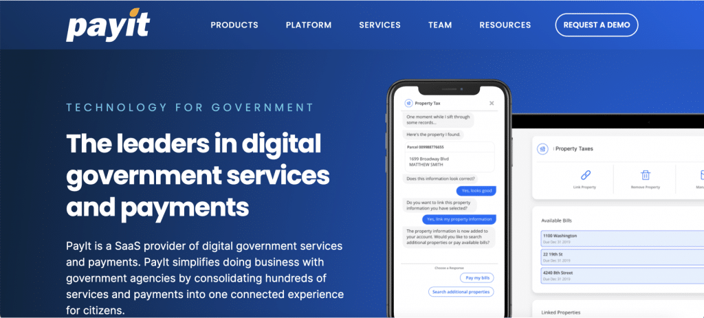
One more good example is PayIt, a leading digital government services provider. A combination of blue and yellow is the best for payment services and is accessible to various types of consumers (B2C and B2B).
Yellow
Yellow is often considered the most vibrant and energetic of all warm colors. This color is associated with happiness and sunshine. It improves mood, causes enthusiasm, promotes openness and encourages communication. Yellow also suggests hope. In some countries, people wear yellow ribbons when their family members and colleagues are at war. Bright yellow can bring a feeling of happiness and joy to the design whereas light yellow gives a feeling of calmness.
How the color yellow affects sales
Yellow captures the user’s attention very well, making it perfect for accents and calls to action. It is well distinguishable on almost any background and immediately catches the eye. No wonder the color of discounts is yellow. Red, orange and yellow are considered to be the best colors to attract customers to critical on-site messaging.
When to use yellow
Soft shades of yellow work well for children. Dark yellow and golden hues are associated with the old days, so they can be used to give a design a sense of stability. It is commonly used for leisure, entertainment and travel. Use bright yellow in your branding if you like to take risks or if you are claiming to be making bold moves.
But be careful with the yellow-black combination, because it signs warning of biological or radiation hazards and can cause subconscious fear.
Successful use of yellow in branding
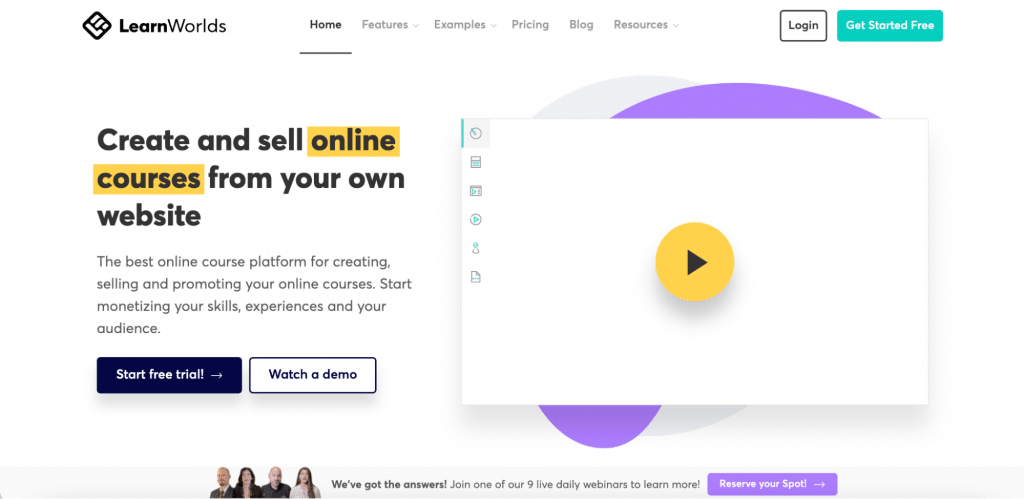
B2B generally uses dark shades of yellow to keep the feeling of warmth and friendliness but not to look too childish. Look at the LearnWorlds website. Their combination of deep yellow and purple speaks of learning, fun, creativity and energy.
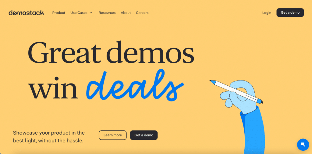
One more B2B example is Demostack. The company helps SaaS sales teams build demos for software products, so one of their top colors is light yellow. This color helps to create the feeling of something fun, bright and interactive.
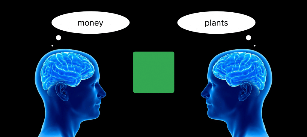
Green
Green is a very earthy color. It represents new beginnings and growth. It also denotes renewal and abundance. On the other hand, green can also have associations with envy, jealousy or a lack of experience.
Green is calming like blue and energetic like yellow. Green balances and harmonizes design and induces a feeling of stability. Brighter shades of green look more energizing, while olive hues are commonly associated with the natural world. The dark green color looks more presentable.
How the color green affects sales
Take a traffic light as an example. The first association with green is to allow action. This color increases conversions when used for action buttons (buy, order, subscribe etc.).
But you should take into account the Restorff effect (or isolation effect): objects are better remembered if they stand out. If you want to use green as a CTA, don’t use saturated colors for the background.
When to use green
Green works in designs related to prosperity, stability, money, growth, investments, renewal and nature. Green is great for agriculture or food (the exception is yellow-green, which suppresses appetite), as well as for finance, healthcare, biology, energy, technology, home and garden products etc.
Green is referred to as the color of nature. Therefore, it can be found wherever there is an “eco” prefix (eco-products, eco-design, eco-technologies). Interestingly, green is also often used by chemical corporations — the main environmental pollutants. If you want to outline the desire to reduce emissions, choose green.
Successful use of green in branding
Let’s see B2B green best practices. Dotmatics as a leader in R&D scientific software development uses bright green as a CTA and accent color. Great choice, because green refers to science, biology and nature. Green along with the people’s images gives us a feeling of friendliness and growth.

Purple
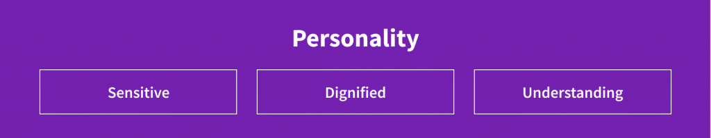
Purple is a mix of red and blue, and it carries the characteristics of both colors. Purple is associated with nobility, wealth and luxury. Historically, purple has an association with royalty. Light shades (such as lavender) convey a feeling of spring and romance. Dark purple conveys elegance and mystery. It also suggests creativity and fantasy.
How the color purple affects sales
Purple is considered the most appealing color for women. In Hollock’s experiment, 23% of women named purple as their favorite color, and among the male respondents, there were no lovers of this color at all. That’s why purple better targets an audience of women. Dark purple can be good for backgrounds, as it gives a rich feeling. If you stopped on bright purple, use it for CTAs and menu elements.
When to use purple
Purple is usually used by creative companies and brands that need to position themselves as prestigious. Also, it is a good catch for the cloth and cosmetics industries. This color is considered quite extravagant, so it should be used with caution. Some shades of purple reduce appetite even more than blue. That is why you should be careful when choosing this color for the food industry, purple is not recommended for agriculture either.
If you don’t want your page to look too feminine, then you need to avoid pink and complement purple with blue. If you want the opposite effect and your target audience is women, then avoid gray and black colors, and take pink as an addition.
Successful use of purple in branding
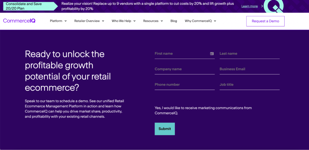
CommerceIQ is an ecommerce management platform. They use dark royal purple for backgrounds and bright for CTAs. It gives a feeling of a creative outstanding company that is not afraid to go beyond traditional boundaries.
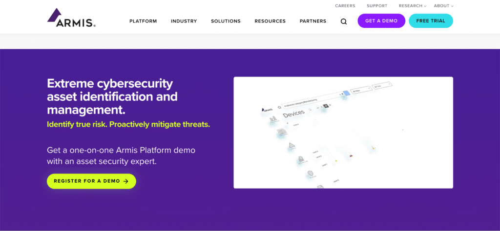
Another cool usage of purple comes from Armis website. Armis is a leader in the cybersecurity industry. They updated their website with rich trendy purple and green to show that they are modern and unique.
Orange
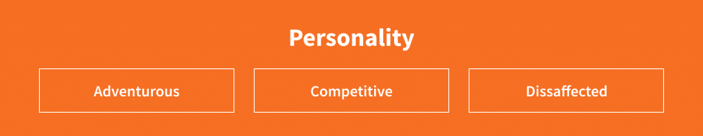
Orange is a very bright and energetic color. Orange is associated with the change of seasons, autumn and earth, so it represents movement. Orange refers to fruits so it is also associated with health and vitality. This color grabs attention in design but doesn’t overwhelm it like red. It is often considered more friendly and hospitable and less provocative. That’s why orange is one of the best colors for use in marketing.
How the color orange affects sales
In most cases, organizations that use orange want to gain trust. Orange is effective for CTAs, because it attracts attention and gives a friendly optimistic feeling at the same time. This color is active and stimulates action.
When to use orange
If you want to create an atmosphere of warmth and friendliness, feel free to choose orange. Orange can add feelings of confidence and energy, as well as stimulate appetite. Orange should be used for goods and services that are intended for a wide audience. This color is well suited for children’s and sporting industries. Also, it will be great for industries where we want to emphasize the speed of any process.
Successful use of orange in branding
Look at the Productive Shop orange. It is bright, fresh, friendly and enthusiastic. The CTA button stands out from everything on the page and assists with stable conversions.
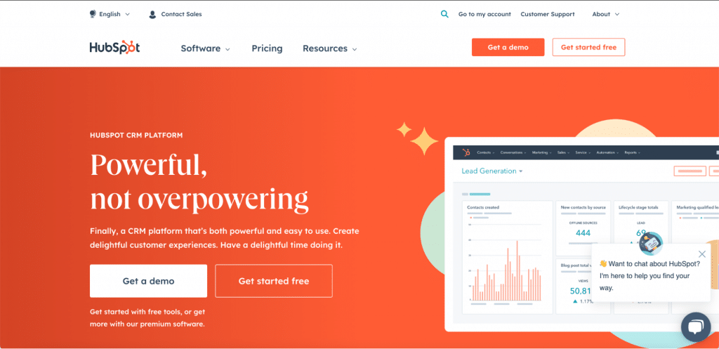
I can’t help but notice HubSpot, one of the most popular CRM platforms. By using orange, they want to target a wide audience and position themselves as a friendly and simple-to-use platform.
Black
Black is the strongest of all neutral colors (it’s actually considered a shade). It usually suggests power, elegance and formality. On the other hand, it is also associated with evil, death and secrets. In many countries, black is the color of mourning.
Black is usually used in original and elegant designs. It can be conservative or modern, traditional or non-trivial — it depends on the color combinations you choose along with black. This color will help you create a sense of sophistication and mystery in your design.
How the color black affects sales
In 2020, the world’s leading brands have provided a large number of designs in dark gray and black tones — for example, Google, Apple, YouTube and Instagram. Dark themes are more pleasing because, in this case, the eyes are less tired. Also, research showed that dark-style design saves battery life on mobile devices with an OLED screen, which means that customers will stay longer on the site. At 100% screen brightness, the switch to dark mode decreases power consumption by 42%.
In 2015, HCI Research Group and the Georgia Institute of Technology conducted a study on the response to visual content on Pinterest. It turned out that the audience is less interested in black-and-white content than in color images. The same conclusion was reached by experts at Xerox, who learned that color materials in business documents increase sales by 80%. So if you decide to choose black as your primary color, don’t forget to add secondary colors to designs.
When to use black
Black is great for expensive goods and services. It is also commonly used in the IT industry. Cosmetics, clothing and car brands use black in branding to show exclusivity and premium pricing. In the era of minimalist design, more and more companies use pure black in their logos.
Successful use of black in branding
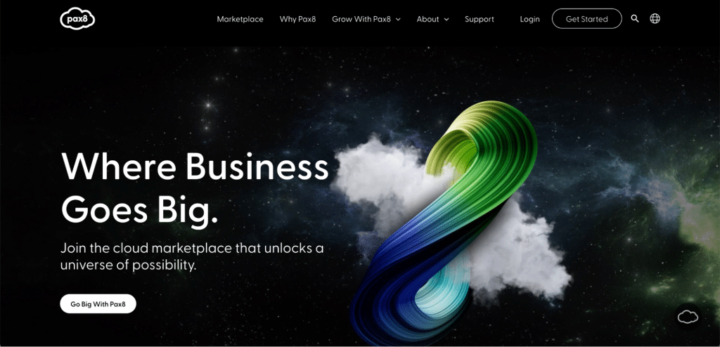
Look at the Pax8 cloud marketplace website. As a representative of IT services, they use black as their main theme, but also add gradients and 3D elements. The website looks modern, engaging and at times mystical.
Pink
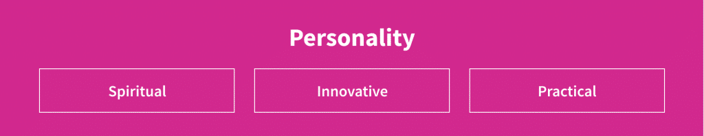
Pink is bright and noticeable, hence why only a few brands dare to use it in their designs. Pink color speaks of tenderness, coquetry and charm. It relaxes and soothes.
Pink in the psychology of color also has both positive and negative sides. Strengths include imagination, passion, creativity, entrepreneurial spirit and the desire for new things. Negative associations include indignation, rebelliousness, impulsiveness and frivolity.
How the color pink affects sales
Pink makes people feel calmer. It is noticed that pink reduces muscle tension and normalizes the functioning of the endocrine system while providing an overall feeling of relaxation. Pink can also have an impact on employee productivity: it is used if you want to motivate employees to think outside the box.
When to use pink
Since pink is typically associated with femininity, this color is most suitable for products intended for women. In addition to the beauty industry, it is suitable for organizations that are engaged in creating comfort and organizing care. For other industries, this color can be a great addition to the base of a brand’s corporate identity. Use pink if you aim to “break the mold.”
Successful use of pink in branding
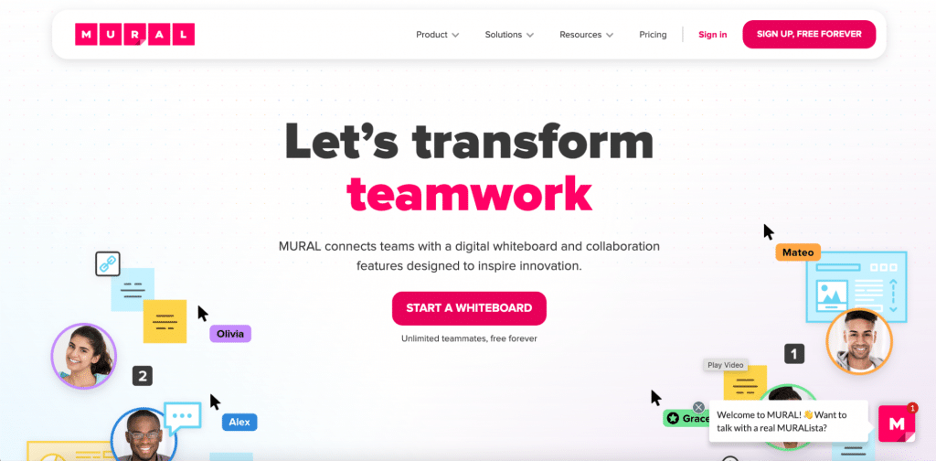
Mural, a digital collaboration service, uses deep pink for CTA elements along with other colors and interactive animations. The website gives us a feeling of friendliness and creativity.
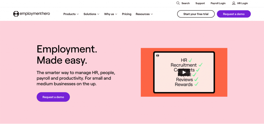
Employment Hero, an HR software, has another pink tone on the main screen. Light pink is used to signal humility, relaxation and ease. Also, the website is targeted mostly at women (as HR is a female-dominant industry).
Brown
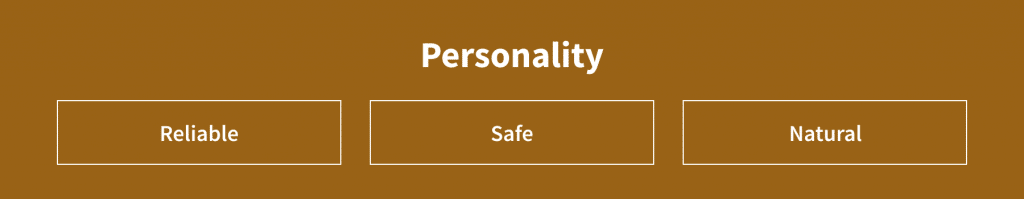
Brown is associated with earth, wood and stone. It’s a neutral and warm color. Brown suggests reliability, consistency and earthiness. Sometimes it might be considered boring. Brown conveys a sense of warmth and wholeness. Darker shades of brown can replace black in backgrounds and typography.
How the color brown affects sales
Brown is good at attracting the attention of conservatives and people who put traditions above exploration. Unfortunately, for some, an excess of brown can cause unpleasant associations with wet earth (dirt), although the earth itself is a symbol of fertility and life.
When to use brown
Brown is rare on the market. In design, we usually use brown as a background color or in woody and rocky textures. Brown creates an atmosphere of comfort and safety. This shade is appropriate for companies in the protection and justice sector — law firms and private security companies. Brown is irreplaceable in areas where tradition and conservatism are an advantage. But I don’t recommend it for use in the aviation and technology industry.
Successful use of brown in branding
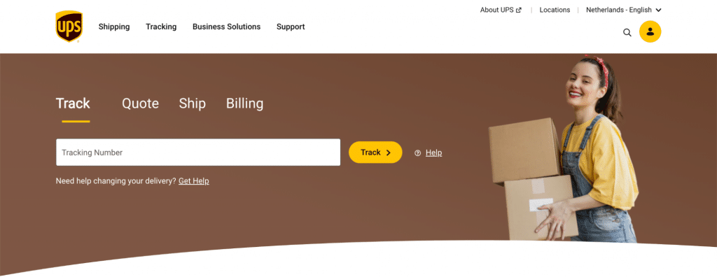
Have a look at UPS, a leading shipping company. Their brown speaks about conservatism, stability, trust and security. The yellow CTA gives a nice balance, which helps the website feel welcoming.
White
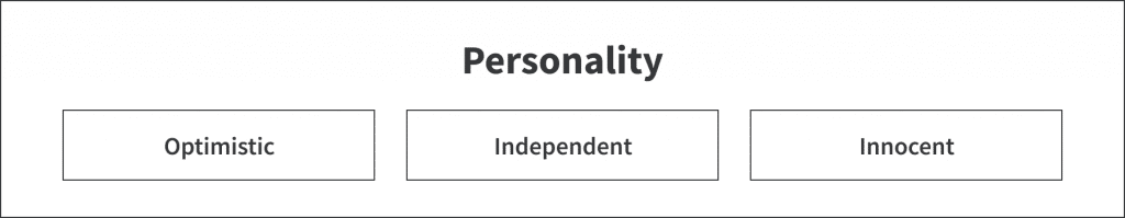
White personality
White and black are on opposite ends of the spectrum, but just like black, white works well with just about any color. White has associations with kindness, innocence and virtue. In the West, brides wear white on their wedding day. White is the color of purity, that’s why angels are usually white in pictures. The classic combination of white and black is stylish, elegant and concise. Sterility, emptiness, detachment and indifference are among the brown color’s negative characteristics.
How the color white affects sales
The use of white is trendy in a minimalistic design approach. Light background works well with other colors and helps to easily place the desired color accents. White space, which is called negative space, is the “air” of a website. This area is left free, which makes the layout more readable. Thus, the user focuses on a small number of needed elements. The abundance of visual elements can degrade the quality of the experience.
When to use white
In design, white is usually a neutral background that makes other colors stand out. White also brings purity and simplicity to design and is very popular in minimalist designs. It is often used by expensive brands. White is also associated with healthcare, especially doctors, nurses and dentists. The color embodies purity and suits brands with a modern eco-concept.
Successful use of white in branding
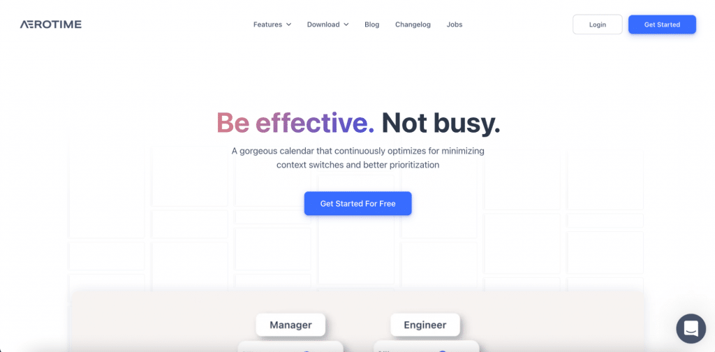
Aerotime uses white and black colors in its design. It looks clean and simple and helps a company to make visitors focus on what is important.
Color trends in design for 2023
Web design trends are always a glimpse into the future. 2023 promises to enter digital history as an experimental artistic year. So let’s discuss 4 design trends that will help you select the best colors for marketing purposes next year.
1. Minimalism
One of the leading trends of recent years is minimalism. According to a joint study by Adobe and the University of Toronto, modern users prefer simple combinations that use 2 to 3 colors. In 2022, the use of a completely monochrome palette has changed to a more colorful one.
The goal of new minimalism is to make the site more interesting without detracting from the essence of the page. Black and white background with a lot of air and small bright accents helps to achieve this goal.
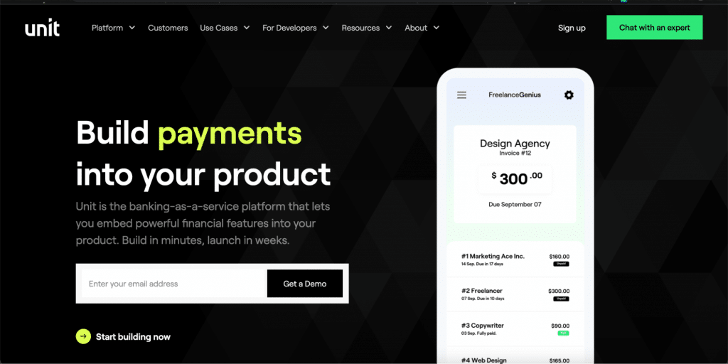
Let’s look at Unit.co, a banking-as-a-service platform. Its website embraces minimalism to near perfection. The luxury black website with tastefully used color elements grabs our attention and guides us to focus on the most important messages.
2. Memphis style design
As one of the defining aesthetics of the 1980s, Memphis design is sometimes considered a flashy style that combines many chaotic patterns and shapes. Memphis design is more colorful, accessible and adventurous than traditional design has ever been. It is a rejection of minimalism.
Use colorful triangles, squares and bold zigzags. But remember to keep a balance between bright elements and an empty background.
Let’s look at the Productive Shop website. The homepage contains various geometrical shapes that create a nice composition. Along with trendy bright colors, the website feels modern, fresh and eye-catchy.

3. Earthy and basic shades (and some neon)
Do you remember the meme “nature heals” from the start of the pandemic? It now impacts web design trends. In 2023, natural and basic shades will give the site a more organic look.
However, among this muted color palette, you can also notice the opposite trend: bright neon accents, which are used for menu icons and all kinds of dividing lines.
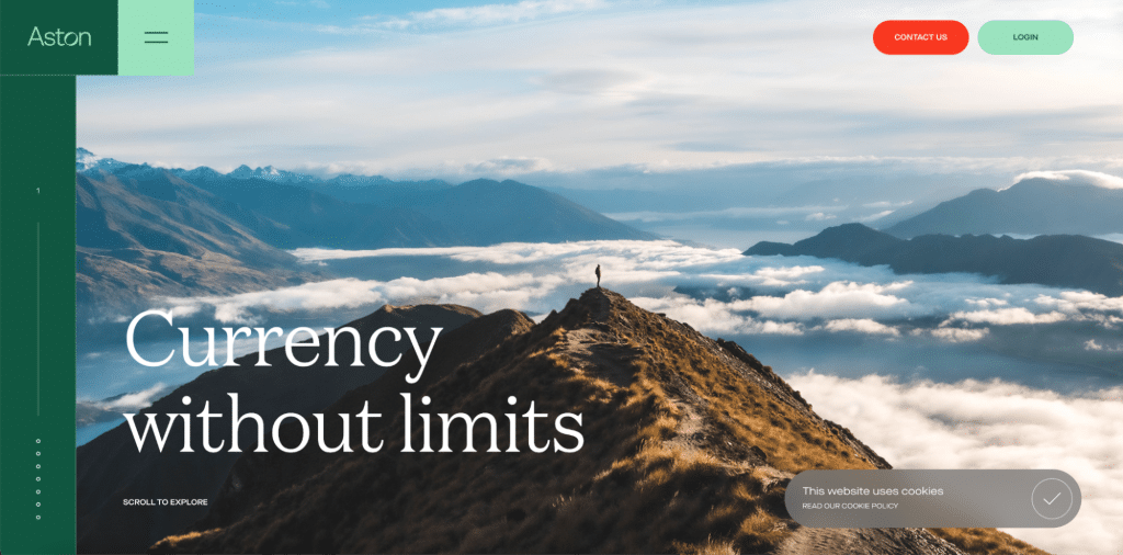
Aston currency management platform uses soft green color, nature elements and neon orange accents in their design. Thumbs up.
4. Smooth gradients
Gradients made a wild comeback from the 1990s and hold leading positions in design trends. A gradient background allows you to enrich the background of the site with a whole range of colors, without distracting attention from the content of the page.
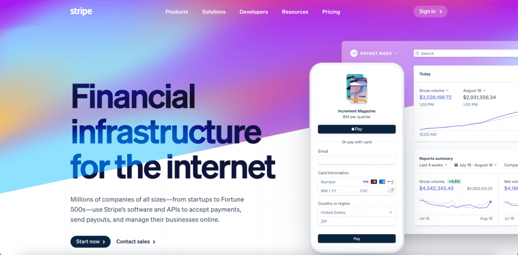
Though the Stripe website was created a while ago, it still looks trendy. Soft animated gradient and semi-transparent browser window make the website outstanding looking for years.
Most of the trends of 2022 were invented decades ago. In those years, there were no technologies that we have now. Perhaps, as a result of experiments, you will find your own, unique style and start a new trend.
How to select the color that works for your B2B business
Let’s find out how to choose the best colors for different marketing purposes.
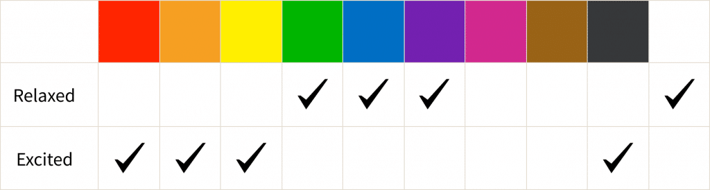
Excitement level
Cold colors reduce excitation, while warm colors increase it. But when should you induce excitement and when should you lower it?
Cold colors have a relaxing effect, so people want to slow down. These colors work when it’s needed to spend more time making a purchase. They also reduce the waiting time at the payment stage.
Strong excitation can motivate action, such as impulsive buying. These are the best sales colors. Red and orange activate us, while moderate colors, such as green and blue, should be avoided. Remember that arousal increases impulsivity.
So, if you want someone to make an immediate decision, boost their arousal with warm colors.
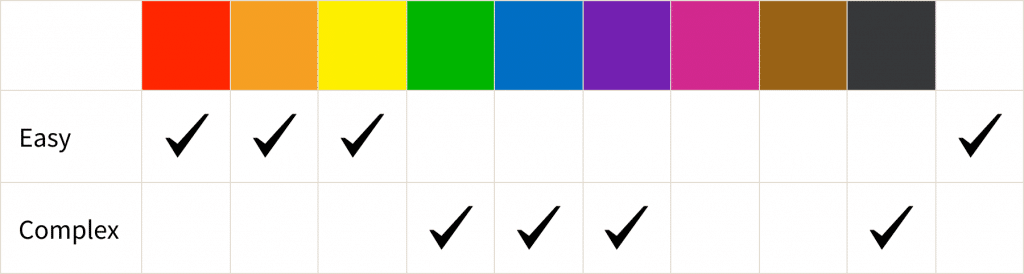
The type of information you have to offer
Basically, we process information in 2 ways:
- Quick and easy analysis. If your arguments are weak or you don’t want users to read and analyze, then you need to use warm colors to increase arousal.
- Complex and rational analysis. If you are persuasive, then you need to use cool colors to reduce the user’s arousal.
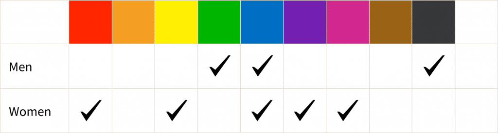
Gender theory
Based on Hurlbert & Ling, women prefer warm colors and men prefer cold ones. Designer Joe Hallock launched research in the early 2000s to understand how people react to different colors. Based on the results, Hallock was able to identify favorite and least favorite colors in different groups of people and understand what associations they evoke. So it turned out that the blue color is equally popular among men and women of different ages — most of the respondents named it their favorite color. And the most unloved were brown and orange colors.
Look and feel
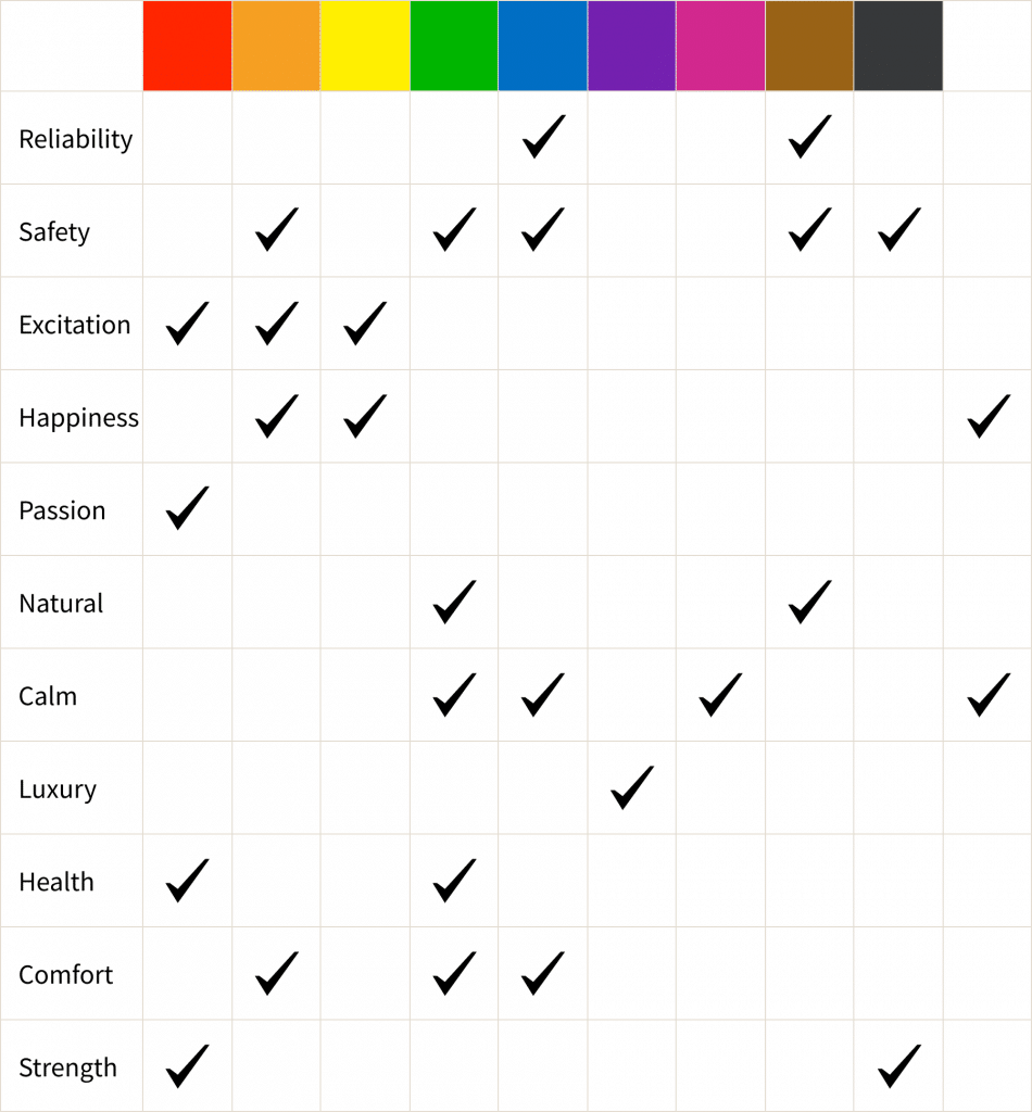
Most marketers and designers use colors to express the nature of their brand. I made a table based on research from Aaker (1997) that describes the most common brand personality traits and their connection with colors.
Target audience
To understand which colors to choose for your brand identity, you need to consider your target audience and their demographics by age, gender, interests and habits. Think about your ideal client and how you want them to feel.
It is important to remember that the perception of color remains an individual reaction, which is often based on our personal experiences. And the color itself is just one of the channels through which we, as buyers, receive information about the brand.
Always research your target audience before choosing a color scheme: do these people have experiences with a particular color? If yes, you need to decide whether this association will positively influence your project.
Competitors
Very often, the color that seems to best convey the right feeling is already taken by your competitors. Identity for the company is always created to show individuality and stand out. So what should we do?
- Exclude competitors’ main colors from your list. Also, exclude colors that don’t seem appropriate for your industry and target audience.
- Try to replace red with a color that has a similar meaning for your audience. For example, it can be burnt orange, which contains red’s power and yellow friendliness.
- Play with shades. If all of your competitors have dark red conservative colors, take a look at bright colors that will help you look more modern.
- Add more colors to your palette. Keep reading to learn how to create a harmonic combination.

So, you can’t treat brand colors thoughtlessly. It is always necessary to carry out a competitive color analysis. First, it will help to avoid the unpleasant situation of mixing with a competitor and, second, it will open up new approaches to the formation of the brand’s identity, character and mood.
Rules of color harmony (or how to choose a couple of colors)
Now that we have chosen the main color we want to use in branding, we need to keep in mind using only one color can be boring and hard to perceive. Let’s have a look at the best color combinations that will help you to pick additional colors.
Monochrome color combination
A monochromatic approach uses different shades of the same tone. Monochrome color schemes are useful in simple messages or to convey brand sophistication (Rider, 2009).

Analogous color combination
An analogous color scheme uses similar tones close together on the color wheel. This combination can increase the perception of a design as harmonic due to visual similarity.

Triadic color combination
Triadic color schemes use 3 colors located at the vertices of an equilateral triangle on a color wheel. This is the most popular color scheme. You can use one color for the background and the other 2 for content and highlights.

Complementary color combination
Complementary colors are opposite to each other on the color wheel. If you want to increase the contrast between the foreground and background, use complementary colors. You can use them if you need to draw attention to a specific element (like a CTA button).

How many colors should you use?
There is one timeless technique that will help you balance colors easily: the 60% + 30% + 10% rule. This rule works because such a ratio of colors allows you to comfortably shift your eyes from one accent to another. Plus, this formula is incredibly easy to use:
- 60% is your main tone.
- 30% is your secondary color.
- 10% is your accent color.
When should you change your color palette?
Constant information and technical development force a business to comply with industry trends and requirements. Internet resources that were popular a few years ago are losing their leading positions. To retain customers and increase the effectiveness of your site, you will need to periodically redesign it.
There are several basic criteria for understanding that a resource needs updating:
- Decrease in conversion and other indicators. If conversions fall without evident market shift reasons, one of the possible reasons can be that we need to update branding.
- Outdated design. Every year there are new trends in web design that must be followed in order to maintain customer loyalty, inspire their trust and appear in their eyes as experts who keep up with the times. If the design is outdated and looks like it’s from the 2000s, it will be impossible to stay relevant in the eyes of your prospects.
- Your company’s growth. A redesign is essential if a company expands or a brand goes international. A design that is suitable for a small business or for a local market may not be effective in the new environment. You need to adjust your website for a new reality and make your website look more professional.
- Your B2B clients’ websites look better than yours. Always monitor your clients to keep up. Being mediocre means losing customers who will migrate to a more attractive solution (even if their feature set is worse). If you see that you are lagging behind, start working on a website refresh project.
If you have at least one reason for a redesign, you should consider it. Two or more reasons? In this case, you should already be in the process of updating your site design. Great news — we can help you with that. Read more about what we offer on our webdesign and branding page.
Achieving color mastery is no easy task. Use the tips in this article to pick the right colors, but if you need professional assistance, give us a shout. We can create a brand book that will best communicate to your target audience.