In B2B marketing, grabbing the attention of prospects is like trying to find a needle in a haystack, except the haystack is on fire and the needle is doing the cha-cha. In the quest to turn curious website visitors into committed customers, you need a demo landing page that distinguishes you from competitors and skillfully captures qualified leads. Like a powerful magnet drawing your target in.
In this blog, I’m going to show you great examples of demo pages and share best practices on how to build them.
So, grab your coffee, and let’s transform your B2B demo landing page into a powerful conversion machine. 🧲

Why do we need a demo landing page?
A demo landing page is like a special hub of your website that helps potential customers explore more about your product or service. Imagine it as a fancy VIP lounge in the sales journey — where businesses showcase what makes their proposition great and help customers see how it can benefit them.
But why is the demo page such a big deal for businesses? Well, let’s break it down:
- Lead capture: Think of the demo page as a smart way to make friends. It doesn’t just showcase your offerings; it also collects your visitors’ contact details. Grabbing those emails is like getting a VIP pass to stay connected with customers and build relationships that last.
- Sales funnel progression: Picture the demo page as your sales GPS. It guides potential customers from being just curious about you to wanting to see your product in action.
- Personalization: The demo page isn’t a one-size-fits-all deal. It’s like a custom suit, tailored to fit each potential customer perfectly. This personal touch makes the page more relevant and effective.
- Educational purpose: Consider the page your go-to teacher. The proactive approach isn’t just about making things easier for customers — it’s also a genius move to cut down on customer support time. By giving users the right insights, you’re not just reducing hurdles; you’re boosting satisfaction too.
Critical questions to answer before designing a page to get demos
Now we know why we are creating a demo landing page, but how to start? Before we dive in, let’s ask three important questions.
1. What are the types of demo landing pages and how to choose the one you need?
Choosing the right demo page is like picking the perfect dish — it depends on the ingredients (product), the guest (your audience) and your dish’s presentation (how you want to showcase your offerings). Here are the various flavors of demo pages:
- Live demo pages offer live demonstrations led by a representative. They offer an interactive experience where potential customers can ask questions and receive instant answers.
- Video demo pages present a pre-recorded showcase of the product or service. Perfect for users who prefer to set their own pace, these demos can be effortlessly shared across different platforms.
- Interactive demo pages invite users to interact directly with the product or service. They enable users to navigate through features, explore functionalities and experience a more engaging and tactile connection.
- Demo request pages empower users to schedule a personalized demonstration at their convenience. They’re an excellent method for capturing qualified leads and tailoring demos to specific customer needs.

Some businesses offer free trials or try before you buy as a type of demo page. Although these pages serve different purposes, both offer users a chance to experience the product before making a purchase. And they typically contain a form where users provide their contact details.
The main difference between a demo page and free trials lies in the level of access to the product or service. A demo page typically offers a guided walkthrough or presentation of the product’s features and capabilities, often led by a representative. On the other hand, a free trial provides users full access to the product or service for a limited time, allowing them to experience its functionality firsthand.
2. What is the difference between demo and a contact us pages?
While some businesses may believe that having a contact us page with a form covers all bases, the reality is that a demo landing page serves a distinct purpose with a different structure. Consider these differences between a demo vs contact us page:
| Demo page | Contact us page | |
|---|---|---|
| Purpose | Showcase and demonstrate a product or service. It provides an interactive experience for potential customers to explore the features, functionalities and benefits. | Facilitate communication between the business and visitors. It serves as a gateway for inquiries, questions or general contact with the company. |
| Elements | A demo page often involves visual elements, interactive tools and, in some cases, live demonstrations. It aims to engage visitors and provide them with a hands-on understanding of what the business offers. | Contact us pages typically include a form or information on how visitors can reach out, such as phone numbers and email addresses. Some may also have a map or office location details. |
| Lead capturing | The captured leads from a demo page are typically individuals who have actively engaged with the product or service, indicating a higher level of interest. | Leads captured on a contact us page may have diverse intents, ranging from seeking information to expressing interest in a broader sense. |
📙 Learn how to build to build a killer contact page.
3. Can there be more than one demo page on a website?
A website can certainly have more than one demo page. In fact, having multiple demo pages can be a strategic approach to cater to different products, services or target audience segments.
Each demo landing page can be tailored to the unique features and benefits of a specific offering, allowing businesses to provide a more personalized and focused experience for their visitors. Multiple demo pages offer the flexibility to highlight the diversity of what a business has to offer. It’s like having a range of showcases under one digital roof.
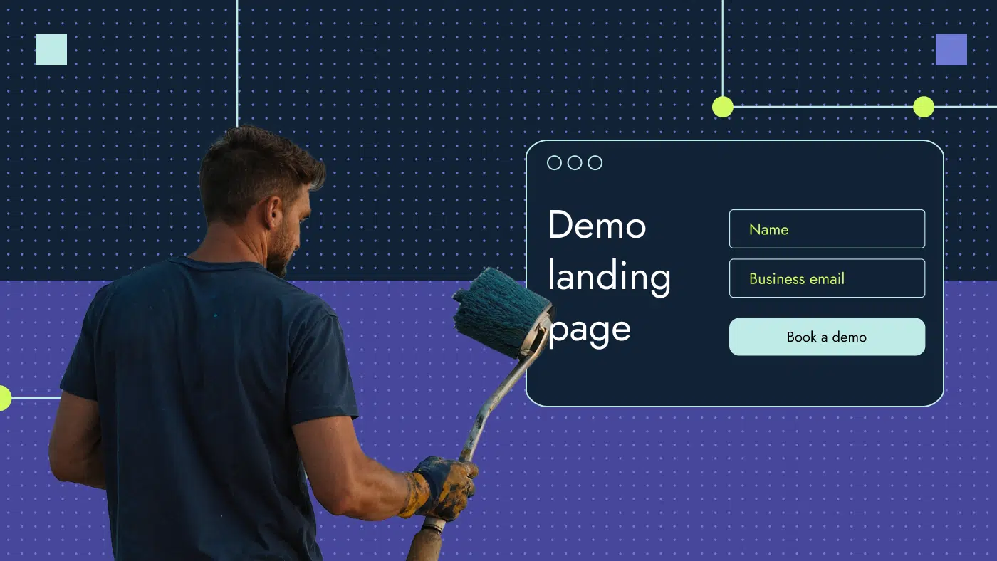
Anatomy of the best “get a demo” pages
Creating a landing page is not a hard process. In this section, I’ll break down the components that contribute to an effective get a demo page that converts SaaS buyers.
1. Headline
A well-written, catchy and actionable headline on your B2B demo page grabs attention right away and helps people understand what your product or service is about. The headline also encourages visitors to take action, like checking out features, watching a demo or requesting more information.
2. Form
The form on your B2B demo page is one of the most crucial elements on the page. It collects valuable information about people interested in your product. Having user details means you can stay in touch, answer questions and guide people through the whole buying process. In addition, the info you get offers insights into your audience, their challenges and their expectations, enabling you to refine your marketing strategies.
💡Pro tip: An intelligent captcha in a form adds an extra layer of security, ensuring that real users provide information while preventing automated bots from interfering. 🤖
3. Call to action (CTA)
A call to action (CTA) on your B2B demo page is not just a friendly guide but a mandatory element, directing visitors on what to do next, whether it’s scheduling a demo, exploring features or getting in touch, turning interest into action.
💡Pro tip: Many B2B landing pages feature generic CTA buttons like “Submit” or “Get started.” These vague prompts leave visitors uncertain about what they’ll receive upon clicking. To encourage follow-through, try specific CTAs like “Get a call,” “Get a custom solution” or “See demo recording.” By setting clear expectations, you’ll enhance the user experience and drive action.
📚Keep reading: Learn how to choose CTA color in my guide on the top 10 colors that make people buy.
4. Unique value description
The value description on a B2B demo landing page plays a crucial role in the narrative of your product or service. It should be benefit-focused and purposeful, addressing your users’ pain points directly. Think of it as a guide that highlights how your offering makes businesses’ lives easier and more efficient. This section is not just about features; it’s about showing how your solution directly addresses users’ needs and challenges.
💡Pro tip: Use simple and short bullet points to make the description easy to skim.
5. Product screenshots if any are available
Product screenshots on a B2B demo page are visual storytellers. They help customers see what your product looks like and how it works. By seeing the actual screens, customers understand better how the product can help them. Screenshots build trust and confidence in your solution and give customers a clear idea of what to expect during the demo.
6. Credibility elements
Credibility elements on a B2B demo landing page are like proof points that show your product is trustworthy. They help potential customers feel confident about your product and encourage them to take action, like signing up for a demo or buying. It’s like showing off your track record to prove you’re the real deal. Here are a few examples of credibility elements:
- Customer reviews are stories from people who’ve used your product. They show what they liked and how it helped them.
- In-depth success stories with proven stats show how your product solved a customer’s problem and the results achieved.
- Awards on a demo page are badges of excellence, showing that your product has been recognized for its quality and innovation by industry experts or competitors.
- Well-known industry partnerships show potential customers that your product is endorsed by respected companies in your industry, increasing trust and expanding your market reach.
From crafting captivating headlines to weaving in trust-building customer testimonials, each piece of this puzzle plays an important role in improving your brand perception and driving webpage conversions.
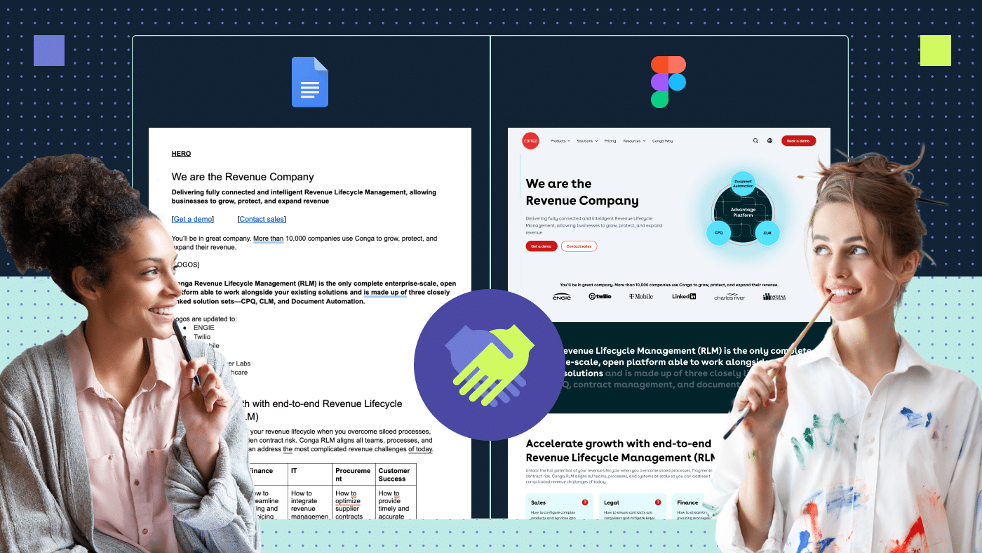
Here’s an example of a perfect B2B demo page from Brinqa. It includes all the essential elements listed above, along with some secret tips I’ll reveal in the next section. So, stay tuned.

How to boost your sales potential: life hacks and best SaaS demo page examples
According to Contentsquare’s Digital Experience Benchmark report, which analyzed 161 billion page views, there’s been a 7.5% decrease in session duration last year. This means we now have even less time to capture users’ attention. With an average time spent on websites being 5.6 minutes and an average session depth of 5 pages, a demo page has only 1 minute to impress users and convert them into customers.

In this section, I’ll share the hacks I’ve personally used to boost webpage conversions and make your page more appealing and captivating. One of our cybersecurity clients even saw a jaw-dropping 50% increase in demo requests. With these nine insider tips, you’ll be equipped to supercharge your SaaS demo page and watch your sales increase.
1. Personalize a demo landing page
Personalization is the key to making your demo landing page stand out. Generic messaging doesn’t cut it anymore. When you customize the content and user experience to match the individual needs and preferences of your audience, the decision-maker you’re targeting quickly sees the relevance and thinks, “Aha, this is for me!”
Here’s how to do it.
- Incorporate dynamic content such as interactive demos or live chat that adapts to the user’s preferences in real time. In this SaaS demo page example from PSPDF, there’s the opportunity to get a tailored free trial of the product through a seamless and user-friendly process.

- Have multiple pages catering to different purposes and audience segments, ensuring that each visitor finds exactly what they’re looking for. A perfect example can be found on the Vector Solutions website, which has distinct SaaS demo landing pages examples tailored to each solution and target audience category:


- Even your call to action can be personalized, with visitors seeing who they’ll be speaking to during the call, adding a human touch to the interaction. See this SaaS demo page example from fluentbooking.com, which offers a user-friendly experience by allowing users to preview who they will be speaking with and the format of the call.

- Include an option for users to call or speak with support if they prefer a quick response and don’t want to wait. See how Nextiva does it.

Even though 71% of customers anticipate personalization from brands, 42% of B2B marketers still haven’t adopted fully personalized marketing strategies. These personalized touches not only make your demo page more engaging and relevant but also foster a deeper connection with your visitors, ultimately driving conversions and sales.
2. Set expectations
On the demo page, lay down the rules before a game. I’m talking about setting clear expectations, so everyone knows what’s coming.
- Clearly state the purpose of the demo, whether it’s to showcase features, solve a specific problem or provide a walkthrough of the product/service.
- Let users know how long the demo will last. This information helps them allocate time accordingly and prevents frustration if it runs longer than expected.
- Specify any technical requirements for participating in the demo, such as internet connection speed, browser compatibility or software installations.
- Outline the topics or sections that will be covered during the demo. This gives users an idea of what to expect and ensures they don’t miss out on important information. Take a cue from CivicPlus, which lays out a comprehensive overview of the demo’s agenda.

3. Make the form as easy as possible to read and fill
When it comes to qualified leads, we’ve all been tempted to ask a laundry list of questions: What’s your name? Phone number? How big is your company? How old is your pet? Enough to make anyone click away.
Instead of bombarding visitors with a long form, offer a breezy demo sign-up. If trimming down your form makes you sweat, remember, you can always gather more info later. Keep the form as concise as possible, providing enough information for your sales team to follow up with a call or email.
Check out parcelLab’s SaaS demo page example with a concise form and an arrow guiding attention directly to it.

4. Keep the page short
When it comes to the length of a B2B conversion page, shorter is often better. A concise page helps maintain visitors’ attention. A good rule of thumb is to aim for a length that allows visitors to digest the content quickly and take action without feeling overwhelmed by excessive details.
💡Pro tip: Don’t forget about placing the form above the fold on your demo page as it can influence conversion rate optimization. By making it immediately visible and accessible without requiring visitors to scroll down, you remove friction from the conversion process and encourage more users to take action.
Tonic has designed an impressive demo page that presents all essential information even without scrolling. Take a look:

5. Run A/B test for conversion rate optimization
A/B testing is a method used to compare two versions of a page to determine which one performs better. It’s like turning your B2B conversion page into a mini laboratory where you mix and match elements to uncover the formula for more demo requests.
Here’s how to A/B test a demo landing page:
- Know your numbers: First, check how many people visited your book a demo page and how many actually sent a request. Calculate the percentage of visitors who booked a demo. According to Capterra’s research, SaaS companies should expect an average website-to-lead conversion rate of 7%. So if your number is less than 7%, there’s room for conversion rate optimization.
- Make different versions: Create different versions of the demo page, each with a small change. You may try different headlines, CTAs, form fields, colors, visuals, layout, copy and customer testimonials to see which one works the best.
- Run the test: Start the A/B test and watch how each version performs. Allow enough time for a sufficient number of visitors to interact with both versions of the page to ensure statistically significant results. Once it’s done, look at the data to see which version is better.
- Choose the winner: If one version does much better than the other, use that one as your new page optimized for conversions.
- Keep improving: Use what you learned to make your demo landing page even better — and keep testing to see what works.

6. Put a calendar on request a demo page
Empowering website visitors to schedule their own demos puts them in control and makes the process convenient. Waiting for an email response is a thing of the past, especially when visitors are eager to get started. Out of 687 demo pages analyzed, only 4% feature calendar schedulers prominently displayed above the fold. What’s intriguing is that many of the companies embracing this approach are newer players in emerging fields like AI, product-led sales, SMS and dev tech.
With tools like HubSpot or Calendly, potential customers can easily pick a date and time that works for them, making the process simple and stress-free.

7. Remove all unnecessary links
When it comes to your B2B demo page, less is often more. Every link on your demo landing page is a potential distraction. By removing unnecessary links, you keep visitors focused on your primary CTA, increasing the likelihood of conversion. But the decision to remove the footer and header has a few nuances to mention:
- The footer often contains important navigation links, contact information and legal disclosures. Removing the footer entirely may influence accessibility. Instead, consider removing non-essential links and information.
- The header typically includes branding elements, navigation menus and search functionality. While removing the header creates a cleaner visual aesthetic, it may also limit user access to essential website features. It’s a good idea to keep the logo that links to the homepage, as this is a common UX practice.
📚 Keep reading: Find out all the secrets of good website navigation design.
Here’s an example I like from JunoJourney, which makes it easy for visitors by removing extra links and keeping the focus on booking a demo.

8. Embed a demo request form directly into the website page
Embedding your demo request form directly into your landing page streamlines the process for visitors. They can book a demo without having to navigate to and load a separate page. This approach enhances user experience and increases the likelihood of webpage conversions by simplifying the journey from showing interest to booking a demo.
Check out CommerceIQ’s website as an example. They’ve embedded a form directly into the homepage.

9. Confirm and thank the prospect
A thank you page is like a virtual high-five for your users. It not only confirms that the form submission went through smoothly but also shows your appreciation for their interest. Plus, it’s a chance to keep users engaged by offering some helpful resources or next steps. This little extra touch goes a long way in building a positive connection with your audience.
The thank you page also helps Google Analytics know when someone has completed an action, like filling out a form. This helps track how well your website is working and how people are using it.
📚Keep reading: Discover how a perfect Thank You page increases your conversion.
Take a look at the thank you page example from parcelLab, where they’ve included an additional product upsell and a link to their resource center, showcasing content they’re proud of.

How to set up demo page submission tracking in GA4
Setting up demo page tracking in Google Analytics 4 (GA4) helps you see how many people submit the demo form. It shows which parts of your website lead to more demo submissions and helps you improve your marketing efforts.
To track demo page submissions in GA4, follow these steps:
- Make a new tag in Google Tag Manager (GTM) to track demo submissions.
- Set up a trigger so the tag fires when someone submits the demo form.
- Write a tracking code to tell GA4 when the form is submitted. Include details like event name and category.
- Test that everything works by submitting the form and checking if GA4 records the event.
- Once it’s working, publish the changes in GTM.
- Navigate to the Events report in GA4 to view data on demo page submissions. You should be able to see metrics such as total submissions, conversion rate and any other relevant data points you’ve configured.
With these steps, you can track how many people submit your demo form and understand their behavior better.
![]()
Build the best demo landing page with Productive Shop
If you’re a B2B SaaS business looking to build a demo page that converts users, reach out to us. From mood board exercises to conceptual wireframes, we make sure to capture your design vision to create demo pages that drive results.

Frequently asked questions
Should the navigation be visible on a demo page?
It’s better to keep the navigation hidden on a SaaS demo page to keep visitors focused on the main action, which is usually to request or schedule a demo. Having visible navigation distracts users from this primary goal and reduces conversion rates. I suggest keeping the clickable logo in the header to allow users to easily return to the homepage, which enhances the user experience.
Should the footer be visible on a B2B demo page?
We should keep the bottom part of the page visible, but let’s make sure there aren’t too many extra links that take people away from the main call to action. I recommend keeping the most important navigation links, contact information and legal disclaimers.
How many form fields should there be on a SaaS demo page?
Keep it simple. Aim to keep the form fields on your demo page as few as possible, ideally no more than what’s necessary to gather essential information for the demo. The form should be positioned above the fold and fully visible without the need to scroll.
Should there be a thank you page after the demo landing page form submission?
Definitely. It’s a good idea to have a thank you page after the form submission. People who filled out the form are usually the most interested in the product, so it’s a good opportunity to offer them additional upsells, subscriptions to resources or other important marketing materials. Plus, the thank you page is valuable for Google Analytics because it marks the completion of a specific action, like submitting a form, allowing businesses to track conversions accurately.
If there is no thank you page, how can you track the conversion of form submission?
If you don’t have a thank you page, you can still track form submission conversions by setting up event tracking in Google Analytics. This involves adding a code snippet to your form submission button that sends data to Google Analytics when the form is successfully submitted.
Is there value in creating internal links to the demo landing page?
Internal links leading to the demo landing page can be quite valuable. They guide visitors directly to the demo, boosting page visibility and SEO. Just be sure to place them strategically, ensuring they align with your audience’s interests and the context of the referring content.
📚Keep reading: What are internal links in SEO and how to build them?
Should there be a popup on exit intent on a demo landing page?
Adding a popup on exit intent to a B2B demo page can be effective in capturing the attention of visitors who are about to leave. It offers them one last chance to engage with your content or take action before exiting the page. Just make sure that the popup is well-designed, relevant and not intrusive to the user, as it can have a bad influence on user experience. Don’t put too many popups on your site; just use a few in important spots to avoid annoying visitors.