 SEO Consulting
  SEO audit
  Uncover market and competitor insights
  Increase Sales Qualified Leads (SQL)
  For CMOs
  For demand generation leaders
  For technology startups
 Enterprise SEO
  Web Search Optimization
  Local SEO
  GEO
GEO  PPC Advertising
  CRM Consulting
  Website Design & Branding
  Website Development
  Web Support
  Web pricing
  Content Writing
  Editorial Calendar
 All resources
  Case studies
  Marketing fundamentals
  Worksheets
  Webinars
  Blogs from the field
  Essential SEO checklists
  Case studies
  The team
  Careers
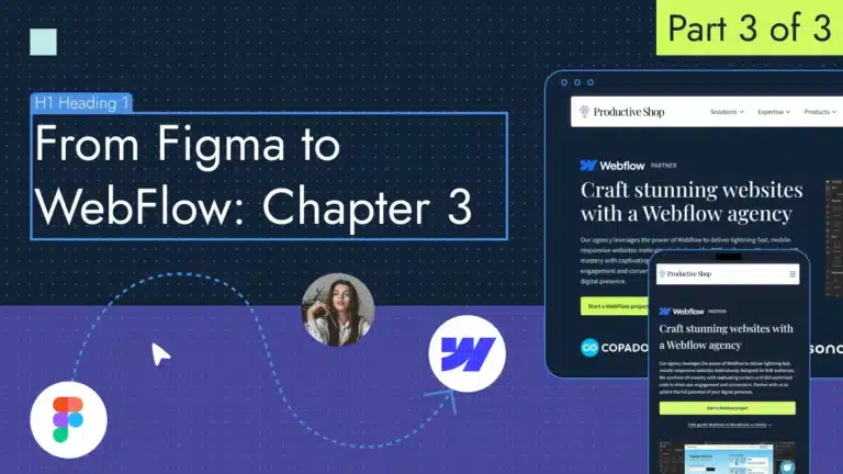
With your landing page designed in Figma and your WebFlow workspace prepared for action in the previous chapters, it’s time now to seamlessly connect the dots between the two platforms. This last part of our journey will provide you with all the steps to smoothly transform your Figma creation into a dynamic, operational landing page within Webflow.
Here’s how to export from Figma to WebFlow:
1. Set up styles in WebFlow
Begin by incorporating all our assets exported from Figma to WebFlow. To do so, select all your files and drag them into the WebFlow environment.

Next, add your own fonts if your brand book includes custom ones, as we have at Productive Shop. Looking for a unique font? Explore our comprehensive guide to find the perfect font that aligns with your business identity. If you’re using the free Google Fonts library, feel free to skip this step.
WebFlow offers two main ways to add fonts to your website:
- Using Google Fonts (WebFlow integrates directly with Google Fonts.)
- Uploading custom fonts.
First, click on the main blank canvas. Then, in the right Settings panel, navigate to the Style tab and scroll down to the Typography section. Click on the preinstalled Arial font, and at the beginning of the dropdown list, you’ll find an Add fonts link. Choose the desired font from the list:

For adding your brand font, in the same new window choose the Custom Fonts section. Assign a clear and descriptive name to your uploaded font family for easy identification within WebFlow.

2. Add content to WebFlow
We will add our content section by section. Here’s a breakdown of the process:
Homepage
- New section: To begin, open your WebFlow project editor and create a new Section element. On the left side of the designer window, click on the Elements panel and choose the desired structure for your section. In our case, since the hero screen is divided into two parts, we’ll use a structure with 2 columns and 1 row.

- Background image or video: To set a background, select the section you want to customize. In the Style panel on the right, navigate to Backgrounds. If you prefer a solid background color, enter the color code. If you want to add an image, click the Plus icon next to the Image and gradient option.

- Headline: Click on the Elements panel at the top left. Search for Headline and drag the element onto your desired section on the canvas. Let’s include the H1 headline.

The headline element will appear with placeholder text. Double-click within the element or select it and press Enter to activate the text editing mode. Adjust the font styles, colors and sizes of your headline using the options available in the right Style panel. Let’s replicate all the styles we have in Figma for the H1 headline.

- Subheadline: The process for adding any element is identical to that of the headline. Drag the paragraph element onto the canvas, input your text and tweak the styles to match those from Figma.
- Set up section margins: Select the section on the canvas. In the Style pane, find the Spacing section. It offers controls for adjusting the top, right, bottom and left margins of your section element. Simply click and drag the handle or enter a specific pixel value to set your desired margins.

💡Pro tip: To set up the section height, you can input a fixed value in the Size panel. However, I recommend using Margins setup instead. This allows the section to adjust automatically based on the content within it, making it more suitable for responsive design.
- Button: Find the button element on the left Elements panel and drag it to the canvas. The button will appear with default text like Button. Double-click within the button element or select it and press Enter to edit the text. In the Style panel, adjust properties like background color and hover effect for buttons. Control border style, padding, font family and size to customize button appearance. In the Link settings panel (within the Style panel), you can add the URL to link to.

💡Pro tip: Hover over the color field, press on a purple Plus icon and create a new variable. WebFlow variables act like central storage units for design values like colors, fonts and spacing. This allows you to easily apply these styles consistently throughout your website and streamline the design process.

- Image: To add an image in WebFlow, click the + icon, find the Image element and drag it to the desired location. Double-click the image on the canvas to open the settings panel, where you can choose Replace Image and select the needed image. Adjust the size and position of the image directly on the canvas or in the Styles panel.
💡Pro tip: Always add alt text to your images. This provides alternative text descriptions for visually impaired users and improves your search engine optimization (SEO) results.
- Eyebrow: First let’s add a WebFlow image at the top of the text section by dragging from the Elements panel. Then add a paragraph for our “WebFlow partner” text. We see that they are located in a column, but how can we make them side by side?
We will use the Navigator panel that is on the left side of the designer window. Group the items into a Flexbox (CTRL+G combination). Then, in the Layout settings on the right side, adjust the alignment to center-left and add a gap between elements.

💡Pro tip: WebFlow offers the option to create reusable components. Select the element or group of elements you wish to convert into a component and right-click to create it. Next, access the Components panel on the left and easily drag and drop the component onto your canvas. Components streamline your workflow by enabling you to reuse pre-designed elements across your website, saving time and effort.

Logo bar
To add a logo bar, begin by inserting a new section and configuring it with a Flex layout. Then, use the Elements panel to drag and drop Image elements onto the canvas and add logos by double-clicking on it.
- In the Style panel for the Flex container, customize attributes such as background color, padding and overall styling for your logo bar.
- Leverage the Flexbox options within the Layout section to manage the horizontal and vertical alignment of your logos within the container.
Value proposition section
According to our design, this section comprises a headline and tabs. We’ve covered creating the headline, so now let’s explore adding tabs. WebFlow provides a built-in Tabs component, making it straightforward to create tabbed content sections.
- First, create a new section and adjust the top and bottom paddings as needed.
- Next, navigate to the Elements panel and choose the Tabs dragging it onto the canvas.
WebFlow’s Tabs component comes with three pre-built tabs by default. I will set the first tab as active open:

In the Layers panel, we see Tabs menu and Tabs content:
Tabs menu
This refers to the horizontal or vertical list of labels displayed at the top or side of the Tabs component. Each label represents a separate content section. You can customize the appearance of the tabs (font, color, size) through the Style panel. The tab that is currently selected should look different from the others so users know where they are.
In my example, I included five tabs, changed the tab layout to vertical, set up the width and height for each tab and added text. Then, I customized the background and borders for both active and inactive tabs.

Tabs content
This refers to the individual sections of content associated with each tab in the Tabs menu. You can add different elements like text boxes, images, videos, forms, or even other WebFlow components inside each tab’s section.
For our tabs content section, I added two containers to accommodate text and image in two columns. Then, I dragged and dropped the necessary elements from the Elements section and adjusted their settings in the Styles panel.

💡Pro tip: If you’re unsure how to create a section in WebFlow, find inspiration from real-life examples in the Made in WebFlow gallery. This platform showcases websites built entirely with WebFlow, and many are available for cloning. You can use them as a starting point for your own project or copy specific sections you’re interested in.
Reviews/case study section
The review section includes most of the elements we’ve covered so far. Follow these steps:
- Begin by creating a new section and inserting two horizontally aligned blocks inside.
- Add a background color in the Styles panel.
- On the left block, add content such as text and buttons, while on the right block insert an image from our assets gallery.
- Since the image aligns with the section borders, apply paddings only to the text section.

The last question is how to add a quote sign near the text without disrupting the layout and grid. Simply drag your SVG icon from the Assets panel to the main section on the canvas. Then, in the Styles panel find the Position section and switch it to absolute. Absolute positioning allows you to remove an element from the normal document flow and precisely control its location on the page. Finally, adjust the position of the image on the canvas using the margin settings.

Successful cases section
Our section with case studies has six examples, and I want them to scroll continuously in a carousel. Let’s see how to do this in WebFlow:
1. Set up the carousel container
From the Elements panel (left side), drag and drop a Div element onto your canvas. In the Style panel (right side), find the Name field at the top and rename this Div element to Carousel.
2. Create the visible logo section
Within the Carousel Div element, drag and drop another Div element. In the Style panel, rename this Logo section. This section will hold the logos initially visible when the page loads.
3. Add the first logo
Inside the Logo section, drag and drop an Image element onto the canvas. In the Style panel, rename this Image element to Logo. This naming convention is crucial for creating a reusable component later.

4. Duplicate the Logo element
To duplicate the logo, right-click on it and select Duplicate from the menu. Then, double-click to replace the image with a new one. Since I want only three cases visible at once, I’ll add three images and adjust the spacing between them to distribute them on the page.

5. Set Logo section width
Ensure the section spans the full width of the screen regardless of screen size. To do this, navigate to the Size section in the Styles panel and set the minimum width to 100%. This step is crucial to prevent the logos from overlapping in the next step.
6. Duplicate the Logo section
Duplicate the Logo section within the Carousel and upload additional logos to be displayed during scrolling.

7. Set up your carousel
To enable horizontal scrolling, align all images horizontally. Choose the Carousel section, switch the layout to Flex and set the direction to Horizontal. Now the logos are displayed in a single row, extending beyond the canvas.

8. Hide overflowing content
To prevent all logos from being visible simultaneously, adjust the overflow setting to Hidden in the Styles panel.

9. Create the scrolling animation
Select the parent Carousel Div and go to the Interactions panel (within the Style panel). Here, you’ll create an animation to achieve the scrolling effect. Next, choose Page load as the trigger for the animation. This will initiate the animation as soon as the page loads.

In the new window that appears, select Start an animation as the action, then click the plus icon to add a new animation setting.

Add a new animation name, choose Logo section on the right panel and select Move as the effect.

Apply Class effect to ensure this animation is applied to both of our Logo section.
Next, set a negative horizontal move value (e.g., -100%) for the animation. This defines the total distance the logos need to scroll to reveal all logos within the carousel container (since Overflow is hidden).
You should also set the animation duration to control the scroll speed.

The animation is functioning, but it begins with the incorrect image. To rectify this, duplicate the Move action on the timeline and set all properties to zero for the first Move action in the list.
Save and enable the Loop option to create a continuous scrolling effect, ensuring the animation repeats seamlessly. Click on the Preview button to see how it works.
CTA section
Our main call to action (CTA) section element is a form. Let’s break down the six steps to efficiently build and set up it in WebFlow:
- Drag and drop a Form element onto your canvas in the desired location. In my scenario, I first added a blue fullscreen section, within which I nested a gray section. Then, I divided the gray section into two parts: one for the text and another for the form.

2. Within the Form, add needed form fields using the Elements panel. These are the usual ones:
-
- Text input: Capture user information like name, email, etc.
- Textarea: Allow users to enter longer text responses.
- Select (or dropdown): Provide pre-defined options for users to choose from.
- Checkbox or radio button: Enable users to select single or multiple options.

3. Navigate to the Settings section in the Style panel. Here, you can set a redirect URL for after form submission and choose the submission method:
-
- Default: Submits the form data to WebFlow for later review within the project.
- Logic: Allows you to connect the form to an external service like email marketing platforms (requires additional setup).

4. Customize the inputs and button text and style them using the Style panel (font, size, color, background etc.).
5. Set up dropdown options for your form. Navigate to the Settings panel and find the Choices section. Here, you can define the available options within the dropdown. Simply click the + icon to add a new option.

6. Add success and error states. Select your form element on the canvas, then go to the Style panel on the right or click on the Gear icon. Modify the thank you text and adjust its appearance using the Style panel options, such as font styles, colors and positioning.

Header
There are two main ways to add a header in WebFlow.
1. Using the built-in header section (simple approach)
This is the easiest method for creating a basic header. Drag and drop a Header section element from the Elements panel onto your canvas at the top of your website. This pre-built section provides the structure for common header elements like navigation menus, logos and CTAs. You can customize the pre-defined elements within the Header section using the Style panel. This includes changing fonts and colors, adding backgrounds and adjusting spacing.

2. Building a custom header from scratch (greater control)
This approach offers more flexibility in designing your header’s layout and functionality.
Drag and drop a Div element onto your canvas at the top of your website. You can add various elements to build your header inside:
- Logo element: Drag and drop a Logo element to represent your website’s logo.
- Navigation menu: Use Link blocks from the Elements panel to create a navigation menu.
- Button: Add a Button element for a CTA button.
- Other elements: Include additional elements like search bars, icons, or social media links as needed.
Once you’ve added the desired elements, use the Style panel to customize their appearance and layout.

Footer
Creating a footer follows a similar logic to building a header, as you can:
- Opt for the built-in footer section
- Customize your own, if needed.
To add a custom footer, simply drag and drop a Div element to the bottom of your website canvas, then populate it with various elements as required:
- Links: Drag and drop Text link elements and link them to relevant pages.
- Social icons: Use icons or images linked to your social media profiles. WebFlow offers built-in social media icons within the Symbols panel.
- Copyright text: Add a Text element and include your copyright information.
- Additional elements: You can include awards, partners (as in our case), newsletter signup form or other relevant elements based on your needs.

3. Adopt a responsive design
In today’s mobile-first world, a landing page that doesn’t adapt to different screen sizes simply isn’t enough. Responsive design ensures your landing page delivers a seamless experience, no matter if visitors are browsing on a desktop, tablet or smartphone. WebFlow offers powerful tools to create responsive websites.
Here’s your guide to crafting a landing page on any device:
3.1 Identify breakpoints
Decide on the key screen sizes (breakpoints) you want to optimize for (e.g., desktop, tablet, mobile). WebFlow typically uses pre-defined breakpoints on the top center Navigator panel, but you can customize them by clicking on the three dots icon.

3.2. Adapt the layout for each breakpoint
Click on each breakpoint (e.g., mobile) to enter the dedicated view. Here, you’ll adjust all the settings specifically for that screen size:
- Grid system: Leverage WebFlow’s grid system to re-arrange elements as needed for smaller screens. You might stack elements vertically instead of displaying them side-by-side on desktop.
- Style panel adjustments: Within the Style panel, adjust element properties like width, margins and padding for optimal placement on smaller screens.
- Text: Ensure your text remains readable across all devices. Use the Style panel to set font sizes and line heights that automatically adjust based on the viewport size.
- Images: Adjust the size of your images to fit the screen width by setting both the width and height to 100%. This ensures that your image spans the entire screen while maintaining its original proportions.

3.3. Review and refine
Once you’ve adapted the layout and styles for each breakpoint, switch between desktop, tablet and mobile views in the Navigator panel to ensure a smooth transition and optimal user experience across all devices. Make any final adjustments as needed.
4. Streamline the process with a Figma to WebFlow plugin
At last, the landing page is complete. But is there a simpler way to streamline this process?
Absolutely. The Figma to WebFlow plugin is a tool designed to connect Figma and WebFlow. It enables designers to seamlessly transfer their designs from Figma directly into WebFlow, eliminating the need for manual exporting and importing. The plugin converts Figma layers into their HTML and CSS counterparts, which is essentially the code that WebFlow generates when you visually design your site.
While using this plugin simplifies the process, it demands a proficient understanding of Figma for accurate migration. Get started with these five steps:
4.1. Install the plugin
The Figma to WebFlow plugin isn’t downloadable in the traditional sense. It resides within the Figma application itself and connects to your WebFlow account. For that, go to Figma Community and save the plugin into your Figma environment.

4.2. Locate the plugin in Figma
All the saved plugins you can easily find in the Plugins tab in the Main menu.

4.3. Connect Figma and WebFlow
Launch the plugin in Figma and click on the Connect account button in the popup window. In the new browser window that appears, choose your WebFlow project where you intend to insert the page and then click on the Authorize app button.

4.4 Prepare your Figma design
Once the plugin is installed and linked, migrate your Figma designs to WebFlow. Start by organizing your Figma design, using features such as Auto Layout for responsive layouts. This ensures that all elements are appropriately transferred during the process.
Understanding auto layouts in Figma takes some practice. You can improve your skills by following tutorials specifically designed to help you grasp this feature.

4.5. Use the Figma to WebFlow plugin
In your Figma canvas, select the design elements you want to transfer to WebFlow. Open the Figma to WebFlow plugin and choose the WebFlow site where you want to import the design. You can also select the template for your section (like header, footer or hero) to ensure it functions properly.

Open your chosen WebFlow project and page. Then simply paste the design (Ctrl/Cmd + V) onto the WebFlow canvas. And there you have it, the page will look identical to how it appeared in Figma, with layer names accurately transferred.

However, there are limitations to the Figma to WebFlow plugin:
- Functional sections like tabs or sliders cannot be pasted accurately, as Figma lacks support for such functionality. These sections will end up appearing as images, requiring manual recreation in WebFlow.
- Creating a fully functional responsive design is not possible due to Figma’s constraints. While Figma enables adjustments to section width and element placement for responsiveness, finer details like font size and spacing for smaller screens must be manually configured in WebFlow.
5. Publish the website from Figma to WebFlow
Here’s a step-by-step guide on how to publish your landing page:
- Review and test: Before publishing, thoroughly review and test your landing page to ensure everything is working as intended. Check for any errors or issues that may affect the user experience. Use the preview Play button to see how the page will look when it’s live.
- Choose publish destination: In the top right corner, locate the Publish button. A pop-up window will appear. Here, you have two options:
- Publish to WebFlow.io subdomain: This is the default option and publishes your landing page to a subdomain provided by WebFlow (e.g., your-project-name.webflow.io).
- Publish to selected domain: This allows you to publish your landing page to your custom domain name.

- Click Publish: Once you’ve chosen your publishing destination, click the final “Publish” button to make your landing page live on the web.

And there you have it! We’ve designed the landing page, created it in WebFlow and successfully launched it. Was it simple? Well, not exactly, especially for the initial page.
I hope this Figma to WebFlow tutorial made this process smoother for you, and I’m sure the next page will be even easier to put together. But if you’d rather save time and stress, reach out to us and we’ll design and launch a stunning website for you.