 SEO Consulting
  SEO audit
  Uncover market and competitor insights
  Increase Sales Qualified Leads (SQL)
  For CMOs
  For demand generation leaders
  For technology startups
 Enterprise SEO
  Web Search Optimization
  Local SEO
  PPC Advertising
  CRM Consulting
  Website Design & Branding
  Website Development
  Web Support
  Web pricing
  Content Writing
  Editorial Calendar
 All resources
  Case studies
  Marketing fundamentals
  Worksheets
  Webinars
  Blogs from the field
  Essential SEO checklists
  Case studies
  The team
  Careers
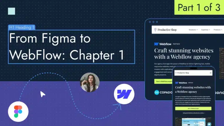
I’ve always believed that there’s no better way to learn a tool than simply diving in and creating something with it. So, instead of just talking about how to design a web page in Figma, let’s use a real-world example. Since the Productive Shop website didn’t have a landing page dedicated to our WebFlow design and development services, I took this opportunity to practice by creating one from scratch — on Figma.
Since we’ve already covered the basics of Figma and page structure creation, let’s jump right into the design process.
Set up a project in Figma
Let’s start by familiarizing ourselves with the tools and settings that will assist us in achieving our goal of designing a landing page in Figma.
Here are the seven steps to set up a project in Figma.
- Create a Figma account: Go to the Figma website and click on the “Get started for free” button (usually located in the top right corner).
- Create a Figma file: Click on Drafts or + in the top right corner of the screen. By default, the file is named “Untitled.”

3. Explore the software layout: Within a Figma file, you can access four main areas: the workspace, toolbar, settings panel and layers panel.

4. Add frame: A frame or artboard is the primary design element in Figma, serving as the page for our website. You can set frame sizes manually or choose from the preset screen sizes in the toolbar on the right. I recommend using 1440px weight for a frame. As you design within the frame, layers are added in the properties panel on the left. Layers in Figma represent the content on the page, including objects, text and images.

5. Add grids: The grid in Figma helps organize all web design elements within the frame and easily transfer them to WebFlow. To set up the grid, click on the + icon in the layout grid section and configure the grid settings. For our website, we’ll use 12 columns with a 24-pixel gutter and a 100-pixel margin.

6. Setup font styles: Font styles are essential for configuring different text elements (from H1 headings to paragraph text) to ensure consistency throughout the web page, in line with the overall website design and brand book. Navigate to the local styles section in the right panel and select text. From there, add the name, choose the desired font family from the dropdown menu and adjust the font size, weight, style and leading.

7. Setup colors: By establishing color styles, along with fonts, we can maintain consistency across the website. To create a new style, access the local styles section in the right panel of Figma and choose color. Then, assign a name and input the color code from your brand book to define the color style.

📚Read more 👉 Everything about choosing the right colors in case you don’t have a brand book.
Build a website with Figma
With our work environment set up, it’s time to start designing our landing page in Figma.
Let’s focus on the eight main sections it should contain.
1. Header
The header is the top section of a web page. Here’s what it looks like on our website.

Begin by creating a new frame using the frame tool (rectangle icon) in Figma. Define the desired width of your header, typically spanning the entire width of the artboard. The header typically includes these elements:
- Logo: Most headers prominently feature a company logo. You can upload your logo image file and place it within the frame.
- Navigation links: A menu bar provides essential links to different sections of your website. You can use the pen tool to create navigation elements and the text tool to create menu labels. Consider using auto layout alignment to manage spacing between navigation items.
- Button: For specific actions you want users to take (e.g., “Sign Up,” “Get Started”), consider including a prominent call to action (CTA) button within the header. Create a button by drawing a rectangle, typing the text and centering it.
Use Figma’s design panel to the right to style your header elements. Apply colors, text styles and shadows.
📚Read more 👉 How to design a perfect website navigation.
2. Hero section
The hero section, often the first impression visitors encounter, plays a crucial role in grabbing attention and communicating your website’s value proposition.
Begin by creating a new frame using the frame tool (rectangle icon). Then:
- Consider using a background image or video to set the visual tone. You can upload your media file and place it within the frame. Alternatively, explore using solid color backgrounds, gradients or subtle textures for a more minimalist approach.
- Write a clear and concise headline that captures attention and communicates your website’s core value proposition. Use Figma’s text tool, applying an H1 font size from the design setting panel. I will include a brief explainer text below the headline to provide more context about our offering. Keep it concise and informative.
- Choose visuals that resonate with your brand message and target audience. After all, a high-quality hero image or video can enhance the visual impact of your section. In this case, I used the screenshot from the Copado website designed on WebFlow.
- Incorporate icons or illustrations to emphasize key aspects of your offering or visually represent complex concepts. I included a WebFlow logo to signify that the page is specifically dedicated to it.
- Don’t miss the chance to guide visitors towards a desired action. Include a clear and prominent call to action button. Use a strong verb to encourage clicks. I’ll duplicate the CTA from the header to maintain website consistency, increasing its size and changing its color for better contrast. Then I will align all our elements within the hero section.
3. Logo bar
The logo bar is typically positioned at the top of a web page, either below or within the hero section. It’s essential for brand recognition and enhances your website’s credibility.
So how to create one? Begin by creating a new frame using the frame tool. Then, upload your logo image files (e.g., PNG, SVG) and place them within the frame. Maintain proper spacing between the logos for clarity and a balanced composition. Use Figma’s auto layout features to manage spacing dynamically, especially if your logo items have varying lengths.
4. Value proposition section
The value proposition section acts as a prime salesperson on your website or landing page, convincing visitors why your product or service is the solution to their problems. Considering the short attention span of website visitors (according to Contentsquare’s report, the average time spent on a page is just 54 seconds), I recommend placing it directly below the hero section. This way, you can capture user attention early and maximize engagement.
Here’s the list of required components:
- Add a clear and concise headline that speaks directly to your target audience’s pain points. Use bold font for impact and apply the H2 text style from the design panel.
- Expand on your value proposition using bulleted points, icons or concise text snippets to emphasize the main features and benefits of your product/service. Concentrate on demonstrating how your offering addresses user needs and provides value. To ensure easy scannability, consider using tabs — with clear headings, brief descriptions and CTAs for each tab. Use H3 headings for the tabs to establish a clear hierarchy.
- Show, don’t just tell. Incorporate visuals to complement your text. Consider using illustrations or screenshots to visually represent your value proposition and its impact. Make sure your images match the overall vibe of your brand.
This is how the value proposition section looks like on our page for WebFlow services:

5. Reviews
A well-designed reviews section can boost trust and credibility for your website.
Begin by creating a new frame. Within a review card, include the following elements:
- Title: Make an attention-grabbing heading that tells people what the review is all about and makes them want to read more.
- Review text: The core content of the review, where the user expresses their experience, opinion and insights about the product or service.
- Reviewer name and photo: Images and names add credibility to the review, associating it with a real person.
- Affiliation: Include the reviewer’s company, designation or any relevant association that adds context to their review if possible.
- Call to action: Depending on the goals, you may include a CTA button within the card, prompting users to read more about the product or read the full case story.
If you have multiple review cards, consider adding navigation elements like arrows, sliders or dots to indicate that users can scroll to see more.

6. Successful cases section
Showcasing successful projects acts as social proof, demonstrating your expertise. The case studies section illustrates the types of projects you undertake, the problems you solve and the value you deliver to clients.
So how to do it? First, create a frame and choose a layout. For the Productive Shop page, I’ve chosen the carousel. It’s ideal for showcasing many cases with limited space. Users can swipe or click arrows to navigate through them.
A perfect successful cases section should consist of these elements:
- Title: A clear and concise headline that captures the essence of successful projects.
- Visual element: An image, icon or short video clip related to the case study that can enhance visual interest.
- Brief description: A short overview of the challenge, solution or achieved results. Keep it concise and highlight key points.
- Client logo (optional): The client’s logo adds credibility and brand recognition. In this case, I used screenshots of clients’ websites that display their logos.

7. CTA section
Let’s start with a clear objective: what action do you want users to take after viewing your content? This could be signing up for a free trial, requesting a demo, making a purchase, downloading a resource or subscribing to a newsletter.

Here’s a rundown of the necessary elements:
- Add a headline. Use strong verbs and clear language to communicate the desired action. Keep your message short and impactful (ideally under five words).
- The CTA section might include a form. Add only the fields necessary to complete the desired action. This could be an email address, name, phone number or a combination depending on your goal. Clearly label each form field using concise and descriptive language.
- Include a clear CTA button within the form, echoing the desired action users should take (e.g., “Sign Up Now,” “Request a Demo”). Make your CTA button stand out from the surrounding elements. Use contrasting colors, bold fonts and clear borders to draw user attention.
If you’d rather not display a form but include only a CTA button, leading users to a dedicated landing page where they can make requests, check out our guide for crafting an ideal B2B demo landing page.
8. Footer
The footer is the section located at the bottom of a web page. Consider designing these common elements:
- Navigation links: Provide essential links to navigate your website such as the About us page, contact, services or sitemap.
- Copyright information: Include your company’s copyright statement and year.
- Social media links: Integrate icons or buttons linking to your social media profiles.
- Legal links: Include links to legal documents like privacy policy or terms of use.
- Contact information: Display your contact details like email address or phone number.

Prepare your web page assets in Figma
Before transitioning the design to WebFlow, it’s essential to properly prepare our assets. Here’s a step-by-step guide on how to do that:
- Use a clear naming convention: Name your layers and frames descriptively in Figma. This makes it easier to identify and locate them in WebFlow during the import process. Consider using a hierarchy (e.g., Section/Component Name/Element) for clarity.
- Group related elements: Group together elements that belong to the same component or section in Figma. This allows for easier import and organization within WebFlow.

3. Export images: For image assets (logos, photos), use recommended image formats like PNG or JPEG depending on the image type and desired level of transparency. I suggest exporting in 2x to ensure better quality and prevent image pixelation. Select an element and choose Export on the right design panel.

📚Read more 👉 Comprehensive tutorial on exporting assets from Figma.
4. Export SVG vectors: For WebFlow, the preferred format for icons and illustrations is usually Scalable Vector Graphics (SVG). This format ensures vector elements remain scalable and editable within WebFlow.

Now we’ve designed our landing page in Figma, let’s learn how to convert your design to WebFlow in the upcoming chapters of this tutorial.
But if you don’t want to spend time and effort learning Figma, contact us and we’re happy to create a high-performing landing page for you.