When I started out in UX design, I assumed talent and creativity would be enough to carry a project. What I quickly learned is that without a solid UX process, even the best ideas fall apart. Teams miscommunicate, goals shift and you end up designing something that looks good on Figma but fails for the user or the business.
The difference between a chaotic project and a successful one? Process.
A UX workflow aligns every team member from the start, backs decisions with real data and ensures that what our team builds actually solves real problems — for users and for the bottom line.
This guide walks you through the exact UX design process our team uses on our B2B SaaS client projects — from research to handoff and post-launch analysis. Whether you’re an internal lead or a technology brand considering our services, get to know the roadmap I follow to deliver consistent results.
Key highlights:
- A successful UX design process starts with deep user and stakeholder empathy, combining interviews, data analysis and competitive research to uncover real problems worth solving.
- Clear problem definition, value proposition alignment and realistic constraints help teams avoid scope creep and focus on what drives the most impact.
- Structured ideation, wireframing and usability testing ensure that solutions are validated early, reducing wasted effort and creating intuitive, user-centered experiences.
- At Productive Shop, every web design project moves from polished UI design to developer-ready handoff, QA and analytics, delivering scalable, high-performance digital experiences.
What is the UX design process?
The UX design process (user experience design process) is a structured, user-centered approach to solving problems through design. It provides a consistent way to translate user insights into design decisions, using research and iteration as its foundation.
UX process is rooted in psychology, cognitive science and human-computer interaction. A UX designer understands how people think, behave and feel when using technology — and then design around those insights.
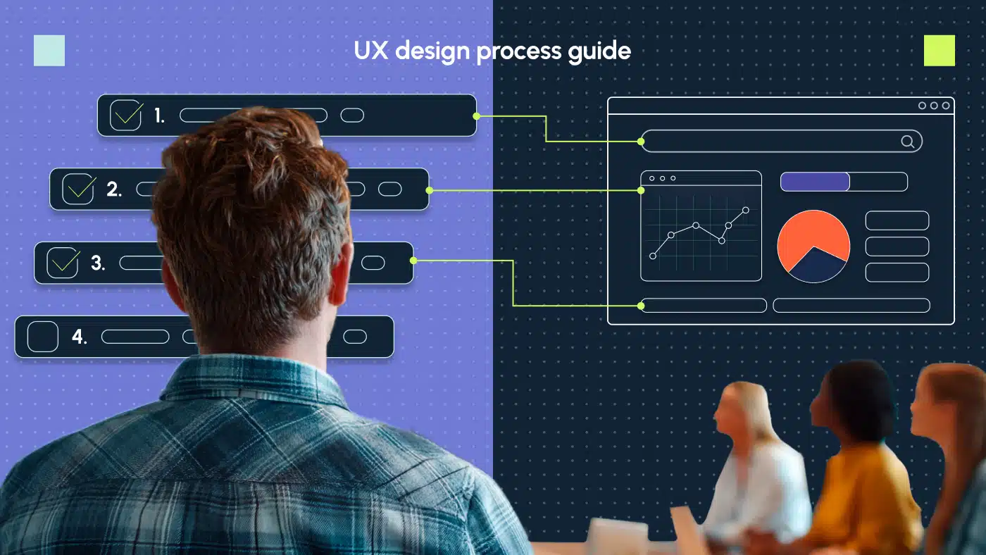
8 proven UX design process steps
A typical UX design process involves these eight key steps, even though each team might tailor them to fit their workflows:
- Empathize: Gather information and conduct research to understand needs, pain points and goals
- Define: Analyze findings and frame a clear problem statement
- Ideate: Brainstorm and generate ideas for solving the problem
- Wireframe: Build low- to high-fidelity mockups of potential solutions
- Test: Gather user feedback to validate and refine design decisions
- Design: Create final visual designs and UI elements that reflect branding and usability principles.
- Handoff: Deliver dev-ready files and documentation
- Analyze: Monitor performance and iterate post-launch
Every project is different, but I always follow this general arc — keeping everyone aligned, limiting unnecessary rework and producing better outcomes across the board.
UX design step 1: Empathize with the user
UX design is all about empathy — understanding what users need, how they feel and what frustrates them. It’s about stepping into their shoes to design experiences that aren’t just functional but actually make sense and feel good to use. When designers put empathy first, they create products that feel natural, intuitive and even a little bit personal.
The empathy stage lays the foundation for every decision that follows. Here, I gather insight from users, stakeholders and data to understand pain points, motivations and goals.
This first step of the UX design process usually includes:
1.1. Stakeholder briefing and client interviews
During this UX design phase, I start building empathy not just for the users, but for the stakeholders, business objectives and the product or service itself.
I go beyond deliverables to get the full project context:
- Business goals and KPIs
- Product positioning and key features
- Known issues with the current experience
- Target audience segments
- Competitive landscape
Once I’ve looked over the starting materials, the next move is to talk with the client (including product, marketing or sales teams). These chats give me more details and help clear up things that aren’t obvious from the briefing papers.
1.2. Competitive analysis
In the process of UX design, I first review direct and indirect competitors to understand:
- Feature parity and gaps
- UX best practices in the category
- Design trends, usability issues and market opportunities
When it comes to UX design analysis, your competitive matrix may look like a table:
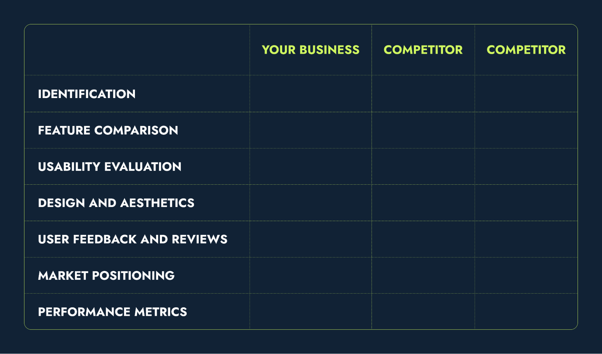
You can also download our popular competitor matrix worksheet.
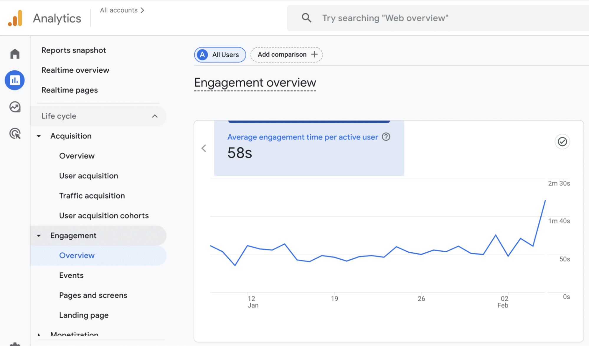
1.3. Analytics review
Analytics reviews give me helpful information about how users interact with a product. I can spot patterns, behaviors and issues users face by looking at this data. So, I can make design decisions based on actual user actions instead of assumptions.
Using tools like GA, Hotjar and Mixpanel, our team identifies:
- Drop-off points, bounce rates, conversion bottlenecks
- Behavioral patterns across user segments
- Friction in navigation or task completion
1.4. User interviews
Unlike quantitative data, user interviews provide rich, narrative feedback that uncovers the “why” behind user behaviors, helping to create more informed and empathetic designs. I speak directly with end users (or close proxies) to uncover:
- What frustrates them
- What tasks they are trying to complete
- What tools or workarounds they currently use
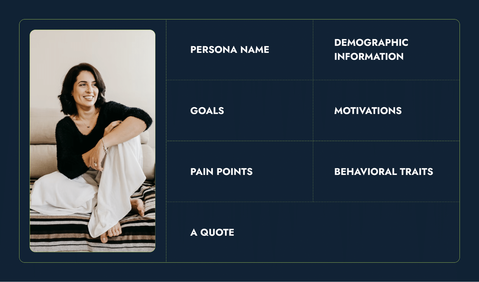
1.5. User personas
Our team distills everything into actionable personas and journey maps to guide ideation and prioritization later on. Personas are made-up characters that represent real users’ traits, goals and behaviors.
Usually, making three to eight personas is enough to cover most types of users for a product. A good persona has these details:
- Basic information: Name, age, gender, occupation and location
- Goals and motivations: What the user wants to achieve and why it matters to them
- Pain points: Key challenges or frustrations they face
- Behavioral traits: Habits, preferences and attitudes toward technology or similar products
- A visual representation: A photo or illustration to make the persona more engaging
- A quote: A statement that summarizes their perspective (e.g., “I need a tool that saves me time, not one that makes things more complicated”).
Use the following persona card as one of the UX design process templates:
1.6. User journey map
A user journey map is a picture that shows the steps a person takes to get something done when using a product or service. It points out what they do, how they feel and any problems they face. The map has these main parts:
- Stages/actions: The major steps in the user’s interaction with the product (e.g., awareness, consideration, engagement, purchase, post-purchase).
- Tasks: What the user does in each phase (e.g., searching for information, comparing options).
- Feelings: Emotional adjectives (e.g., excited, frustrated, relieved) to represent the user’s experience at each step.
- Improvement opportunities: Suggestions for optimizing the experience at each step (e.g., clearer navigation, faster loading times).
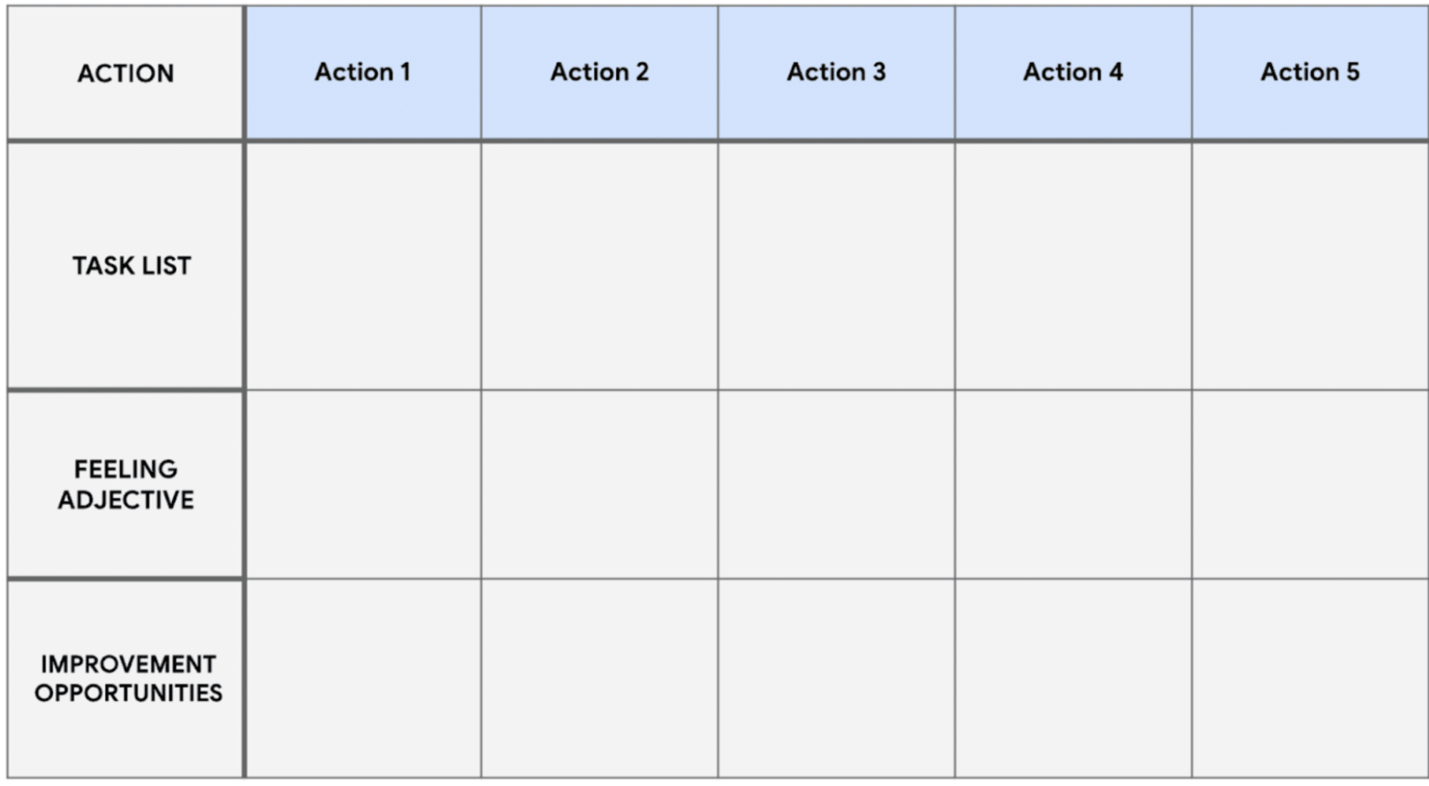
By structuring the user journey map with actions, tasks, emotions and opportunities, you’ll create a tool that identifies user pain points and provides actionable insights to improve the experience.
UX design step 2: Define what you want to accomplish with the project
Once I understand the user landscape, it’s time to sharpen the focus. The second phase of UX design consolidates all I learned from research into a clear problem statement and a practical design brief.
In this early stage UX design process, I define:
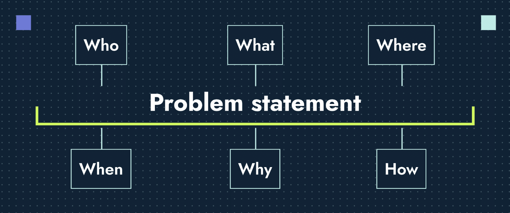
2.1. Problem statements
I articulate the core user and business challenges using the 5Ws and H framework:
- Who: Which users face the problem
- What: The exact pain point
- Where/When: The context and timing of the issue
- Why: Importance of the product
- How: Current user behavior or workarounds
2.2. Value proposition
I define the product’s “why us” — what it offers that directly solves the user’s need and differentiates it from competitors. This comes from:
- Matching features to pain points
- Synthesizing research insights
- Validating gaps from competitor reviews
2.3. Success metrics and KPIs
I translate project goals into trackable outcomes:
- Usability: Task success rate, error rate, time on task
- Engagement: Session duration, return visits
- Conversion: Form fills, purchases, key action completions
At this stage, it’s also important to define design team KPIs to measure the effectiveness of the user experience design methodology and ensure continuous improvement. These KPIs help evaluate the team’s impact on user experience, business goals and overall project success.
Key design team KPIs may include:
- Brand consistency score
- Design system adoption
- Stakeholder brand alignment
- First-draft approval rate
- Design system adoption
- On-time delivery
- Response time
2.4. Graphic design project constraints
Project constraints are factors that affect the scope in a UX design project. Dealing with them early on in the planning stage helps create a practical plan and makes the work run smoother.
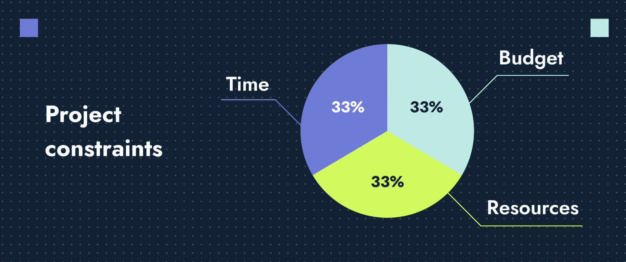
Our team defines what’s fixed (and what’s flexible) across:
- Timeline: Milestones, review dates, launch deadlines
- Budget: Research scope, tools, rounds of iteration
- Resources: Team capacity, available developers, decision-maker access
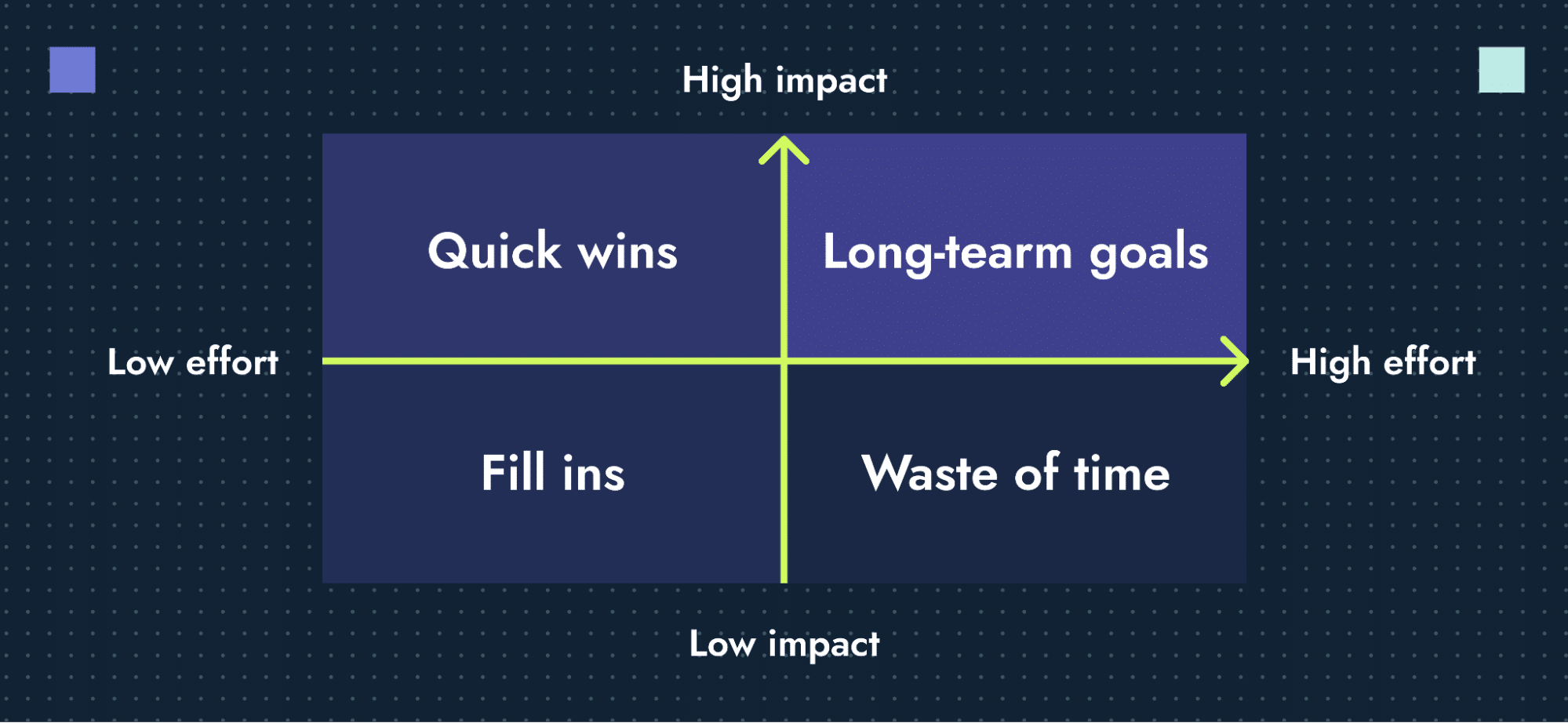
2.5. Features priority matrix
A priority matrix is a tool that helps to decide which features or tasks are most important by looking at how much they matter and how easy they are to do. I use an effort/impact matrix to determine:
- What gets built first: High impact, low effort features
- What requires long-term planning: High impact, high effort
- What’s implemented if resources allow: Low impact, low effort
- What’s unnecessary or too costly relative to value: Low impact, high effort
UX design step 3: Ideate creative visual solutions
Ideation is the creative part of UX design where the team works together to think of solutions to user problems. The goal isn’t to get it perfect on the first try — it’s to think expansively, challenge assumptions and uncover unexpected angles.
Let’s review key steps in UX design ideation phase:
3.1. Brainstorming sessions
Brainstorming is a way to generate many ideas in a relaxed and collaborative setting where no one judges or criticizes. The aim is to let creativity flow, consider different perspectives and avoid settling on one solution too quickly.
Our team runs structured sessions using techniques like:
- Classic brainstorming: Open idea-sharing in a no-judgment zone
- Crazy 8s: Eight rapid sketches in eight minutes to force variety
- How might we: Reframing pain points into solution-focused questions
- Mind mapping: Visual exploration of themes and their relationships
- SCAMPER: Prompted ideation by Substituting, Combining, Modifying, etc.
Each method is picked based on the complexity of the challenge and the mix of people in the room.
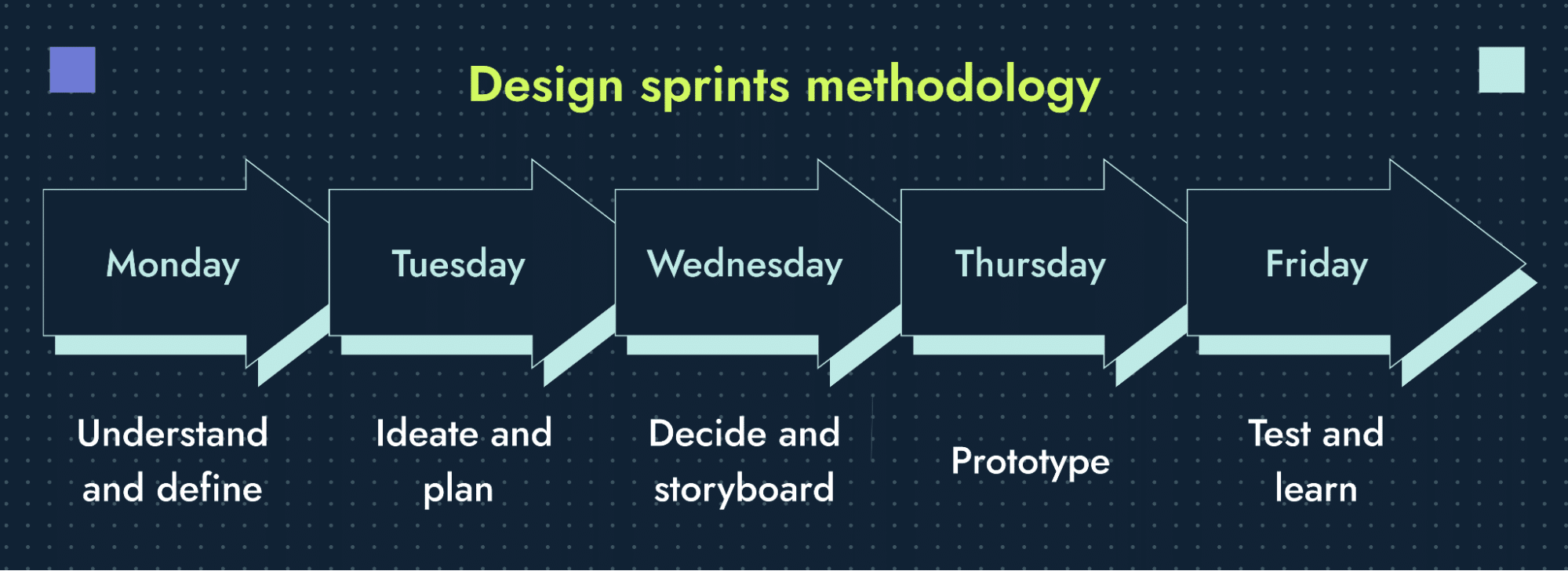
3.2. Design sprints
Design sprints are deeply connected to the UX design approach as they provide a structure for solving problems and generating innovative solutions.
The design sprint is a five-day process developed by GV (formerly Google Ventures) to address critical business questions through design, prototyping and testing with customers.
The five-day design sprint process includes:
- Monday — Understand and define: Set a long-term goal and map out the challenge you want to address. Gather insights from team experts and select a specific, ambitious target to solve in one week.
- Tuesday — Ideate and plan: Review existing ideas for inspiration and sketch solutions using a four-step process. Start planning Friday’s test by recruiting customers who fit the target profile.
- Wednesday — Decide and storyboard: Critique all proposed solutions and select the most promising ones. Combine winning ideas into a storyboard, creating a step-by-step plan for the prototype.
- Thursday — Prototype: Build a realistic, customer-facing prototype based on the storyboard using a “fake it” philosophy. Finalize testing logistics by confirming schedules, reviewing the prototype and preparing an interview script.
- Friday — Test and learn: Conduct customer interviews to observe how users interact with the prototype. Analyze feedback to determine next UX design steps and refine the solution.
3.3. Cross-functional collaboration in UX design process
Great ideas aren’t just a design responsibility. I invite input from product, dev, marketing and support teams to ensure:
- Technical feasibility
- Business relevance
- Messaging alignment
Our team often runs co-design workshops, UX design thinking process, exercises or async feedback sessions using tools like Miro, Figma or Notion.
Discover how copywriting and design teams can actually collaborate
3.4. Prioritization frameworks for ideas
During the ideation stage in UX design, you often end up with many ideas. Prioritization frameworks help you decide which ideas are best suited to meet user needs, fit within the business goals and work with the available resources. Once you have a pool of ideas, you can sort them using frameworks like:
- ICE (Impact, Confidence, Ease)
- RICE (Reach, Impact, Confidence, Effort)
- MoSCoW (Must-have, Should-have, Could-have, Won’t-have)
- Kano model (Basic, Performance, Exciter features)
- $100 test (Team votes based on perceived value)
Each method helps to decide what’s viable now and what can wait.
3.5. Risk assessment of potential solutions
Now I have a list of ideas ready to be implemented. However, not all solutions are free from potential risks. By addressing risks early, I ensure feasibility, user satisfaction and the overall success of the solution.
I run a quick scan for the following risks:
- User risks: Will this frustrate, confuse or alienate users?
- Tech risks: Can we actually build this — and maintain it?
- Compliance risks: Are there legal, accessibility or brand constraints?
I prioritize risks by likelihood × impact — and mitigate early.
UX design step 4: Build wireframes
Wireframes in web design bring structure to ideas. This is where rough concepts become tangible layouts — focusing on hierarchy, functionality and flow before visual design comes into play.
A wireframe isn’t a sketch for aesthetics. It’s a tool for logic. It helps the team align on layout, content placement and user interactions before committing to visual polish. However, before jumping into the wireframing, make sure you’ve taken time to properly design UX process flows that reflect real user behaviors.
Here’s what wireframing includes:
4.1. Information architecture (IA) and user flows
Before creating the wireframes, I map out how users move through the product and how content is organized with:
- Information architecture (IA): Defines the website navigation structure of existing pages, how the pages are grouped and how users navigate between them.
- User flows: Outlines the steps a user takes to complete a task (for example, make a purchase, update a profile), including decision points and system responses.
Tools used: Miro, Figma, Lucidchart
Visual deliverables: Site maps, flow diagrams. Here’s how the user flow may look:
4.2. Content hierarchy
Content strategy and hierarchy help organize and display content so it matches what users need and what the business aims for, making sure users see the most important information first. This includes:
- Primary vs. secondary messaging
- Placement of calls to action (CTAs)
- Use of headings, subheadings and body copy
- Logical grouping of related content
I follow visual hierarchy principles, including size, contrast and alignment, to make it easy for users to scan and act.
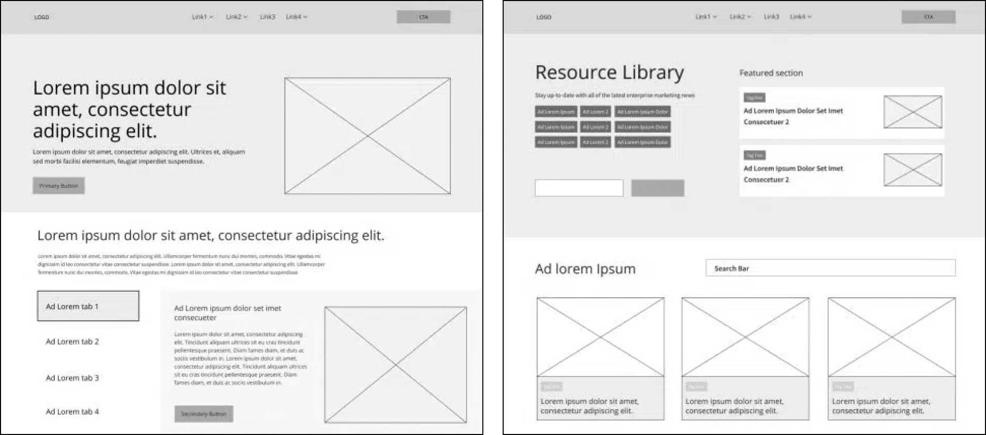
4.3. Wireframes
Our team creates low- to mid-fidelity wireframes to define layout and function. These are greyscale, clickable designs focused on:
- Layout logic
- Element spacing
- Navigation placement
- Functionality flow (not visuals yet)
Wireframes do not include detailed design elements like colors, typography or final images, keeping the focus on functionality and user flow. Here’s an example of a wireframe:
4.4. Mobile-first design thinking
The mobile-first approach is a UX design strategy that prioritizes creating a seamless and intuitive experience for mobile users before expanding to larger screens (like tablets and desktops). I design for the smallest screen first (mobile) to ensure:
- Essential content is prioritized
- Interactions are touch-friendly (for example, 48px tap targets)
- Navigation is intuitive on small devices
Once mobile wireframes are solid, I scale up for tablets and desktops.
4.5. Accessibility guidelines
Accessibility in UX design ensures that digital products are usable by people of all abilities, including those with disabilities. During the wireframing stage, integrating accessibility guidelines helps create inclusive designs that accommodate users with visual, auditory, motor and cognitive impairments.
I follow WCAG 2.1 AA standards (web content accessibility guidelines) and include:
- Logical tab order and keyboard navigability
- Clear labels and form instructions
- Minimum contrast ratios
- No reliance on color alone to convey meaning
Designing with accessibility in mind from the start avoids costly remediation later.
UX design step 5: Test wireframes or prototypes
After making the wireframes, testing is the next step in UX design. User testing detects friction, confusion or missed expectations — when it’s still easy (and cheap) to fix.
Whether I’m testing wireframes, prototypes or full flows, the goal is the same: make sure real users can use the product as I intended. Testing is done in the following steps of the UX design process.
5.1. Build a UX research plan
A good UX research plan keeps everything clear, consistent and focused on providing useful information during testing. I outline the purpose, scope and logistics:
- What we’re testing: Feature, task or flow
- Who we’re testing: Real or representative users
- What we want to learn: Usability, clarity, behavior
- How we’ll measure success: completion rate, time on task, error rate etc.
Tools: Maze, UserTesting, Hotjar, internal testers
Output: A documented plan with goals, scenarios and KPIs
5.2. Conduct a usability study
Once wireframes are created and a solid UX research plan is in place, conducting a usability study becomes the next step in the UX design process. A usability study evaluates how easily participants can complete key tasks within a design. It focuses on real users interacting with a wireframe or prototype, helping you assess the user experience and uncover potential usability issues early in the design process.
Our team conducts moderated or unmoderated sessions with real users. The goal is to observe how they interact with the product and note where things go off track.
- Moderated: A researcher guides the session in real time. Great for deep dives.
- Unmoderated: Users complete tasks on their own. Great for speed and scale.
What to measure:
- Can users complete key actions?
- Where do they hesitate or fail?
- What feedback or questions do they have?
3. Findings and iteration
Next step is to analyze results and translate them into changes:
- Consolidate friction points into themes
- Prioritize usability issues by severity and frequency
- Adjust wireframes or flows based on insights
- Re-test if needed
UX design step 6: Design (aka, shaping the pixels into perfection)
In the design stage of UX, rough ideas are turned into polished, finished designs that look great and work well. With validated wireframes in place, this stage transforms structure into visual language — applying branding, user interface (UI) standards and accessibility to create polished, ready-to-build screens.
It’s not just about how things look. It’s also about how design supports usability, performance and development handoff.
Let’s walk through the essential steps to transform our wireframes into a fully designed interface.
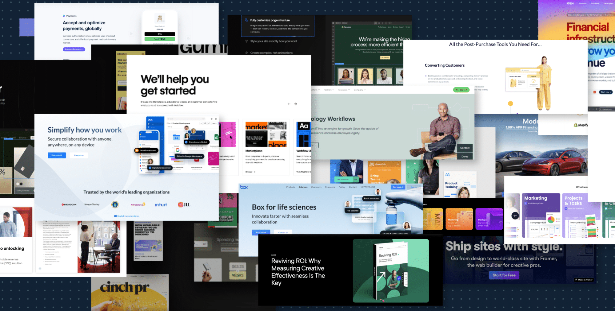
6.1. Create a moodboard
Moodboards help to establish the visual direction and design language before moving into high-fidelity UI design. They act as a visual reference board, ensuring that the design aligns with user expectations, brand identity and overall project goals.
I start by exploring visual direction:
- Fonts, colors, imagery, iconography
- Competitor references and industry trends
- Brand tone and personality
Moodboards align stakeholders on look and feel before full designs begin, helping prevent subjective revisions later. Here’s an example of a moodboard in the user experience design process:
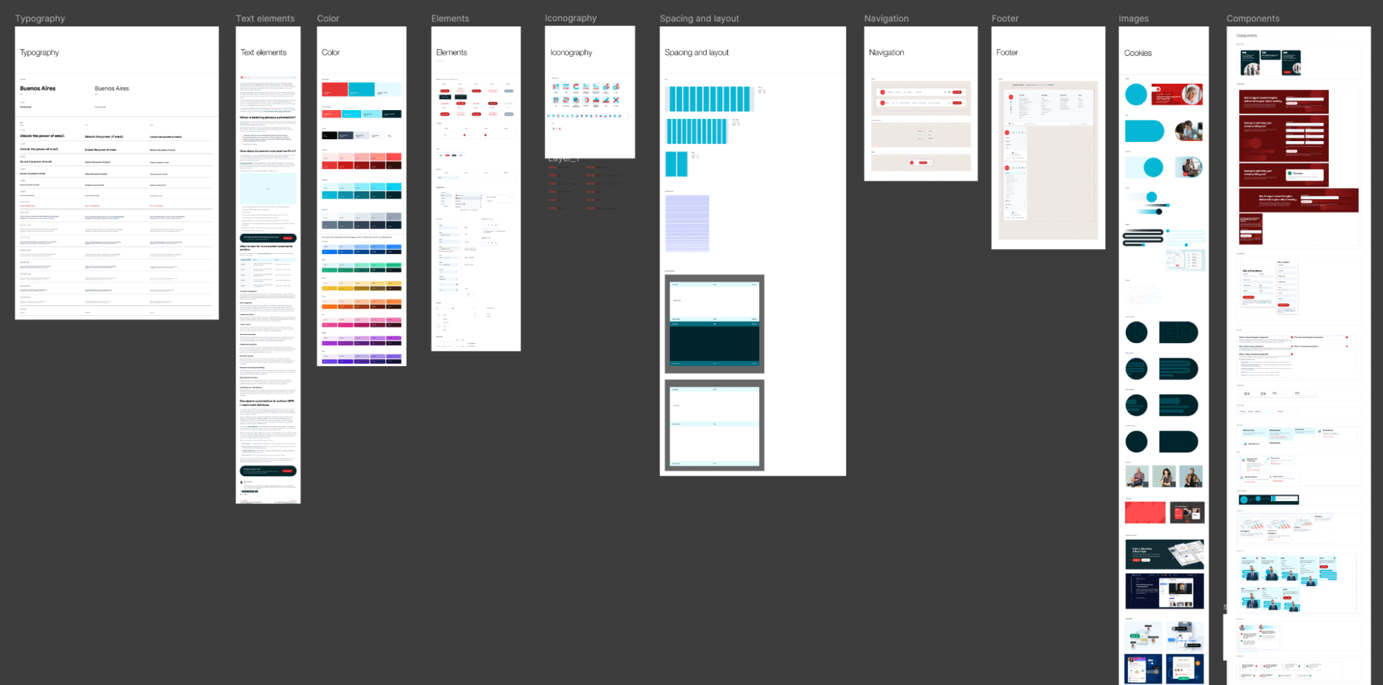
6.2. Build the design system (UI kit)
A design system (UI kit) is a set of reusable UI components, guidelines and design principles that ensure consistency, scalability and efficiency throughout a product’s lifecycle. Our team builds a reusable library of components that enforces consistency across screens:
- Typography styles
- Button states
- Form inputs and validation
- Cards, containers, navigation patterns
- Grids, spacing and layout rules
Our kits are built in Figma and tied to Variables and Styles, making updates scalable and handoff seamless. Take a peek:
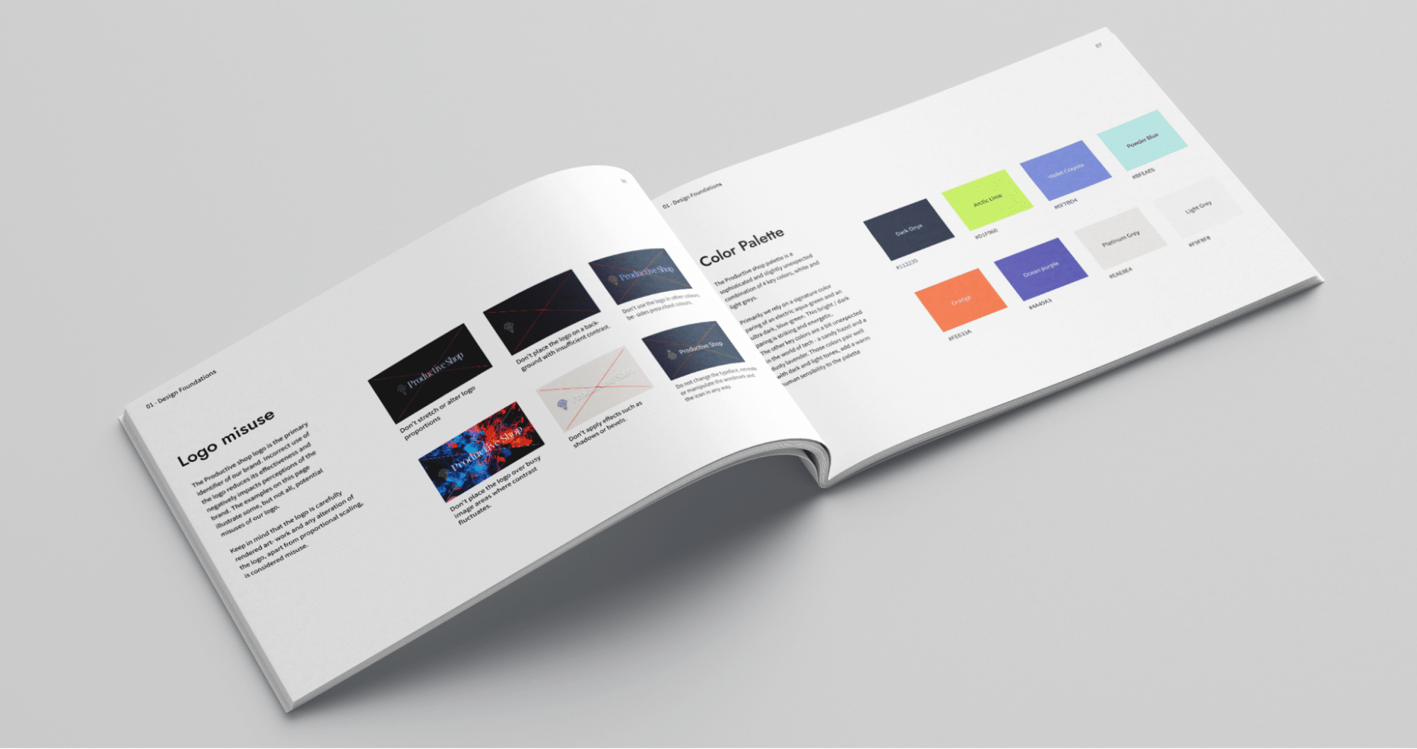
6.3. Brand alignment guidelines
Although a UI kit is mostly used for technical reasons, it’s also important to show the brand’s personality clearly. Brand guidelines help keep everything looking uniform, so the design matches the brand’s style in every part of the user experience.
I align every element to the client’s brand, typically outlined in their company brand book:
- Logo use and placement
- Color palette rules
- Visual tone (photography, icons, illustrations)
- Messaging framework and writing style
6.4. Full UI/UX design
And finally comes one of the most exciting stages of the UI/UX design process: transforming wireframes into fully designed user interfaces.
In my case, I use Figma to get all this work done:
- Layout refinement and spacing
- State-specific interactions (hover, focus, pressed)
- Visual enhancements like shadows, icons and gradients
- Mobile, tablet and desktop views
All components are structured for developer handoff with clean layers, naming conventions and consistent spacing:
Need help bringing websites to life? Follow our step-by-step guide to design a web page in Figma.
6.5. Responsive design considerations
Responsive design ensures that the design adapts seamlessly across different screen sizes and devices, providing a consistent and user-friendly experience. I design with responsiveness from the start, using mobile-first principles and clear breakpoints:
- 360px (mobile), 768px (tablet), 1440px/1920px (desktop)
- Grid systems and auto-layout rules
- Device testing for layout integrity and interaction
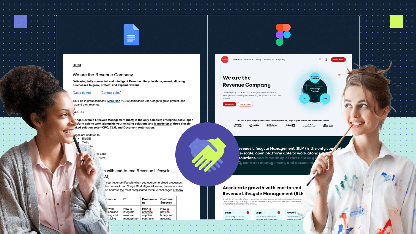
This is a UX design process example from our Conga design project.

Focusing on responsive design makes sure users have a smooth experience whether they’re using a phone, tablet or computer. This step in the UX design process connects the design and development workflows, resulting in a product that works well and is easy to use.
6.6. Version control and design documentation
After finalizing the design, maintaining version control and comprehensive design documentation ensures consistency, collaboration and efficiency throughout the UX design development process. Just like developers use Git for code, designers need version control to manage design iterations.
I use Figma version history and naming conventions to keep designs trackable. Each screen moves through a clearly defined status:
Draft → Review → Approved → Final
UX design step 7: Handoff to web development
Once the human-centered designs are approved, I prep everything for development. A clean handoff means fewer surprises in build, faster dev cycles and fewer back-and-forths later.
This stage in our UX design process is a structured transition with shared expectations, documentation and checks.
Based on our experience, I’ve developed a comprehensive handoff checklist, created collaboratively by both our design and development teams, to ensure that no important steps are overlooked.
Key considerations to keep in mind during the handoff process:
7.1. Dev-ready design files
Our design team delivers polished Figma files with:
- Organized layers and frames
- Responsive layouts (mobile, tablet, desktop, widescreen)
- Defined components, states and styles
- Reusable UX design patterns for repeatable UI blocks
Everything is cleaned up with no hidden layers and no placeholder text.
7.2. Consistency checks
Before anything is handed off, I always confirm:
- All spacing, font sizes and corner radii are using proper variables
- Hover and active states are fully designed
- Icons are components and properly grouped
- All interactions and edge cases are accounted for
7.3. Dev notes and documentation
I annotate files with:
- Functional notes (example: “this slides in from the left on click”)
- Linkages to animations or interactions
- Copy updates and content rules
- Accessibility requirements (contrast, alt text, tab order)
For the cases in which the CMS is managed in-house, I also provide a “what you can control” guide with editable styles and components.
7.4. Asset prep
I also make sure:
- All images are export-ready, optimized and properly named
- No watermarked placeholders or missing visuals
- Icon sets are packaged by type or usage
UX design step 8: QA and analyze
The stages of UX design process continue after development. Our team then supports implementation, runs quality assurance and sets up analytics to monitor how the product performs in the real world.
These steps help to achieve a final product experience that matches the design vision.
8.1. Design QA
Our team manually reviews the built product against the approved designs:
- Layout, spacing and type hierarchy
- Color and contrast
- Button states, hover/focus interactions
- Responsiveness across devices
- Accessibility (keyboard nav, screen reader tags and more)
We flag discrepancies and work with devs to make adjustments before launch.
8.2. Functional and flow checks
Testing core user flows (for example, signup, checkout, dashboard actions) ensures:
- No blockers or broken links
- Logical navigation
- Smooth transitions and animations
- Copy is final and error-free
8.3. Analytics setup
Our team also tracks performance from day one:
- Implementing tools like Google Analytics, Hotjar, Mixpanel or Amplitude
- Setting up events for conversions, form fills, button clicks and drop-offs
- Tracking behavior across devices and user types
- Defining conversion funnels and retention metrics to evaluate product success over time
8.4. Post-launch review
After the product is live, I monitor:
- User behavior patterns (heatmaps, session recordings)
- Funnel performance (drop-offs, exits, completions)
- Usability or accessibility complaints
- Opportunities for quick wins and improvements
I often recommend A/B testing for high-impact areas such as CTAs, layouts or navigation structures to further optimize UX. By tackling problems early, the QA process helps design and development teams work better together and makes the path to launch more efficient.
Partner with Productive Shop for a human-centered UX design process
The UX design process isn’t just a checklist. It’s how our experienced UX designers turn research, strategy and creativity into experiences that perform. From aligning stakeholders early to user testing and refining after launch, every step is built to reduce friction, speed up execution and deliver work that actually moves the needle.
Whether you’re building a new product or overhauling an existing one, following a defined UX design process and methodology helps you:
- Catch problems before they cost you
- Align your team and avoid rework
- Deliver an accessible, scalable design
- Make decisions with data, not gut feel
With our website design services, you gain a partner that applies this exact process to bring structure, clarity and rigor to every web build.
Contact us to see how we can build stunning and functional web experiences for your brand.