
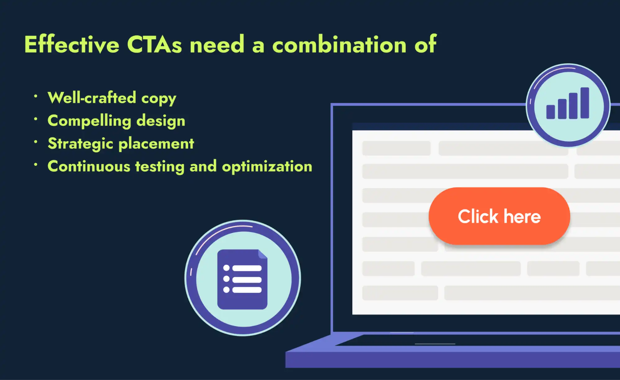
CTA best practices are a set of guidelines for ensuring your calls to action (CTAs) effectively drive user engagement and conversions.
These practices cover different aspects of creating a call to action, including:
- Copy: The text that encourages users to take action
- Design: The colors, fonts and other visual elements that make your CTA attractive
- Placement: The strategic location where users are most likely to see it
- Testing: The process of experimenting with CTA variations to see which ones resonate best with the audience
- Optimization: The practice of using user behavior to refine your CTA and make it more effective
A call to action is a key element of the narrative you create on your website. Through multiple formats, CTAs guide users to take the next step in their buyer journey.
The importance of calls to action on a website
Imagine what would happen on your website if the “Contact us” button was replaced by “You can call our office or send us an email.” This long sentence doesn’t prompt a clear action, and you’d likely see fewer clicks, calls and emails — or maybe hear the sound of crickets around.
An effective call to action skips the fluff and tells users exactly what you want them to do next. No more confusion: just a clear, concise message that drives action.
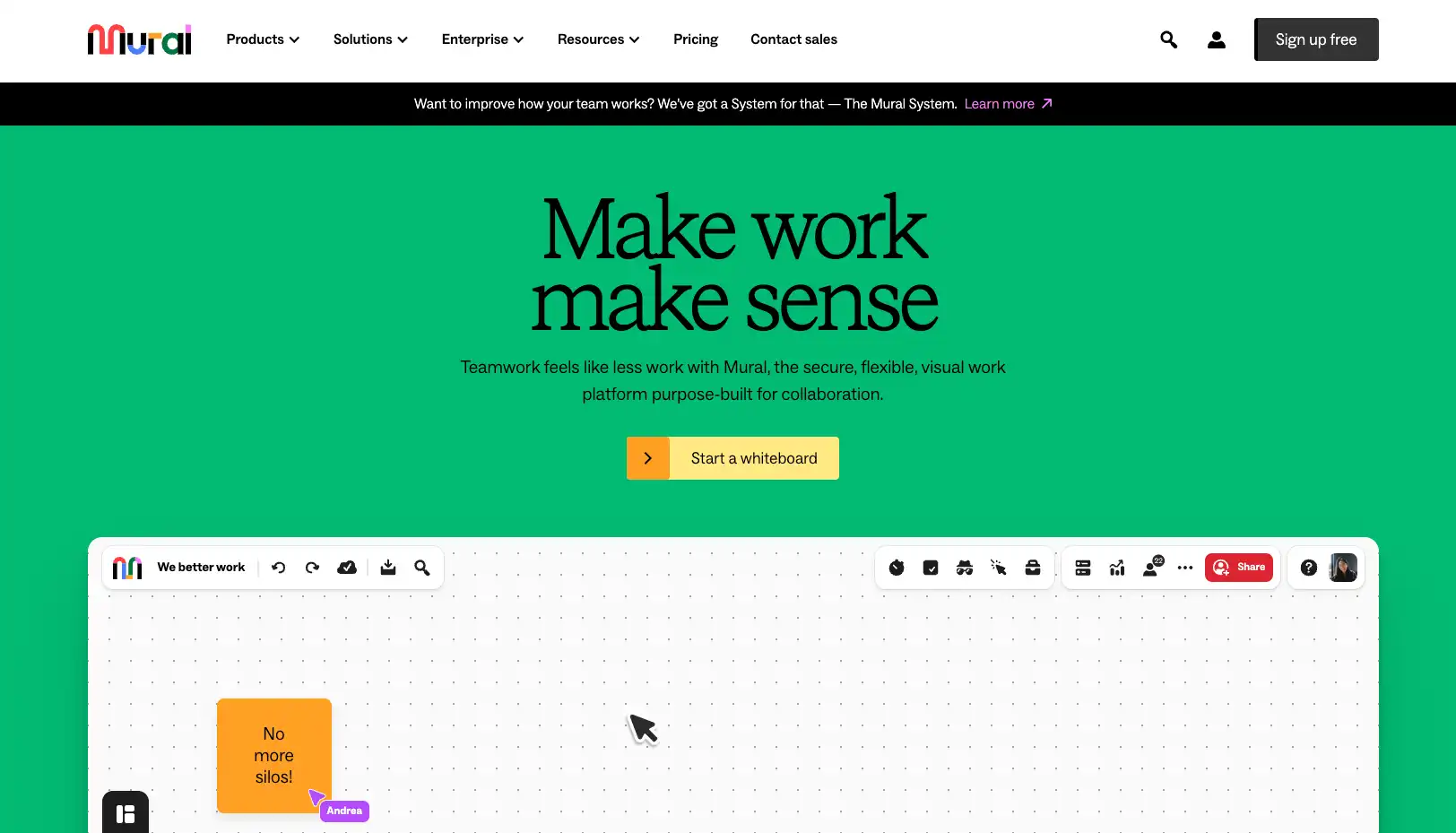
Here’s an example from Mural, a visual collaboration platform for creating whiteboards and managing projects. The orange button on the center of Mural’s homepage prompts users to “Start a whiteboard.” The action is so simple and direct that it makes us want to click. This is the goal of a catchy CTA: to trigger a click that feels natural, almost instinctive.
Calls to action are crucial on your website to:
- Enhance user experience: Clear and concise CTAs increase satisfaction by helping the audience navigate your site more easily. A call to action streamlines the user journey, guiding visitors toward actions most relevant to their needs.
- Boost engagement: According to the HubSpot State of Marketing report, attracting clicks, shares and comments is one of the top challenges marketers face when creating content. CTAs motivate your audience to click by offering a clear benefit, whether free access to a product or a comprehensive guide on a relevant topic.
- Increase conversion rates: Downloads, sign-ups and sales show that you’re successfully meeting your audience’s needs. By adding CTAs to your website, you empower users to take action that can lead to these outcomes.
- Track performance: A Content Marketing Institute survey reports that website engagement and conversions are two of the most important metrics B2B companies rely on to evaluate content performance. CTAs provide measurable data on clicks, subscriptions and other actions, helping you assess the effectiveness of your SEO strategy and optimize content for better results.
15 call to action best practices to attract and convert
Follow these 15 CTA best practices to engage your audience and boost conversions through your website:
1. Understand the basic structure of a CTA
Think of a CTA as a micro-sales pitch with two parts:
- The supporting text: It’s the pitch offer. It presents the benefits users gain by taking action.
- The clickable element: It’s the pitch closer. It prompts visitors to take action, typically by clicking on a button or banner.
In this example from Echo AI, a conversation intelligence software, the headlines focus on the advantage (improving agent performance) and the solution (faster coaching with the help of AI). On the bottom, the “See a demo” CTA button completes the message, encouraging users to view the product in action. Applying this basic structure gives users a clear direction to click while keeping your copy benefit-oriented.

📈 Explore other digital marketing tactics to increase demo requests
2. Pick up the right CTA format
The right CTA format depends on factors such as the context of the action to take, the design and the preferences of your buyer personas. Let’s review the most common CTA formats on a website:
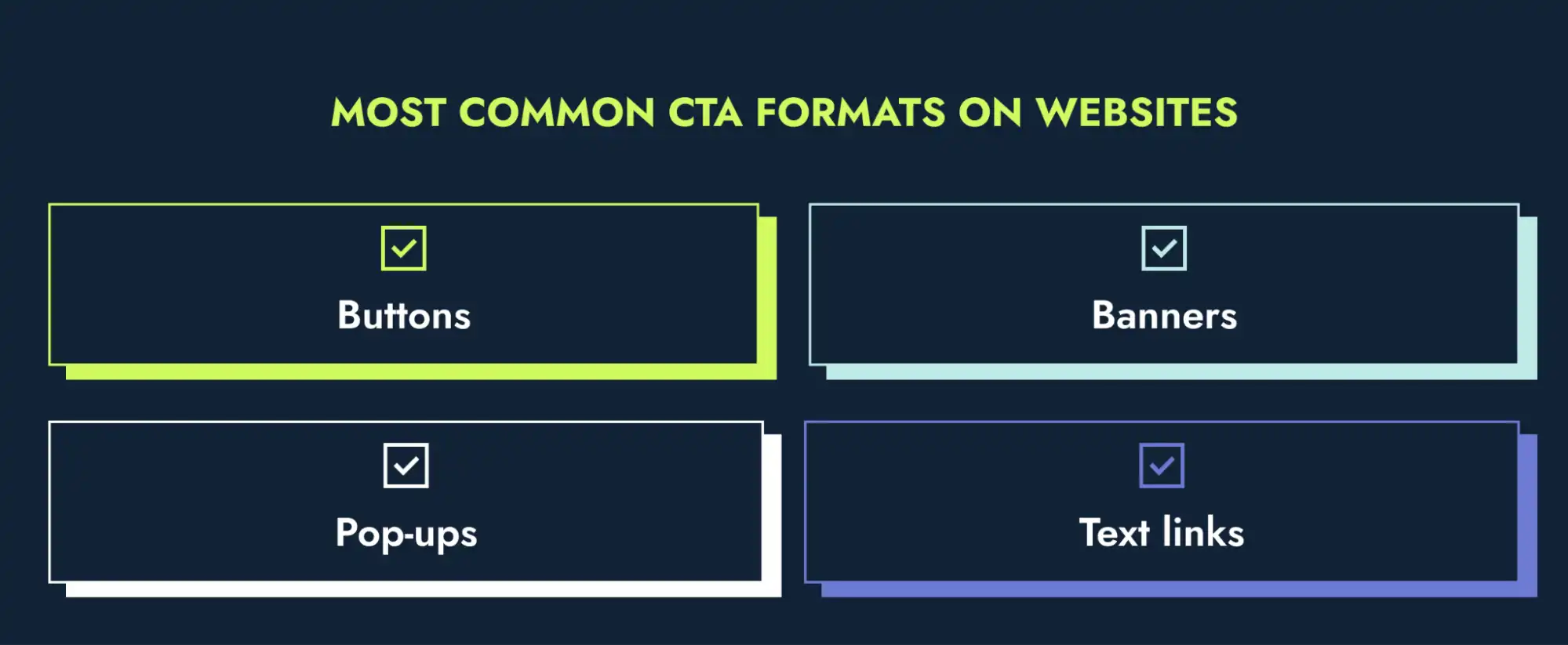
Buttons
Buttons are the most popular CTA format, appearing on homepages, landing pages, product pages and forms. With varied formats, colors and sizes, they serve as attractive prompts, guiding visitors toward the following action. This one from Google Workspace is the most visible element of the page and expresses a sense of urgency with “Get started now.” This button is the primary CTA of the page, which means it’s the action Google wants us to take.

Banners
Banners tend to grab attention at the top or bottom of a web page, showcasing special offers or important updates. The marketing mix modeling platform Keen uses this format to promote a new report. While the CTA “Download now” may not be the most prominent element, the banner’s blue color makes the message pop.
Pop-ups
Ever notice those last-minute pop-up messages on websites as you’re about to leave? They are CTA pop-ups. Use them strategically, and you can offer discounts or promote messages like free shipping on your first order. But be mindful of how often and when they show up. Pop-ups can get annoying if they appear too often or at the wrong time, like when you’re browsing a product page.
Here’s an example from the online course platform LearnWorlds, where they effectively use this element to encourage downloads of special content on their website.

Text links
A CTA text link seamlessly integrates into content, guiding users to resources or actions without disrupting their reading flow. This approach helps you promote blogs, ebooks, testimonials, case studies and other website sections. For example, Salesforce explores text links to promote its latest content reports, campaigns and news.

Feeling lost about which CTA format to use? I’ll walk you through the top use cases.
| CTA formats | Use cases |
|---|---|
| Buttons |
|
| Banners |
|
| Pop-ups |
|
| Text links |
|
Find out the 8 best CTA types to maximize your website’s potential
3. Highlight what users gain before asking them to click on your CTA
A CTA that connects with users clearly shows the benefit of clicking, offering a solution to their problem.
Take a look at this example from Box, an intelligent content management platform. Their homepage header reads: “Secure collaboration, content management, and workflow — powered by AI. Get started.” The copy explains the company’s key advantage, making clear how Box solutions provide a smarter and more collaborative work experience.

Box follows CTA button best practices here. While the supporting text spells out clear benefits to the audience, the “Get started” button remains concise and clear. This strategy prevents the CTA from becoming too long, making sure the button doesn’t take up half the page.
To draw attention to your calls to action’s value, ask yourself these questions:
- Does the copy align with the needs and interests of my audience?
- Does it solve a specific problem?
- Are the benefits easy to understand?
- Is the action clear?
The goal is to answer “yes” to all of them, making your calls to action irresistible to your website visitors.
4. Nail the timing of creating a sense of urgency
It’s common to see copywriting advice suggesting that calls to action must trigger a sense of urgency and scarcity. Limited-time offers like “Shop and save 50%” and “Sale ends today” are examples of this approach. They use the psychology of user behavior, much like the way designers make color and font choices to create eye-catching buttons.
However, overusing urgency tactics on CTAs undermines trust and creates friction, so apply this practice strategically.
Take the INBOUND conference website as an example of how urgency can be effective in certain bottom-funnel CTAs. They display a banner at the top that reads: “Purchase your tickets for INBOUND before it’s too late!” Since every visitor of the website is a potential attendee, the CTA encourages a quick decision by highlighting the risk of missing out.

But this sense of urgency doesn’t quite fit with B2B products or services, where decisions usually require extensive research and buy-in from multiple stakeholders. A call to action that triggers impulsive choices on your product page might feel pushy like the tone of those home shopping channels. When writing your CTAs, prioritize tailoring them to the buyer journey and ideal customers.
5. Embrace the “less is more” in your copy
When it comes to call to action copy, cut the fluff — too many words can drive your audience away. By keeping your text concise, you avoid unnecessary words that dilute the actionable message. These are my favorite CTA copy best practices to craft compelling phrases:
- Start with a verb: CTAs are action-oriented, so consider options that encourage users, like “try” for a product, “explore” for a topic and “download” for a guide or ebook.
- Keep it as concise as possible: A call to action has no word limit, but a briefer copy is easier to understand and act upon.
- Stick to one copy for each action: Consistency helps users anticipate what clicking the CTA will entail and prevents sloppy copy. If you’re testing different CTA versions, make the variations significant and test them one at a time.
Get inspired by 60 powerful call to action phrases for B2B
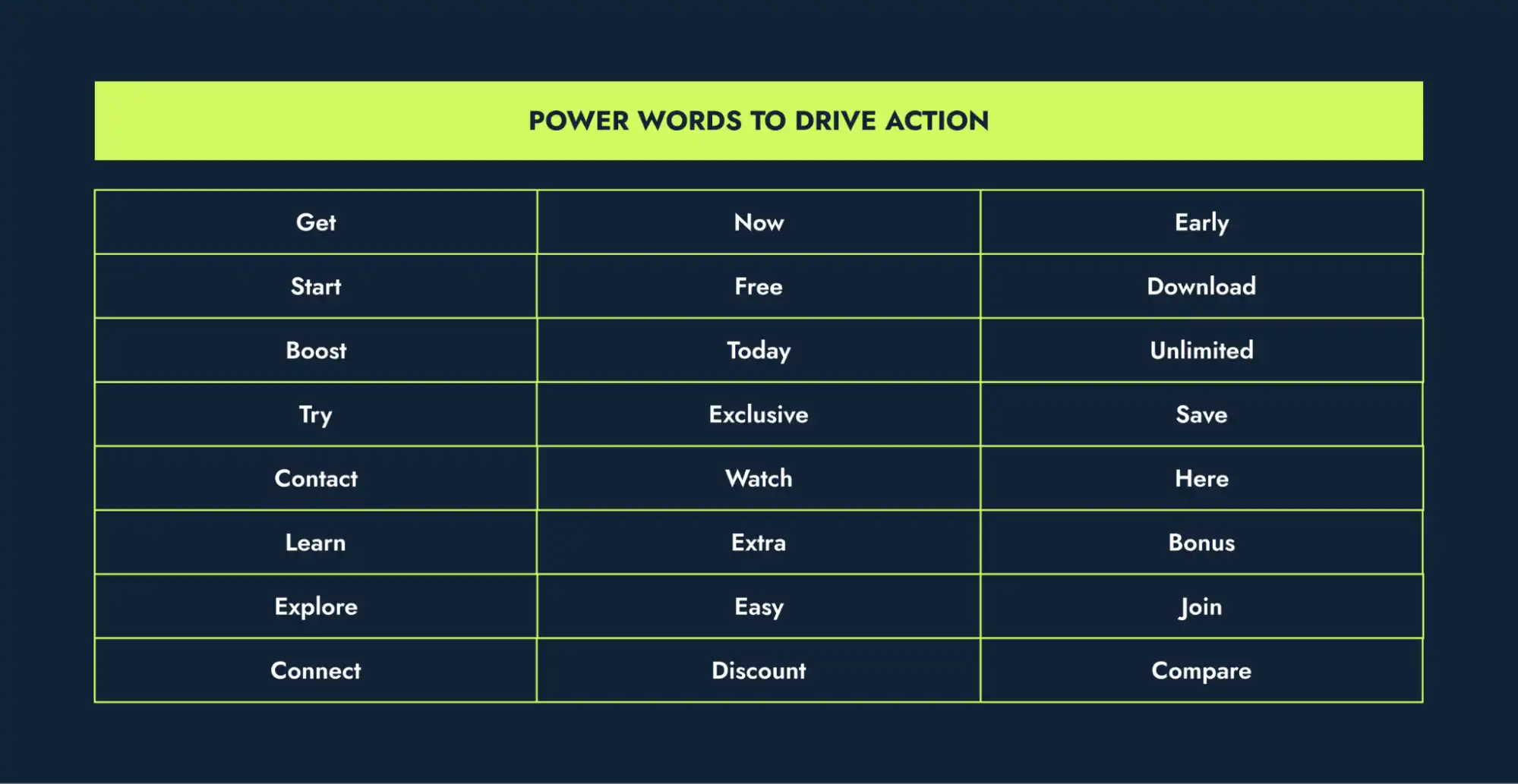
6. Make the most of power words
Power words are those words that really grab you and make you feel something — curiosity, excitement, maybe even a little bit of “I need this product.” The purpose is to drive you to take action.
- “Get,” “start” and “join” are examples of short verbs that compel immediate action.
- “Free,” “limited” and “exclusive” are adjectives that express a clear benefit.
- “Now,” “today” and “here” are adverbs that offer a direction of when and where the action happens.
Use these examples to inspire your copywriting:
7. Personalize your CTAs
Personalization means customizing the CTA messaging to fit users’ needs, preferences and interests. Based on user behavior and past interactions on your website, you can make CTAs more relevant and impactful. Here are a few examples I like:
- “Read more about”: This type of call to action encourages users to explore blogs and resource pages related to their interests (e.g., “Read more about CTA performance metrics”).
- “See our solutions for”: If your company offers products or services tailored to different industries, you can use this example to lead visitors to landing pages or product pages. For example, based on users’ interest in “HR software,” you can personalize a call to action on “See our solutions for HR.”
- “You might also like”: This is a popular option for suggesting products, content or resources that complement the user’s current interest (e.g., “You might also like our list of 60 powerful CTAs to hit marketing goals”).
👉 PRO tip: By incorporating first-person pronouns (e.g., “Start my free trial”) into your CTAs, you create a sense of ownership that encourages the audience to take action. In fact, a HubSpot report shows that personalized CTAs convert 202% better than general CTAs.
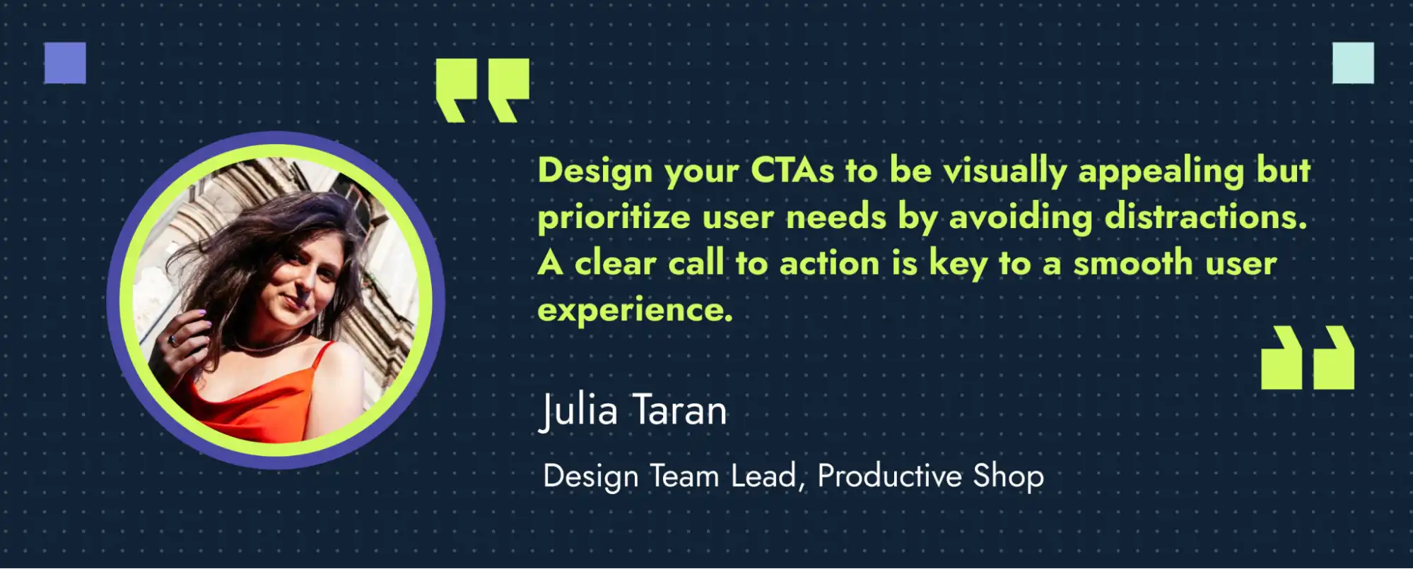
8. Be design wise
When you visit a website, the call to action should be so clear that you spot it without even having to think about it. It’s not magic but pure design: your banners and buttons grab audiences’ attention by integrating their color and format with the overall appearance of the page.
Our head designer, Julia Taran, likes to say that a sharp CTA should stand out without interrupting the flow. It needs to balance visual appeal with a clutter-free design, making it easy for visitors to take action.
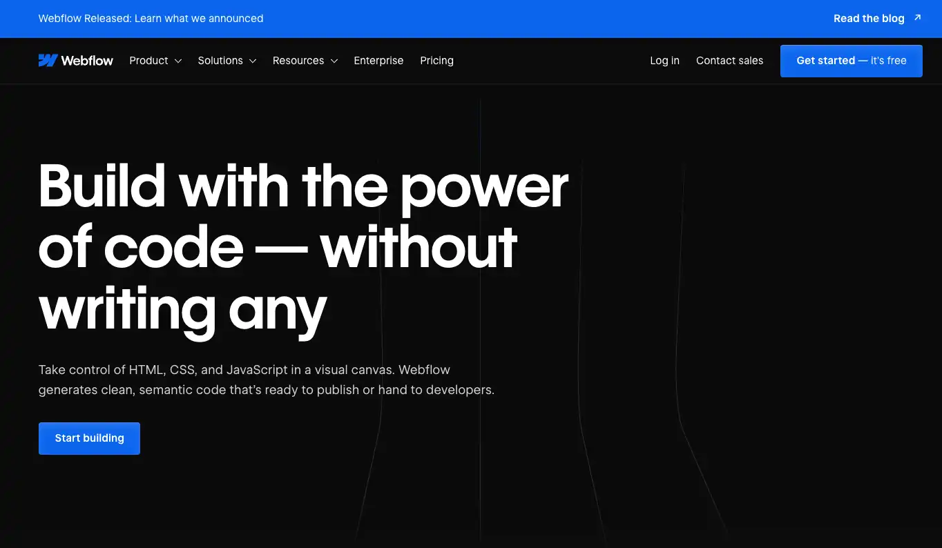
WebFlow, for example, chose a contrasting blue color to make the CTA buttons pop and hook the user. No matter how far you scroll down the page, the buttons remain a consistent blue, always easy to read and ready to click.
Follow these website call to action best practices to make your button design bold without being pushy:
- Prioritize readability: Use a large enough font size that’s easy to read on all devices. Test your CTA across various screen sizes to ensure readability, especially on mobile.
- Ensure contrast: The button colors should pop against your background and complement your brand palette. Remember to choose a contrasting font tone to make the copy readable.
- Keep an eye on proportions: Find a balance that’s visually appealing and ensures the button is easily clickable, especially on mobile devices. Aim for a size that allows for proper finger targeting on touchscreens.
- Align with your brand identity: Your CTA should be an extension of your brand. Choose colors, fonts and even button shapes that reflect your brand aesthetic. This consistency builds trust and reinforces brand recognition.
Check out 7 best practices for CTA button design in Figma
9. Design with plenty of white space
White space is the area around design elements on a webpage. It improves readability and clarity by reducing distractions and visual clutter.
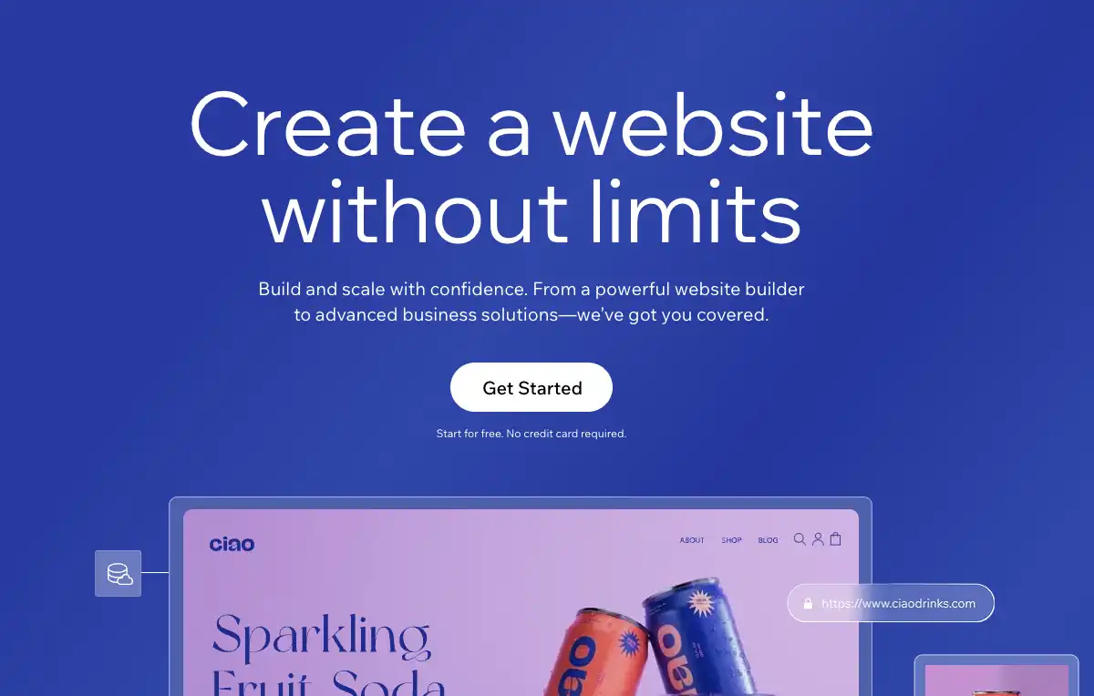
Website platform Wix leaves plenty of white space (it’s actually very blue in this case) around its CTAs, giving the page a clean look and making its buttons the focal point.
A common dilemma businesses face in design is whether to include more text or extra visual elements to fill empty spaces. Take Dropbox, for example. While their blue CTA button has ample room below it, the amount of supporting text makes the page look overloaded with information. Feeling like your CTAs are squeezed? Make sure there’s enough space surrounding it.

10. Use creative resources
Want your call to action to really pop? Add some creative resources and watch the user experience come alive. Our client QuotaPath uses CTA boxes within their blog posts to promote relevant content. These visual elements break up the text, making related content more engaging for readers.

Add to your calls to action resources like:
-
- Videos: Teasers or trailers offer a dynamic way to promote webinars and other virtual events, providing a sneak peek at the immersive experience attendees can expect.
- Audio: To promote a podcast episode, create a short clip featuring a snippet of the conversation to give listeners a taste of the full episode.
- Animations: Motion excels at explaining interfaces and features, making your product more user-friendly. Highlight key functionalities and engage users with virtual tours and animated snippets.
- Illustrations: Icons and other formats representing product benefits can quickly communicate complex information in a visually appealing format. Consider using them to promote special content, such as guides, reports and ebooks.
11. Make your CTAs accessible
Website accessibility allows all users to interact with your CTAs with ease, regardless of their abilities or devices. It covers aspects like:
- Buttons and banners size: Interactive elements should be large and well-spaced enough for easy tapping or clicking on any device, supporting users with varying motor skills.
- Color selection: Contrast between text and background enables users with visual limitations to see and differentiate them from other content.
- Mobile adaptability: Responsive design enhances user experience across devices and screen sizes, accommodating those using smartphones or tablets.
Taking an inclusive approach to design and web development can boost your search engine rankings. Getting an SEO audit is a good start:
- Helping you tackle accessibility issues
- Guiding you in implementing CTA best practices
- Optimizing CTAs for higher search ranking and organic traffic
🛠️ Need help with rankings? Grab our enterprise SEO audit checklist for B2B websites
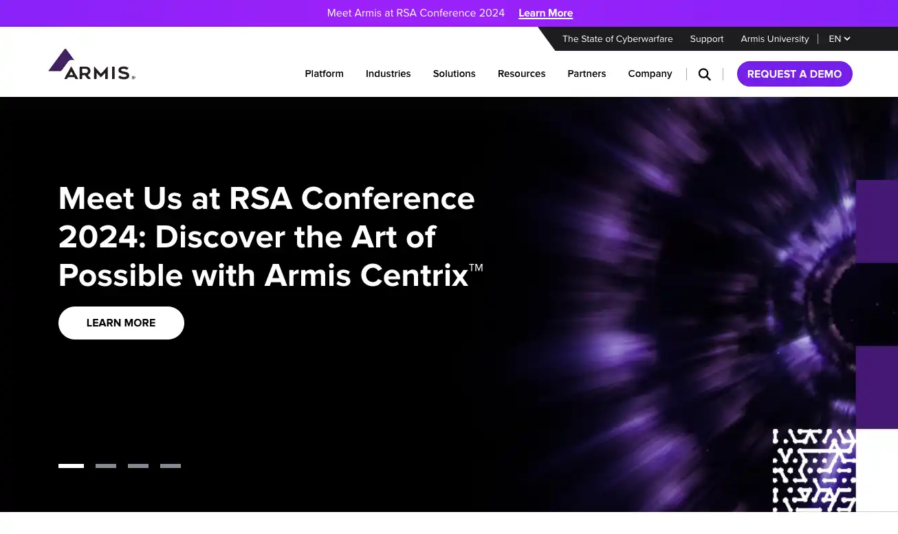
12. Test the CTA’s placement
The placement of a call to action within a website impacts its visibility and effectiveness. In this example from cybersecurity giant Armis, the focus is on the purple CTA button at the top of the page. The menu stays at the top as you scroll, keeping the CTA visible and aligned with the context.
While proper placement is one of the key call to action button best practices, remember they don’t have to stay in one spot all the time. Place your calls to action where the action aligns with the user flow on the page.
👉 PRO tip: A/B testing is one of the best practices for CTA buttons, helping you find the right placement to boost clicks and conversions.
13. Take advantage of social proof
Social proof is the use of others’ actions and opinions to encourage users to take action. It includes reviews, case studies and testimonials about your products or services.
E-commerce platform Shopify’s website, for example, features a section for customer success stories, with a CTA button at the top inviting users to start a free trial. Take a look.
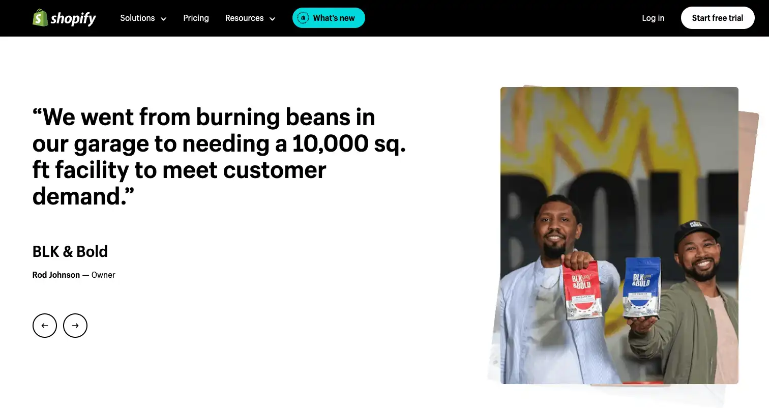
Incorporating specific CTAs, such as “See case studies” or “Explore reviews,” helps you persuade visitors to take action. Gartner research shows that customer reviews are one of the top emerging trends in B2B marketing due to their influence on software purchase decisions.
14. Analyze performance
If your visitors don’t engage with your calls to action, it’s time to track your buttons and banners to understand why. Monitoring and analyzing CTA performance metrics is a best practice for optimizing their effectiveness over time.
Metrics such as bounce rate, conversion rate, and click-through rate (CTR) offer valuable insights into how well CTAs are performing and where you can make improvements. By identifying patterns and areas for web search optimization, you refine your CTA strategies to hit your marketing goals.
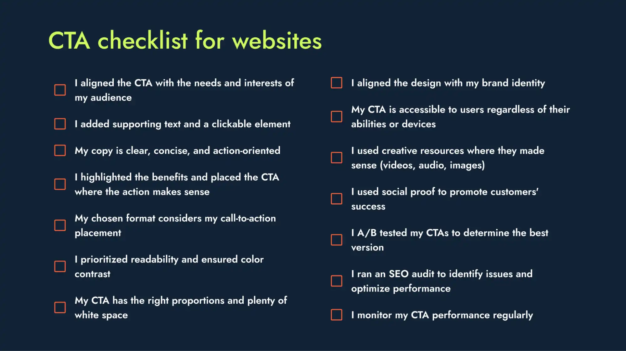
15. Keep a checklist to evaluate your calls to action
By maintaining a CTA checklist, you ensure consistent messaging and a seamless user experience, which can boost your conversions. See our checklist and start optimizing your CTAs:
Enhance your website call to action best practices with the right strategies
Trying out new creative formats is key to finding the CTAs that really hit the mark — and we’re here to help. Our B2B SEO agency specializes in delivering measurable results for SaaS companies, with services that include:
- Web design: Build a user-friendly, conversion-focused website with eye-catching CTAs that seamlessly guide visitors through the buyer’s journey
- Content writing: Power your website with engaging CTA copy that speaks to B2B audiences, aligns with your brand voice and boosts click-through rates
- SEO consulting services: Improve CTA placement and performance with data-driven insights to attract your target audience and prompt action
Let’s turn CTA best practices into results. Reach out to us today.
Discover how to implement CTA best practices to achieve results