


Summarize with AI
A call to action increases conversion by nudging people in the right direction — it acts as a broker, sending users from one page to another with the promise of value on the next page. But knowing what to say and how to say it? That’s where things get interesting.
As an SEO lead working closely with B2B SaaS companies, I’ve seen firsthand what makes people click and what makes them scroll right past. I’ll guide you through my best insights to help you create a call to action (CTA) that speaks to your audience and drives CTA conversion.
Key highlights:
- Catchy CTAs guide website visitors to take the next step, whether that’s signing up, getting a quote or checking out a product. Make sure your CTAs match what your audience is looking for — the action must be clear so they know exactly what to do.
- CTA conversion depends on where you place your calls to action. Drop your CTAs where they naturally fit within your page’s flow, helping users move through the site without feeling overwhelmed or distracted.
- Call to action conversion is an ongoing process of tracking and optimization. Test different texts, colors and formats to find what works best for your audience.
Why you should care about CTA conversions
In our B2B SEO strategy sessions with clients, increasing conversions is a recurring topic of discussion. Even if it’s not the main concern, it usually comes up through questions like:
- Are we targeting the right keywords for SEO lead generation?
- What top SEO priorities should we focus on for conversion rate optimization (CRO)?
- Is there any sloppy copy or poor user experience holding back visitor actions on our website?
And these concerns make perfect sense. When you invest in attracting visitors to your website, you obviously want to encourage them to take action. But when we check for gaps that could hurt website rankings, a common issue is weak or missing CTAs.
According to a Content Marketing Institute report, 55% of B2B marketers face challenges in creating content that prompts a desired action, such as conversion. Without calls to action that convert, your website’s potential is limited, leaving potential leads and opportunities untapped.
First of all, what do we mean by website conversions?
Conversion means different things depending on what you’re tracking, whether it’s demo form submissions or deals closed.
The goal of website conversions is to get your audience to take the next step you want them to take. Since your visitors are now part of your B2B funnel, it’s up to your marketing team to decide what action makes sense to your target audience at each stage.
Let’s pinpoint where different conversion events fall within the marketing funnel:
- Downloading a white paper: The action typically sits at the top of the funnel, where visitors gather information and share their email in exchange for valuable insights, which makes this event great for education and trust building.
- Contacting a sales team: This conversion point is in the middle of the funnel, when visitors have done their research and show direct buying intent. They might be interested in solutions but still need guidance to take action.
- Buying a SaaS subscription: This event is at the bottom of the funnel (ka-ching!). Visitors found value in your solution and are ready to seal the deal.
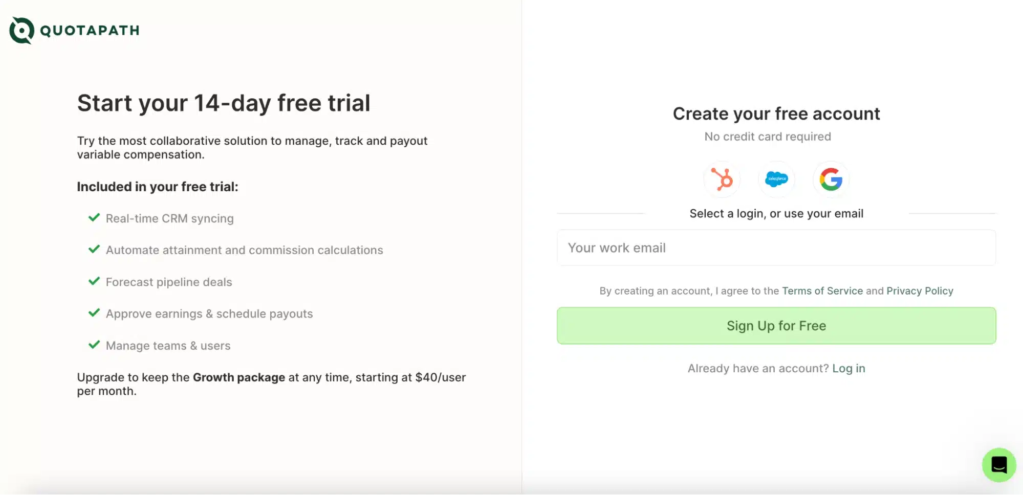
Each conversion point serves a unique purpose: attracting, nurturing leads, driving sales and more. Look at this example from QuotaPath, a sales compensation management platform. They offer both:
- A trial page for those who want to create an account for free
- A demo page with a form to request a product demonstration
As you see on the trial page, the visitor is about to register their email to create a free account. This is a marketing qualified lead (MQL): a potential customer who has shown interest in the product but may not necessarily be ready to buy it.
Notice that the high-converting CTA button “Sign up for free” has a green color that stands out from the rest of the page, and the copy clearly tells visitors what they’ll get.
A visitor requesting the product demo generates a sales qualified lead (SQL). This user expresses a strong interest in the product and is likely to talk to a salesperson, suggesting they’re in the decision-making stage. You see that the green CTA button pops, prompting a simple action: “Select meeting time.”
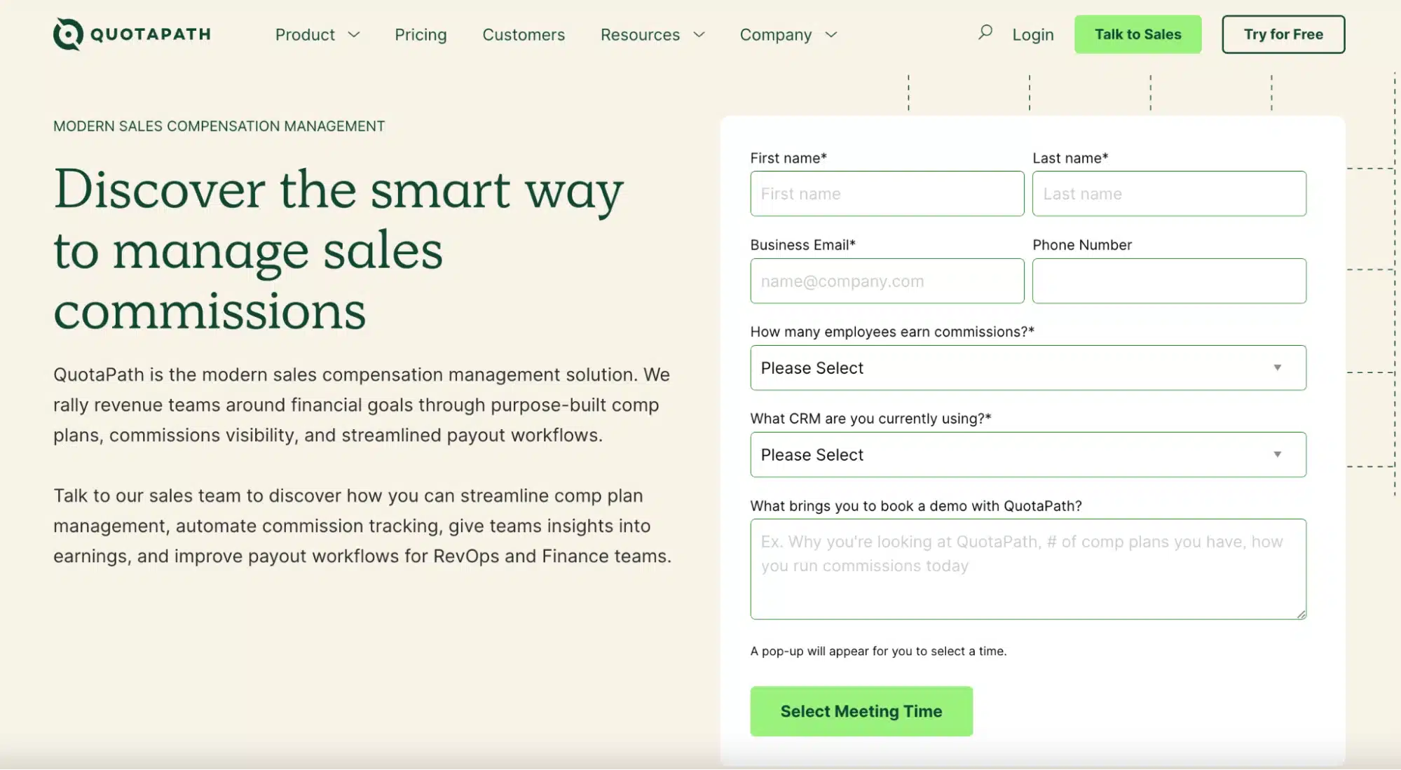
Can you tell the difference between getting a trial and a demo? While a trial represents an initial interest in exploring the product, a demo signals a deeper, more committed interest in understanding the product’s value.
Both are conversion points that match the goals at each stage of the buyer journey, using engaging CTAs.
The takeaway?
Some companies define conversion as the final sale of the product, while others define it as adding users to their CRM system. Whatever your choice, calls to action that convert are decisive in driving results throughout the funnel. Let’s see why.
What is the purpose of a call to action in your conversion path?
The purpose of a call to action is to guide users toward actions and help you control their flow on your website. CTAs are your website traffic signals as you move users around. And you want all the lights green to move them to the ultimate goal, which is conversion.
Let me show you how Keen, a marketing mix modeling platform, uses CTA buttons that convert on their homepage to guide users toward the next step of the funnel.
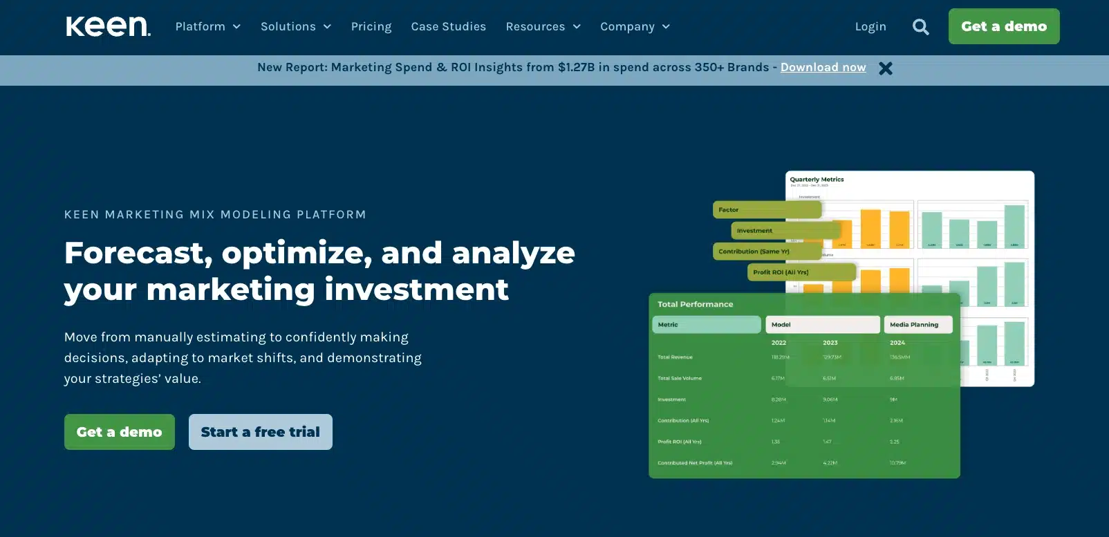
To increase demo requests, Keen placed an appealing green button with a copy for bottom-funnel users: “Get a demo.” This CTA is the most compelling element of the page and highlights the chance to see the product in action.
And to guide visitors to the free trial page, they use the “Start a free trial” button in a more subtle color but still with a strong copy. This CTA is there to attract middle-funnel visitors to experience the platform and see its differentials, potentially leading to a future sale.
So, through different CTAs, you:
- Educate top-of-funnel visitors with marketing resources like guides and blog posts
- Showcase product or service features to engage middle-funnel visitors
- Offer great deals to convert bottom-funnel users
My 9 favorite strategies to drive conversions with CTAs
So how does a call to action increase conversion? I often advise our clients on tactics that help them increase click-throughs, downloads or sign-ups on their websites.
Try my nine favorite strategies for building the best CTAs for conversions.
1. Align your CTAs with users’ intent
Imagine users visiting your website with a specific intent: finding your product’s pricing information. They find nice CTAs there (e.g., contact us, learn more, watch a demo) but none leads to the pricing page. Frustrated, they leave without clicking anywhere. This is a common mistake marketers make: their CTAs don’t match visitors’ intent, leading to missed conversions.
On the other hand, when CTAs are aligned with user intent, they significantly enhance engagement. Here’s an example from Sage, a provider of HR and accounting software. In their blog post on “How CFOs can get people on board with AI,” they feature a CTA for a relevant product. The CTA is even more effective because it aligns with the content both visually and contextually, motivating user clicks.

As a user visiting a product page, for example, I want to click on “Watch a demo” to see if the product is a good fit for my needs. I’d also be happy to click on a good CTA like “Check out our reviews,” where I can explore testimonials. And if I’m ready to make a purchase, I’d expect to see a “Buy now.” And that’s it.
Remember: Users don’t want distractions, so align your CTAs with their intent. If you have a pricing page somewhere on your website, make sure it’s easy to find by placing a CTA in visible areas like the header or within relevant sections of your content.
2. Place your CTA where it makes sense
Before I show you the best spots to place your calls to action, here’s a quick breakdown of common formats of CTA on websites:
- Button: The most common format to place across the homepage, after landing page forms, on menu bars and in text boxes.
- Text link: An effective format to include within sentences, paragraphs and menus, offering a subtler option compared to buttons.
- Banner: Eye-catching website element to place on headers and inside blogs to promote product launches and special content.
- Pop-up: A CTA that appears strategically on a website when a user is about to leave (but also during their browsing session) to offer deals or encourage subscriptions.
Make the most of your website’s potential with these 8 types of compelling calls to action
Now, let’s take a look at an example from Viz.ai, an AI-powered care coordination platform. There are two CTA buttons on their life sciences page:
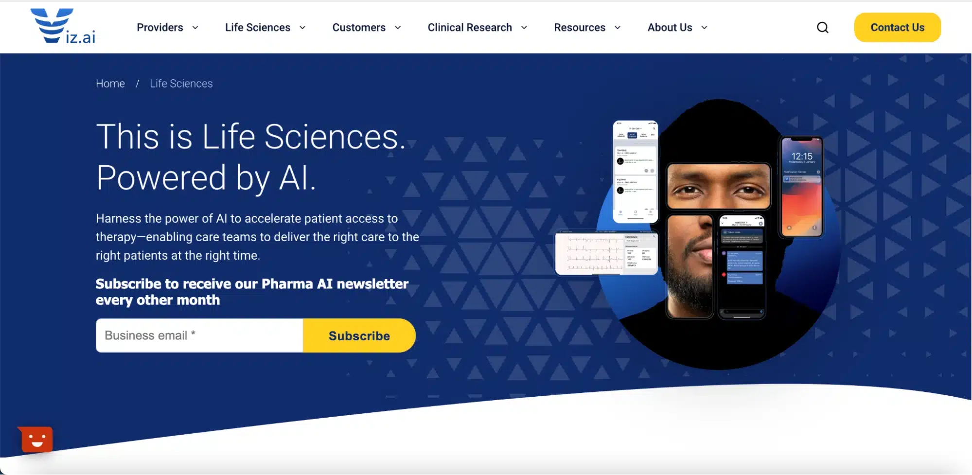
Viz’s page features two conversion points with distinct goals: “Contact us” for demo requests and “Subscribe” for newsletter sign-ups.
- The button at the top aligns with the menu as a natural last step of the website navigation.
- The subscription button feels natural after the presentation copy.
- Both are visible with their contrasting colors, and they don’t disturb or confuse us at any moment.
The takeaway? Ensure that you’re creating a narrative to guide visitors in their journey by placing your CTAs where they become a natural element of the page.
3. Pitch users based on their industry and the context
Here’s another format of CTA, a sidebar. In this example from Styra, the CTA matches the topic of the blog: both are about dynamic authorization for zero trust security.

My point? The text in the sidebar CTA changes depending on the content. The strategy here is to edit your copy according to your value proposition. The CTA button “Download the PDF” is a clear command and relates to what you’re talking about.
Next, check out this banner from Box, an intelligent content management platform. This is a banner CTA placed in the middle of a blog post on enterprise workflow automation.
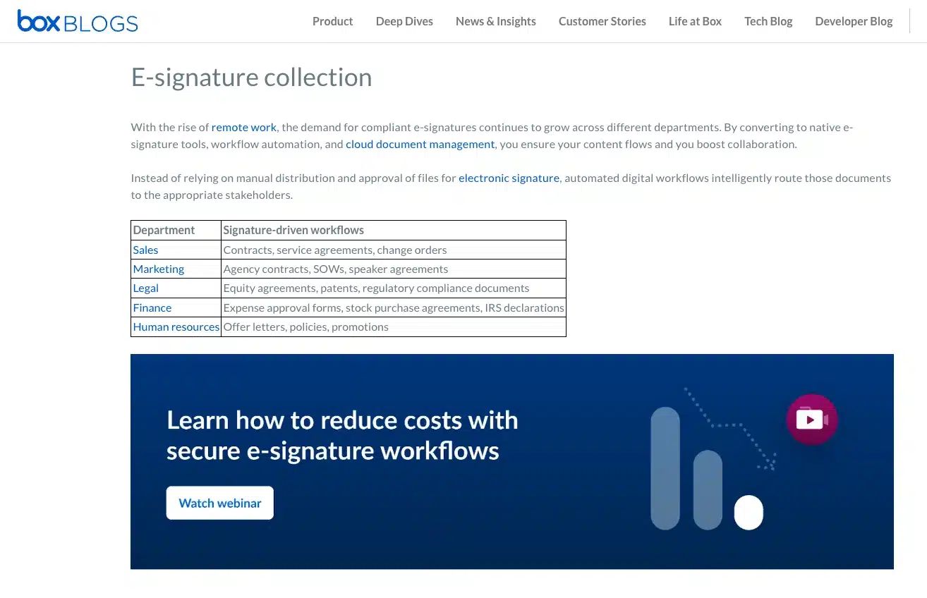
The banner invites readers to watch a webinar on e-signature workflows, which is exactly the topic discussed in that section of the article. The contextual placement ties the CTA to the content, giving visitors an easy pathway to explore related resources.
When you target a specific industry you want to pitch, focus on CTAs with solutions for them instead of something general.
4. Be specific in the copy
These are the two basic elements of the copy you need to master:
- The supporting text: Sets the stage for the CTA button. It grabs attention, explains the value proposition and creates a sense of anticipation for what clicking the button will bring.
- The CTA copy: The actual text on the button. It’s the ultimate push that makes users take action.
You can distinguish both elements in this example from cybersecurity company Armis. As you see, there’s not much space for text, so the copy focuses on the product’s key benefits and the action Armis wants users to take: watch a video.

The best practice here is to specify in the copy the advantage of taking the action in your CTA.
A similar tactic appears in a CTA on Tonic’s website.
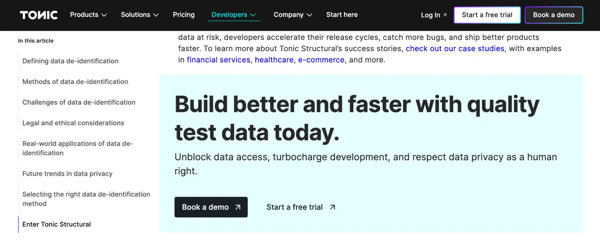
The data platform for development and testing focuses on product benefits (better and faster development) and features (unblock data access, turbocharge development, respect data privacy), using concise, action-oriented language.
Engage your audience with 60 powerful CTA phrases for successful B2B marketing campaigns
5. It’s OK to break the rules (sometimes) if you cover the basics
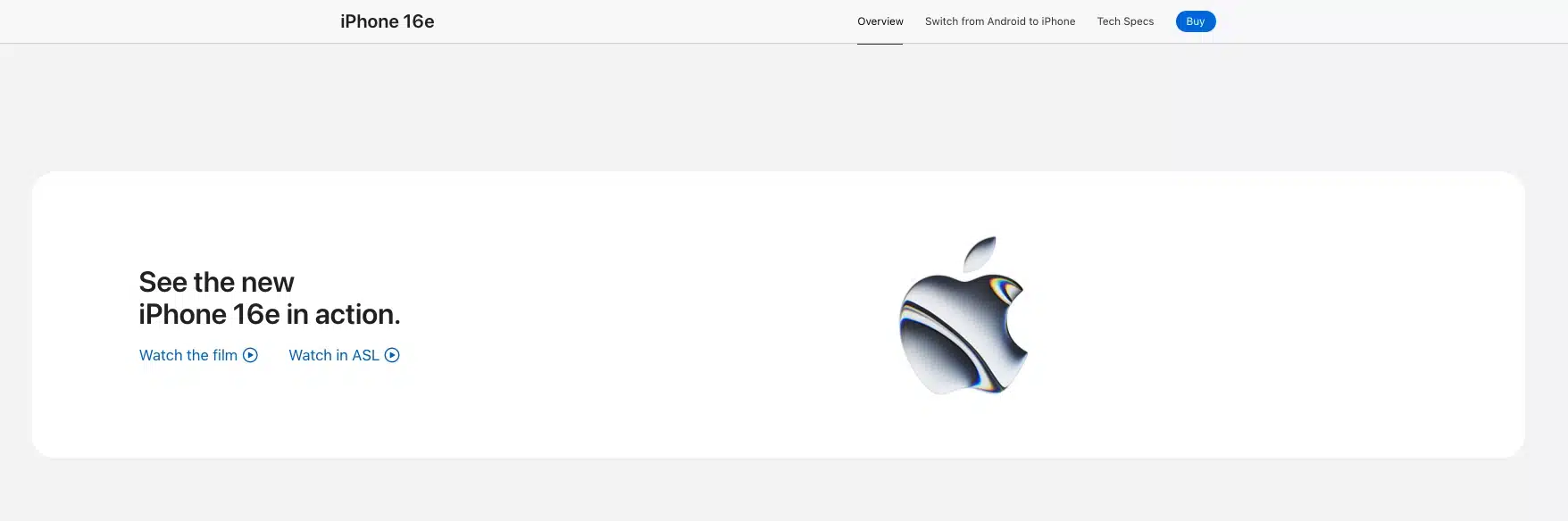
In this B2C example, Apple showcases a CTA that is as simple as effective. When you visit the iPhone 16e page, you notice there’s only one CTA, a blue “Buy” button, which follows you as you scroll down.
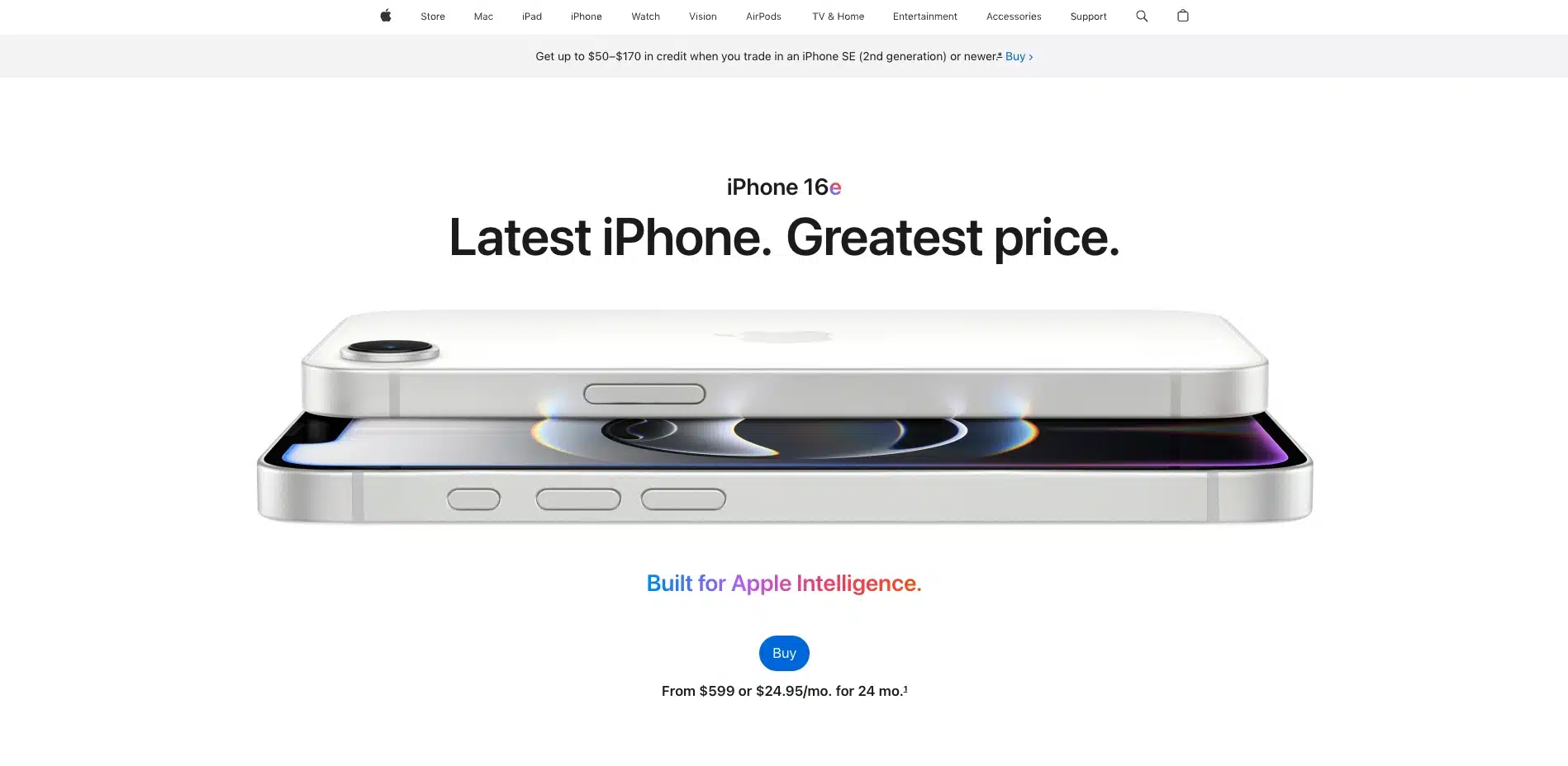
The page has a few links related to the product, like “Watch the film” or “Watch in ASL,” but it maintains a clean layout with strategic call to action buttons. And that means Apple is encouraging the user to focus on one conversion goal (the sale) instead of many actions.
This approach goes against a traditional internal linking strategy that would recommend linking to high-authority pages within your website to distribute link equity and improve SEO. On this iPhone page, you scroll down and spend significant time without being able to click on anything. But in this case, it’s okay to break the rules, since the value proposition comes through every feature on the product page.
6. Look for the perfect balance of attraction without intrusion
Speaking of broken rules, marketers sometimes compromise their CRO strategies by making a risky move: sticking their CTAs intrusively within the narrative.
An example of how you create standout CTAs without being invasive comes from Zendesk, a help desk platform. They often use illustrations from their brand guide to promote content within their blog. Notice that the image captures attention to the CTA while the copy uses the same colors and font type as the whole text. This is what we want: a balance of attraction without intrusion.
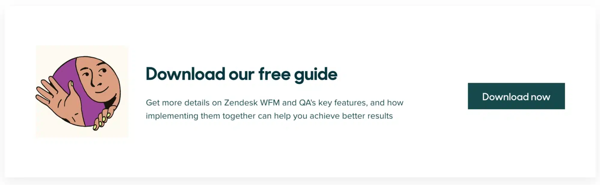
To increase your CTA conversion rates without being intrusive, you should:
- Avoid distraction: Animations and graphics sometimes compete for attention. Make sure your CTA is visible without making it the focus of the page.
- Build visitors’ confidence: Don’t leave space for doubt in your CTA structure. Use direct sentences in the copy and prioritize having only one action to take.
- Guide users through their journey: A CTA like “Learn more” expresses an action more clearly than “Click here,” which doesn’t give users any context about where it leads. By making your CTAs clear and concise, you support users in taking a step further in their buying journey.
7. Don’t overuse CTAs
Definitely, “the more, the merrier” doesn’t apply to CTAs.
This is another common mistake B2B businesses make — thinking that too many buttons will increase conversion chances. In fact, it’s just the opposite. Remember that idea of CTAs as traffic lights guiding your website visitors. If there are too many on the street, the traffic doesn’t flow.
Designers tend to balance the use of buttons by creating what we call micro CTAs. They’re versions with microcopy but also smaller designs.
Take the example of Sedna, which showcases apps that integrate with their platform. At the bottom, there’s a subtle “Talk to Us” CTA that’s easily identifiable as clickable.
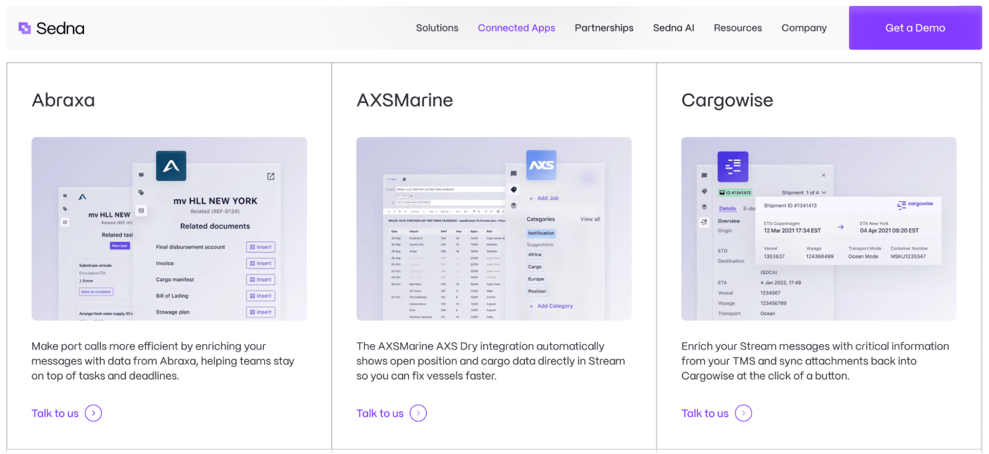
But whether they’re buttons, links or banners, they’re still calls to action, so use them with caution.
8. Track your sources of conversion
Performance tracking could be a whole new chapter of our strategies for conversion rate optimization since a CTA is key to CRO success. But I’ll focus on the best practices to measure your success: tracking call to action conversion rates and identifying which spots are driving results.
For example, consider a user visiting HubSpot seeking a demonstration of their CRM platform. You see two “Get a demo” buttons: one prominently placed at the menu of the page and another positioned below the supporting text within the header section.
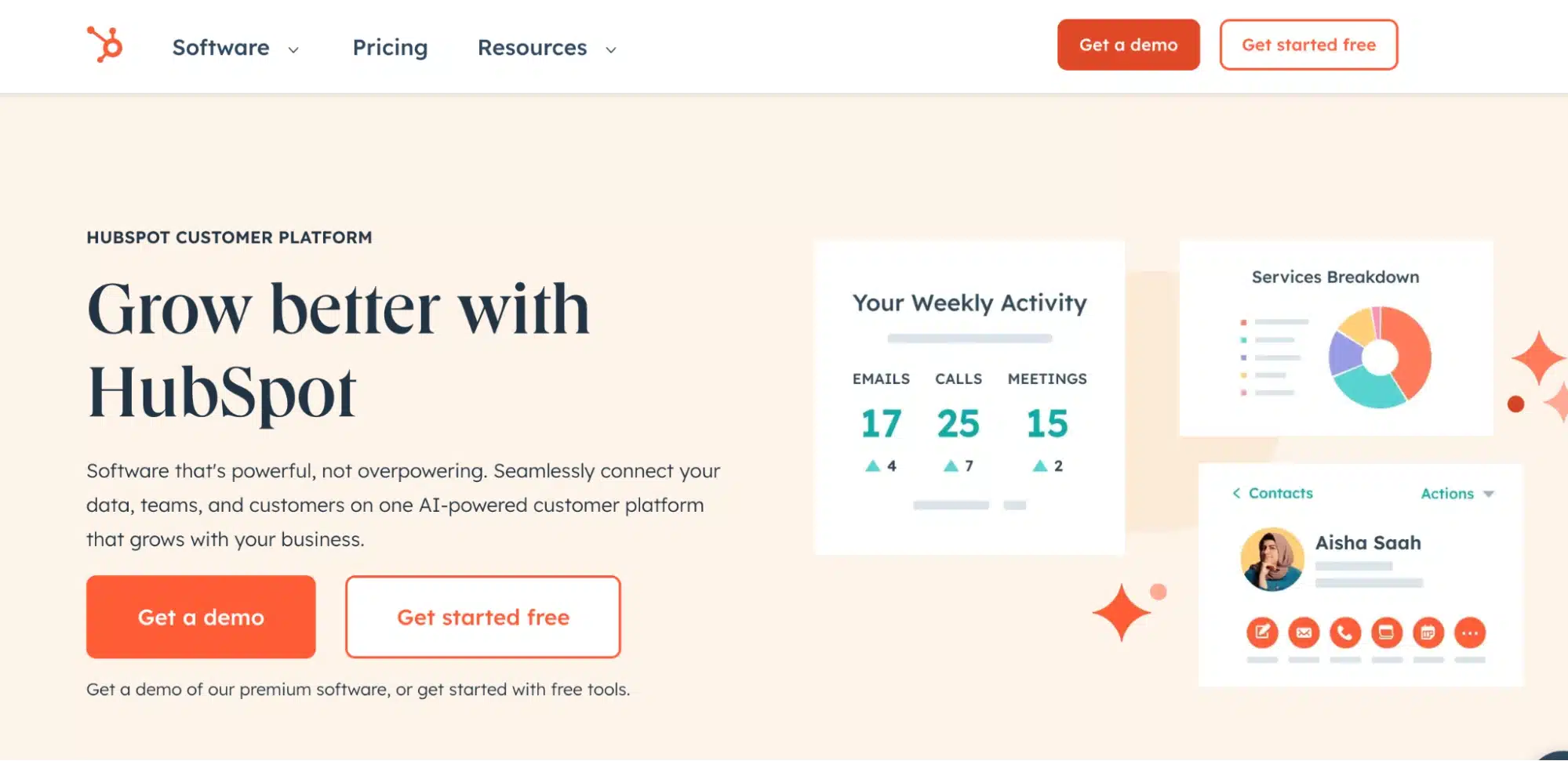
By using GA4 and Google Tag Manager, HubSpot marked up these specific elements of the page. So when I click on any one of them, I am directed to the same demo page. However, depending on where I clicked, the link shows a change in the source of the click. See the difference between the URL parameters:


The links indicate that HubSpot is tracking clicks on these buttons. By doing so on your page, you’re able to know how many clicks you get on your website buttons every month. This practice empowers your digital marketing team to improve those that aren’t converting by A/B testing the color, font or copy.
Remember: To optimize CTA conversions, integrate multiple strategies throughout the buying journey. Salesforce’s State of Marketing Report indicates that marketers use an average of nine different strategies to capture data across the entire customer journey, including web registration (82%), subscriptions (75%), and gated content (43%) like webinars, white papers and ebooks.
9. Make your CTAs visually appealing
Last, but not least, create visually stunning CTAs that capture users’ attention while seamlessly integrating into the narrative. Here are my go-to strategies:
- Use colors and contrast: Take advantage of colors that sell within your brand palette, especially those that contrast with the background of your website. Consider complementary colors or high-contrast combinations to draw attention to your CTAs.
- Optimize for all devices: Design your CTAs with mobile users in mind first, adjusting to various screen sizes — Unbounce’s Conversion Benchmark Report shows that 83% of landing page visits come from mobile devices.
- Include creative resources: Make your CTAs engaging with images and visual assets that create identification with your brand and content.
- Tap into CTA tools: You don’t need a designer to create calls to action for your website. There are many user-friendly tools with drag-and-drop functionality and pre-designed elements that make it easy to build click-triggering CTA banners and buttons.
Increase your conversions with these 7 best practices for CTA button design in Figma
Get expert help to create the best calls to action for conversion
Improving your CTAs is a continuous process that requires testing different approaches to find what resonates better with your audience. Need a hand to make your calls to action increase conversion? Our team is ready to help you with:
- SEO consulting services: Get a solid strategy to boost search rankings, attract the audience and maximize your organic traffic
- Conversion rate optimization: Refine user journeys and website elements to increase your CTA conversion rates
- Web search optimization: Improve your site’s visibility with a keyword strategy and technical enhancements to rank higher
- Web design: Stand out online with responsive, user-centric designs that capture attention and guide visitors toward taking action
- Content writing: Partner with our content team to create engaging copy that keeps visitors ready to take action, from compelling headlines to persuasive button text
Let’s kickstart your CRO strategy optimization — just give us a shout.
* Blog edited by Claudia Flores
Start optimizing your CRO strategy today